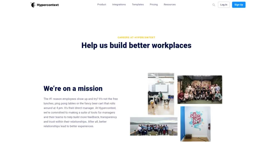
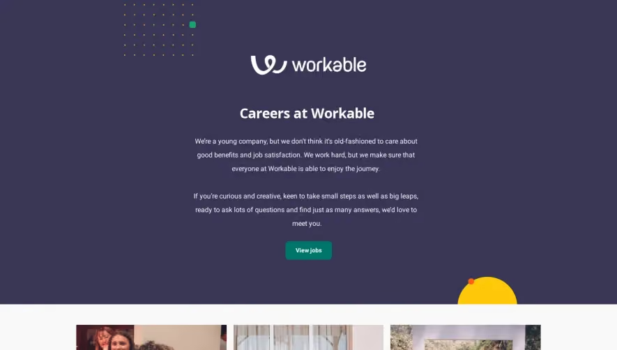
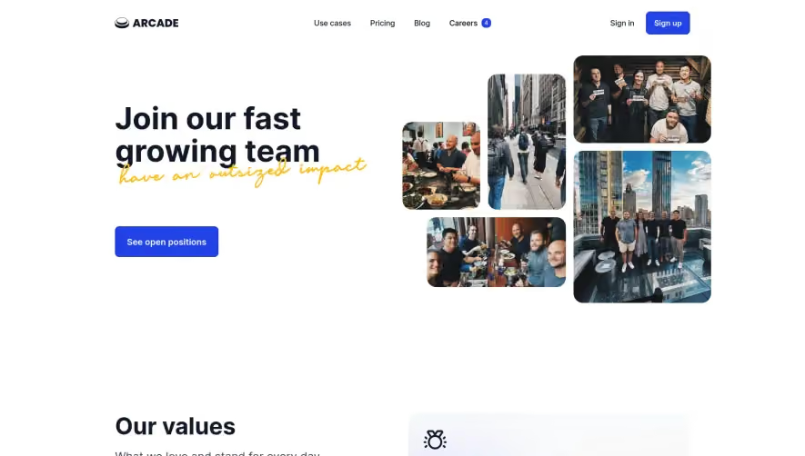
Generate a new design based on this screen using your own content.
Thank you! Your submission has been received!
Oops! Something went wrong while submitting the form.
# Design from Reference: Slite Career Page
Create an original, high-fidelity visual design inspired by the reference. Prioritize composition, typography, colors, spacing, and component styling over technical implementation.
## Reference
- **Product:** Slite
- **Category:** Careers Page
- **Screenshot:** https://cdn.prod.website-files.com/5e9dc792e1210c5325f7ebbc/62ecada23da29e7925f6187c_1659677246231-5ea380c6f0e208340c491d16_screencapture-slite-jobs-2020-04-25-02_13_03.webp
Analyze the screenshot first. If inaccessible, request it rather than guessing.
## Content
{{content.instructions}}
{{content.data}}
Preserve essential messaging and factual accuracy. Adapt structure and copy length for visual balance; never invent product claims.
## Visual Design
Use this context to reproduce the reference's visual language: layout, typography, colors, spacing, borders, radii, and distinctive elements. The screenshot takes priority if descriptions conflict.
## Direction
{{preferences.fidelityInstructions}}
## Output
{{output.instructions}}
Deliver a polished, cohesive design with precise alignment, hierarchy, and spacing. Produce the requested visual artifact, not just a description. If unsupported, explain the limitation.
Slite's careers page opens with a bold headline "Come for the mission, stay for the team" paired with a candid team photo. No stock imagery. That immediate authenticity sets the tone for everything below. The investor logos from Y Combinator, Index Ventures, and Spark Capital add quiet credibility without shouting.
Smart Content Hierarchy
The page flows naturally: hero, then a personal letter-style "Hey there" section, benefits, work philosophy, open positions, and finally a massive team grid. The "We work thoughtfully" section breaks down their culture into four pillars with numbered blocks. Written culture, async work, transparency, remote. Simple grid, no fluff. Typography is minimal and readable throughout, mostly a clean sans-serif with generous whitespace doing the heavy lifting.
The Team Grid Steals the Show
That photo grid at the bottom is huge and unapologetically real. Roughly 20 team members with actual names and roles. It's warm and grounding. The purple accent color appears sparingly, mostly on CTAs and links, keeping things focused. Footer is dense but well-organized into clear columns.