Design with AI
Generate a new design based on this screen using your own content.
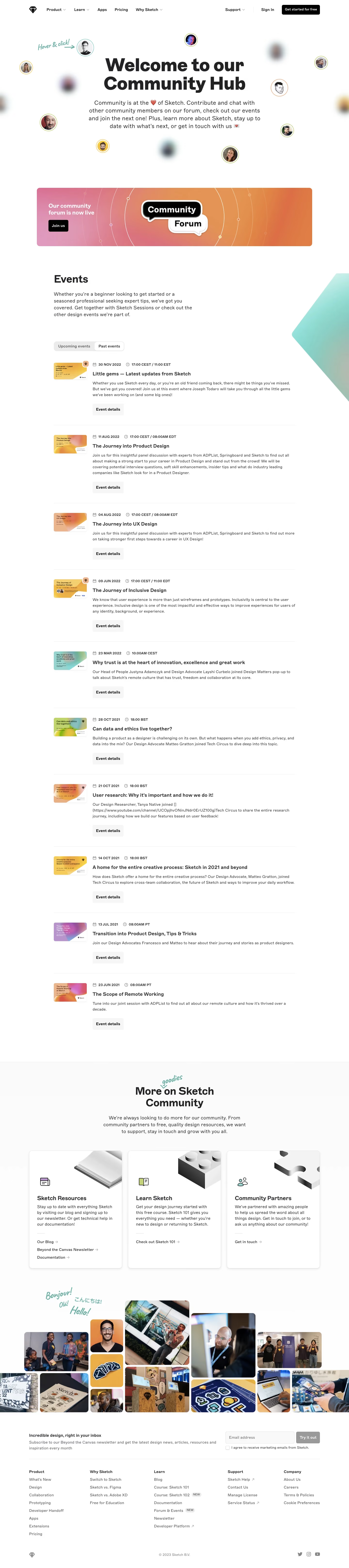
# Design from Reference: Sketch Events Page
Create an original, high-fidelity visual design inspired by the reference. Prioritize composition, typography, colors, spacing, and component styling over technical implementation.
## Reference
- **Product:** Sketch
- **Category:** Events Page
- **Screenshot:** https://cdn.prod.website-files.com/5e9dc792e1210c5325f7ebbc/6acb6e9c2837b9f3168fb4db_6acb6bdba985900f7f27bd60_cms-fcc5c9f0b7b0d848819d1961.webp
Analyze the screenshot first. If inaccessible, request it rather than guessing.
## Content
{{content.instructions}}
{{content.data}}
Preserve essential messaging and factual accuracy. Adapt structure and copy length for visual balance; never invent product claims.
## Visual Design
### Overall aesthetic
- **Character:** Friendly design-community hub with floating portraits, editorial event rows and playful handwritten annotations.
### Page composition
- **Canvas:** 1440 × 6453 screenshot pixels; CSS estimates are near screenshot scale, with capture scale unverified.
- **Sequence:** Navigation; centered hero/portrait constellation; gradient forum banner; past/upcoming event list; three resource cards; photo collage; newsletter/footer.
### Information hierarchy
- **Priority:** Large community headline leads to forum action and chronological events. Event rows show thumbnail, date/time, title, description and details action.
### Typography
- **Family:** Heavy sans-serif headings, neutral body and handwritten decorative annotations; exact fonts are unverified.
- **Scale:** Estimated CSS hero 72px, section titles 42px, event titles 20px, body 17–18px and metadata 14px.
### Colors & surfaces
- **Sampled palette:** White #FFFFFF with near-whites #FBFBFB and #FAFAFA.
- **Accents:** Black actions; coral/orange/pink gradient banner; mint annotations; small multicolor portrait rings and event artwork.
### Components
- **Events:** Plain ruled rows with small thumbnails and pale rectangular actions; segmented past/upcoming toggle.
- **Resources:** Three rounded shadowed cards with metallic abstract illustrations. Collage uses varied rounded photo tiles.
- **Geometry:** Estimated 12px card radius and 48px button heights.
### Visual rhythm
- **Spacing:** Broad 100px CSS section gaps; regular event-row padding maintains order through the long list.
### Responsive
- **Guidance:** Mobile is not shown. Stack event thumbnail/copy, reduce floating portraits and reflow resource/collage grids.
### Adaptation guidance
- **Transfer:** Preserve community warmth and event utility. Supply original portraits, event information and resource destinations.
Use this context to reproduce the reference's visual language: layout, typography, colors, spacing, borders, radii, and distinctive elements. The screenshot takes priority if descriptions conflict.
## Direction
{{preferences.fidelityInstructions}}
## Output
{{output.instructions}}
Deliver a polished, cohesive design with precise alignment, hierarchy, and spacing. Produce the requested visual artifact, not just a description. If unsupported, explain the limitation.