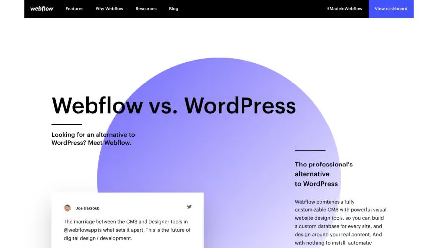
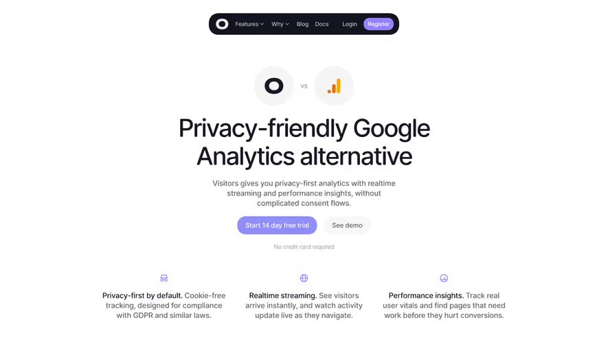
Design with AI
Generate a new design based on this screen using your own content.
# Design from Reference: Routine Comparison Page
Create an original, high-fidelity visual design inspired by the reference. Prioritize composition, typography, colors, spacing, and component styling over technical implementation.
## Reference
- **Product:** Routine
- **Category:** Comparison Page
- **Screenshot:** https://cdn.prod.website-files.com/5e9dc792e1210c5325f7ebbc/6acadc585c79bb17f221b104_6acadbb70a7a70fbdd8f15dd_cms-4a0a0f95395f125190237f2f.webp
Analyze the screenshot first. If inaccessible, request it rather than guessing.
## Content
{{content.instructions}}
{{content.data}}
Preserve essential messaging and factual accuracy. Adapt structure and copy length for visual balance; never invent product claims.
## Visual Design
### Overall aesthetic
- **Style:** Minimal comparison landing page emphasizing product screenshots, alternating white sections, and coral signup accents.
### Page composition
- **Canvas:** 2880 × 16794 image px; CSS estimates assume unverified 2×.
- **Sequence:** Hero comparison copy and video screenshot; trust logos; alternating feature pairs; desktop-dashboard hero; extended product preview; testimonials; signup/footer.
### Information hierarchy
- **Primary:** Alternative-to-competitor headline.
- **Evidence:** Calendar/tasks/notes/scheduling screenshots dominate body.
- **Proof:** Logo row and testimonial columns.
- **Conversion:** Small coral request-access form near bottom.
### Typography
- **Family:** Neutral sans serif; exact identity unverified.
- **Hero:** Approximately 40–48px CSS bold.
- **Section headings:** Approximately 28–32px.
- **Body:** Approximately 14–16px.
- **Metadata:** Approximately 11–12px.
- **Precision:** Estimated under 2×.
### Colors & surfaces
- **Canvas:** #FFFFFF.
- **Neutral surfaces:** #FCFBFC and #F2F2F2.
- **Borders:** #E7E7E7 and #E5E5E5.
- **Text:** Dark gray.
- **Accent:** Coral branding/actions and pale violet links; exact tokens unverified.
- **Precision:** Flat samples.
### Components
- **Hero media:** Large app preview with circular play overlay.
- **Feature art:** Calendar screenshots, task cards, command examples, and note panels.
- **Desktop section:** Wide landscape-background product screenshot.
- **Testimonials:** Three unboxed text columns with small avatars.
- **Signup:** Compact email field and coral submit.
### Visual rhythm
- **Spacing:** Broad gaps between alternating feature pairs.
- **Alignment:** Repeated left/right copy-media structure.
- **Density:** Detailed screenshots contrast with short headings and paragraphs.
### Responsive
- **Observed:** Desktop only.
- **Recommendation:** Stack pairs, crop product previews thoughtfully, and reduce testimonial columns.
### Adaptation guidance
- **Preserve:** Evidence-led comparison and alternating product narrative.
- **Content:** Use verified comparison claims and actual product screenshots.
- **Behavior:** Video, scheduling, and access request unverified.
Use this context to reproduce the reference's visual language: layout, typography, colors, spacing, borders, radii, and distinctive elements. The screenshot takes priority if descriptions conflict.
## Direction
{{preferences.fidelityInstructions}}
## Output
{{output.instructions}}
Deliver a polished, cohesive design with precise alignment, hierarchy, and spacing. Produce the requested visual artifact, not just a description. If unsupported, explain the limitation.