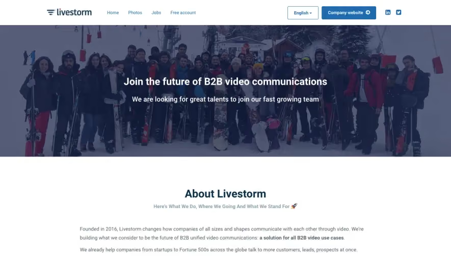
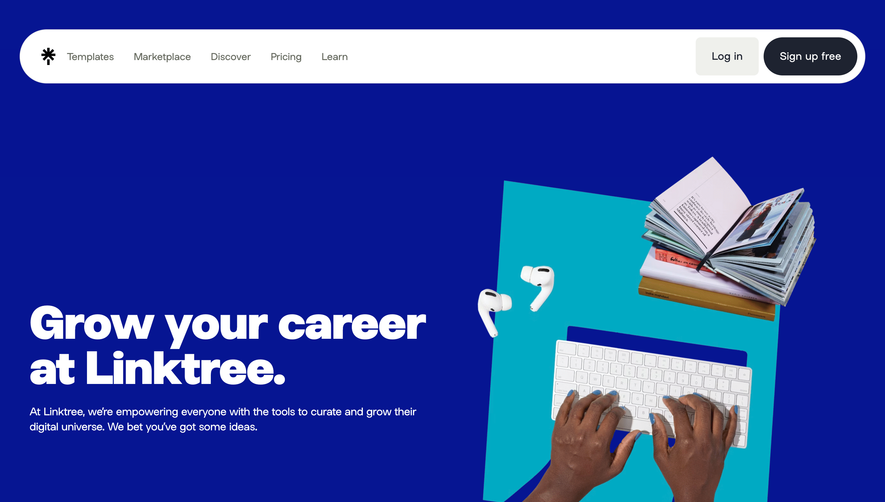
Generate a new design based on this screen using your own content.
Thank you! Your submission has been received!
Oops! Something went wrong while submitting the form.
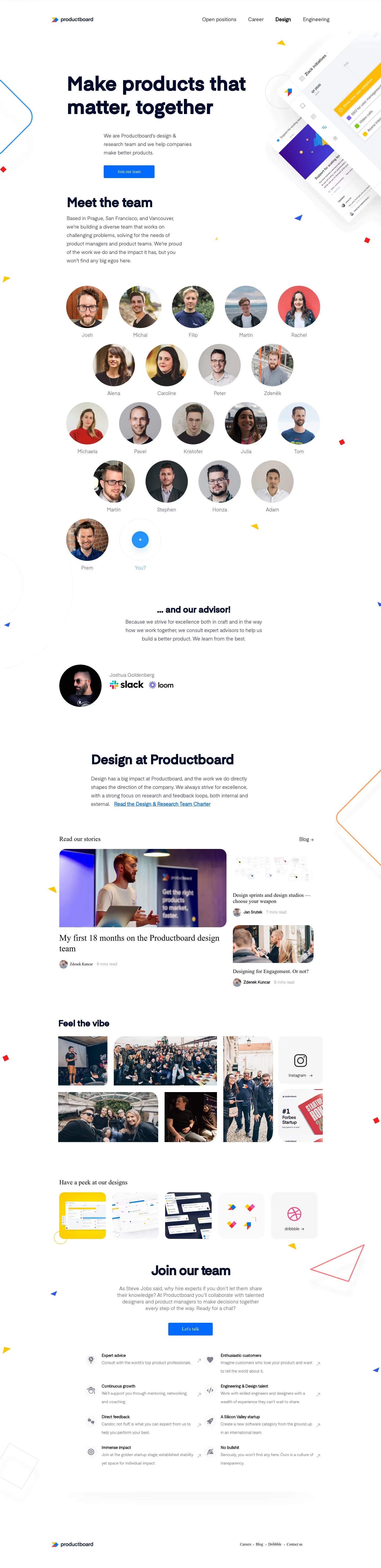
# Design from Reference: ProductBoard roductboard Careers Page
Create an original, high-fidelity visual design inspired by the reference. Prioritize composition, typography, colors, spacing, and component styling over technical implementation.
## Reference
- **Product:** ProductBoard
- **Category:** Careers Page
- **Screenshot:** https://cdn.prod.website-files.com/5e9dc792e1210c5325f7ebbc/62eca42b9147fe9328379003_1659674520734-62ec9c91c8eb839c508d637e_screenshot-device-a5adfd64063c5a727746c92f57eb6da2-1659606583495.webp
Analyze the screenshot first. If inaccessible, request it rather than guessing.
## Content
{{content.instructions}}
{{content.data}}
Preserve essential messaging and factual accuracy. Adapt structure and copy length for visual balance; never invent product claims.
## Visual Design
Use this context to reproduce the reference's visual language: layout, typography, colors, spacing, borders, radii, and distinctive elements. The screenshot takes priority if descriptions conflict.
## Direction
{{preferences.fidelityInstructions}}
## Output
{{output.instructions}}
Deliver a polished, cohesive design with precise alignment, hierarchy, and spacing. Produce the requested visual artifact, not just a description. If unsupported, explain the limitation.
Productboard’s careers page radiates a modern, minimalist aesthetic with a professional but inviting tone. White space dominates, letting content breathe and guiding users’ attention to key actions. The design feels approachable—balancing clean lines and subtle charm—with a restrained playfulness that fits a tech-driven SaaS environment.
Layout and Structure
The layout is intuitively structured: a prominent hero section headlines the company mission and culture, flanked with a welcoming call to action. Content flows logically, guiding visitors through “About Us,” values, employee testimonials, and open positions without overwhelming them. The “Jobs” section uses clear filters and search, facilitating swift discovery of roles. The footer is comprehensive yet uncluttered.
Visual Elements
Photography takes center stage, featuring diverse, authentic employee images and lively team moments. Custom icons and clean line illustrations add clarity to values and benefits sections without competing for attention. Subtle hover animations and animated transitions create a responsive, polished feel.
Color Palette and Typography
A fresh palette of whites and blues dominates, punctuated by the iconic Productboard yellow for CTAs and accents. This choice enhances both visual hierarchy and brand recognition. Typography is contemporary and legible—using sans-serif families with varied weights and decisive headers, ensuring easy skimmability.
User Experience Patterns
Navigation is sticky and straightforward, with smooth anchor-link scrolling and persistent CTAs. Job listings load dynamically, and the application flow is streamlined—reducing friction with concise forms and clear next steps.
Unique or Notable Design Choices
The careers page stands out by blending personality with professionalism—employee testimonials leverage video and candid photography, humanizing the brand. Animated microinteractions signal responsiveness, while clear, inviting copy reinforces an innovative and trustworthy culture.