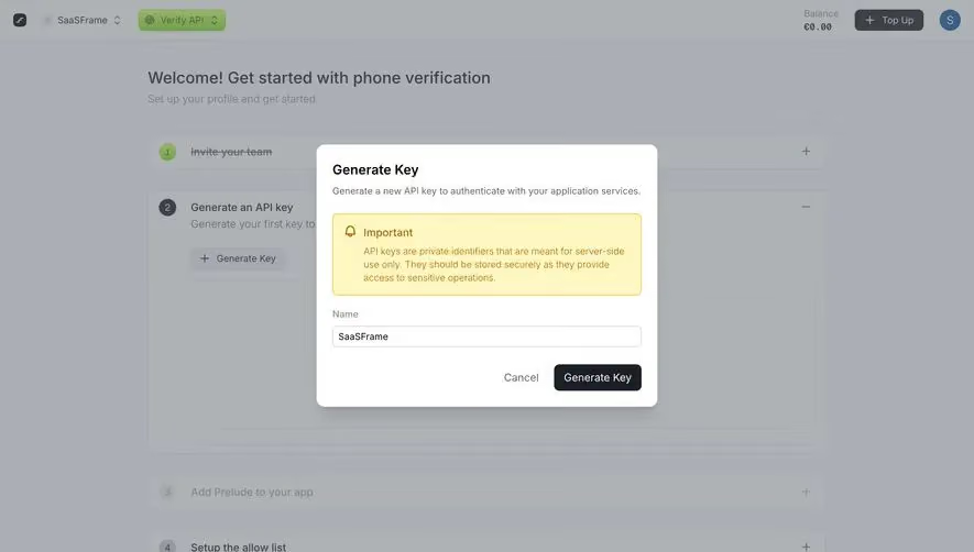
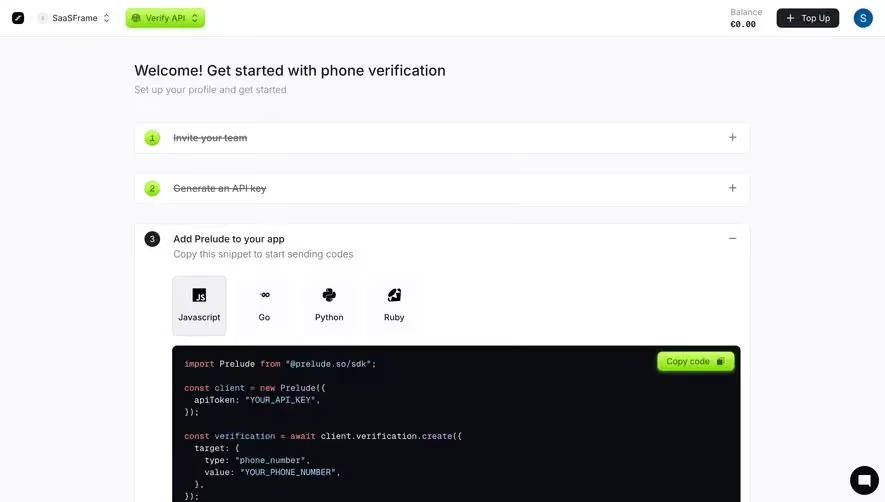
Generate a new design based on this screen using your own content.
Thank you! Your submission has been received!
Oops! Something went wrong while submitting the form.
# Design from Reference: Prelude Create First App
Create an original, high-fidelity visual design inspired by the reference. Prioritize composition, typography, colors, spacing, and component styling over technical implementation.
## Reference
- **Product:** Prelude
- **Category:** Account Setup
- **Screenshot:** https://cdn.prod.website-files.com/5e9dc792e1210c5325f7ebbc/697b762cda6b6fcf8bb76a28_-ROJ4vHz7dPFORc22VA5UkPeyUTkMo_ymoJFyeWksj8.avif
Analyze the screenshot first. If inaccessible, request it rather than guessing.
## Content
{{content.instructions}}
{{content.data}}
Preserve essential messaging and factual accuracy. Adapt structure and copy length for visual balance; never invent product claims.
## Visual Design
Use this context to reproduce the reference's visual language: layout, typography, colors, spacing, borders, radii, and distinctive elements. The screenshot takes priority if descriptions conflict.
## Direction
{{preferences.fidelityInstructions}}
## Output
{{output.instructions}}
Deliver a polished, cohesive design with precise alignment, hierarchy, and spacing. Produce the requested visual artifact, not just a description. If unsupported, explain the limitation.
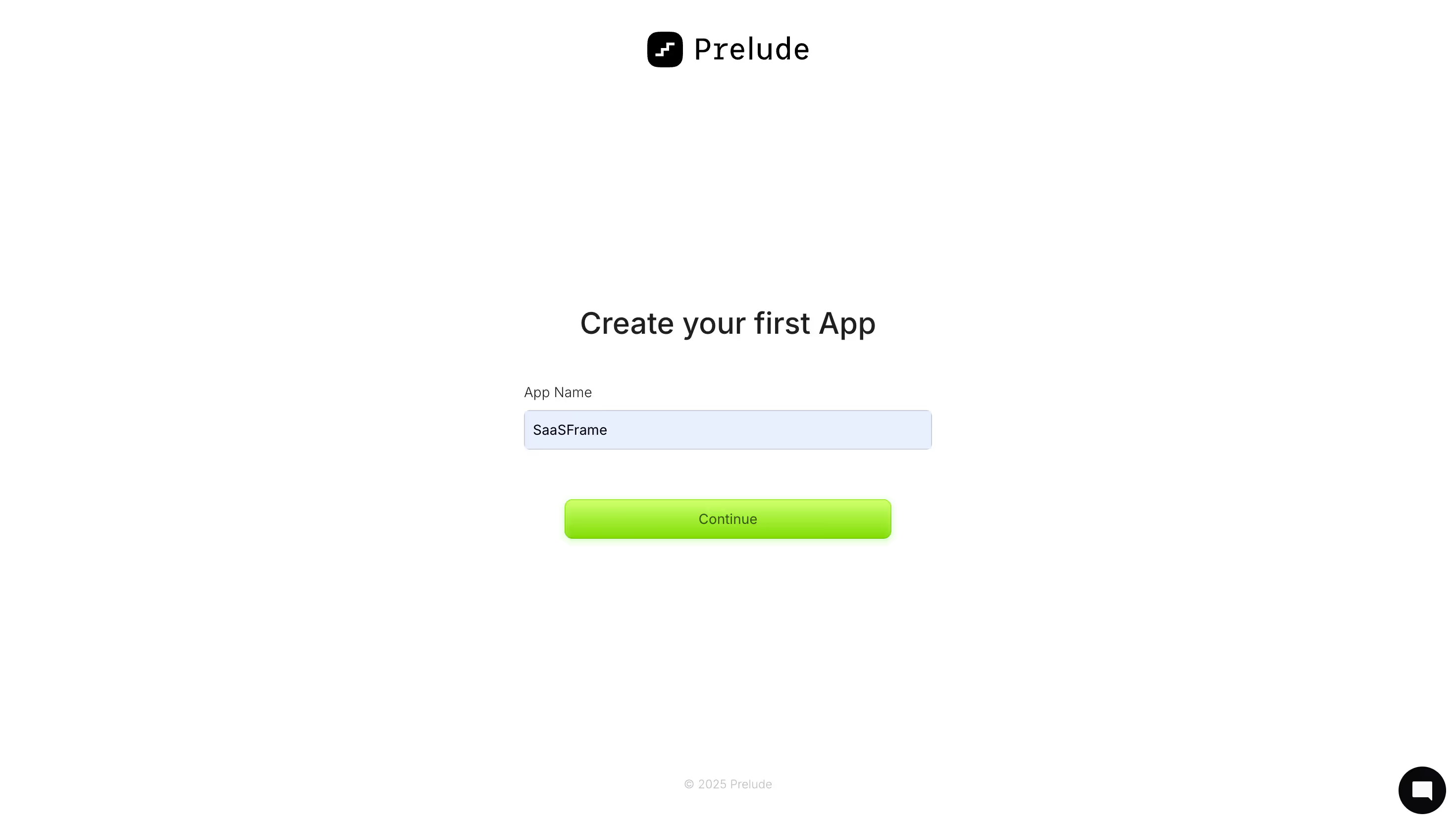
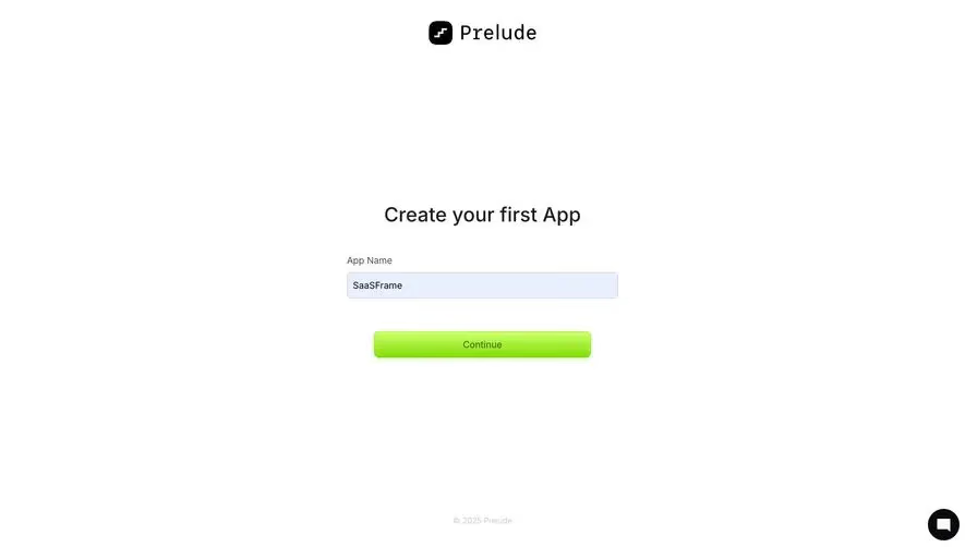
Prelude nails the first-run experience here. You land on this page and there's literally one thing to do: name your app and hit Continue. No sidebar, no nav, no distractions. Just a centered card-style layout that feels almost meditative. The hierarchy is dead simple. Logo up top, heading, input, button. Done.
That Button Though
The lime green CTA is doing all the heavy lifting visually. Against a pure white background with black type, it pops hard. It's got a slight gradient that gives it an almost physical, pressable quality. Smart move when everything else is so minimal. The input field has a soft blue tint when active, which is a subtle but thoughtful touch that keeps the form feeling alive.
Typography That Stays Out of the Way
Clean sans-serif throughout. The "Create your first App" heading is large enough to anchor the page without screaming. Label text is small and muted. Everything breathes. The generous whitespace makes this feel confident, not empty. Great reference for any onboarding flow where you want to reduce cognitive load to near zero.