Design with AI
Generate a new design based on this screen using your own content.
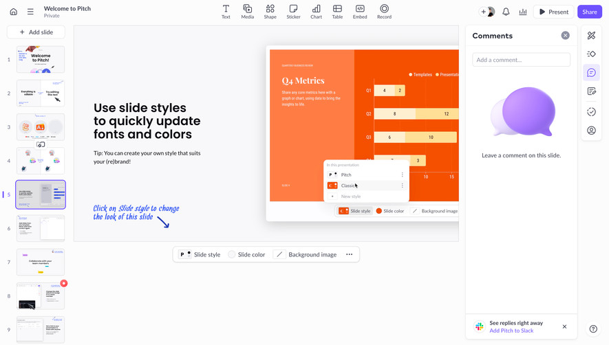
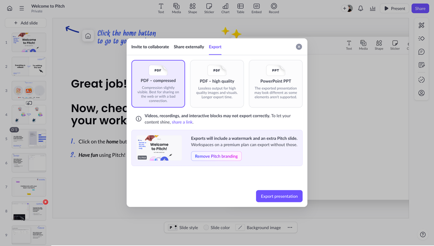
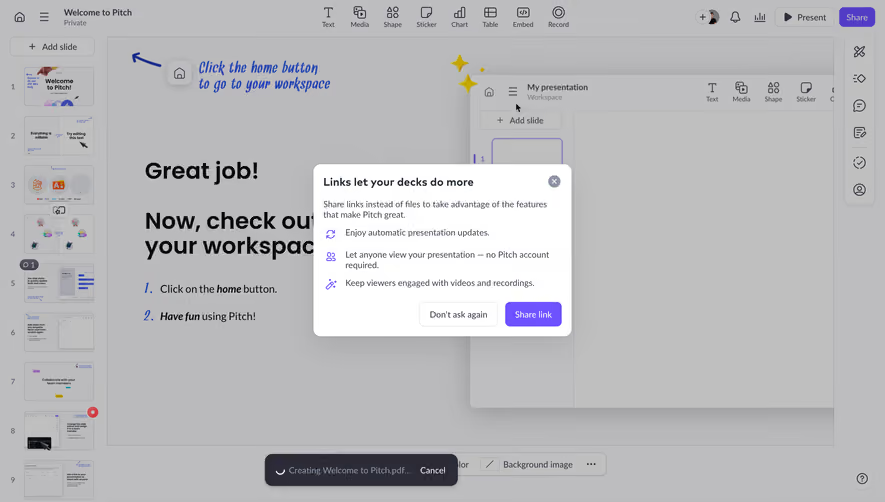
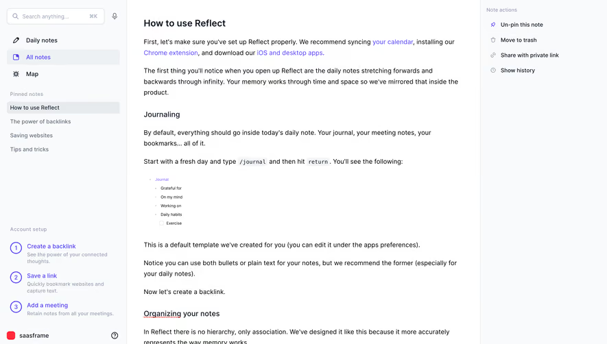
# Design from Reference: Pitch Presentation Comments Side Panel
Create an original, high-fidelity visual design inspired by the reference. Prioritize composition, typography, colors, spacing, and component styling over technical implementation.
## Reference
- **Product:** Pitch
- **Category:** Text Editor
- **Screenshot:** https://cdn.prod.website-files.com/5e9dc792e1210c5325f7ebbc/6aca27eaaca7079066e8e82d_6aca2709fc79d3a6f5db2b18_cms-2483874ae91887ac8c103032.webp
Analyze the screenshot first. If inaccessible, request it rather than guessing.
## Content
{{content.instructions}}
{{content.data}}
Preserve essential messaging and factual accuracy. Adapt structure and copy length for visual balance; never invent product claims.
## Visual Design
### Overall aesthetic
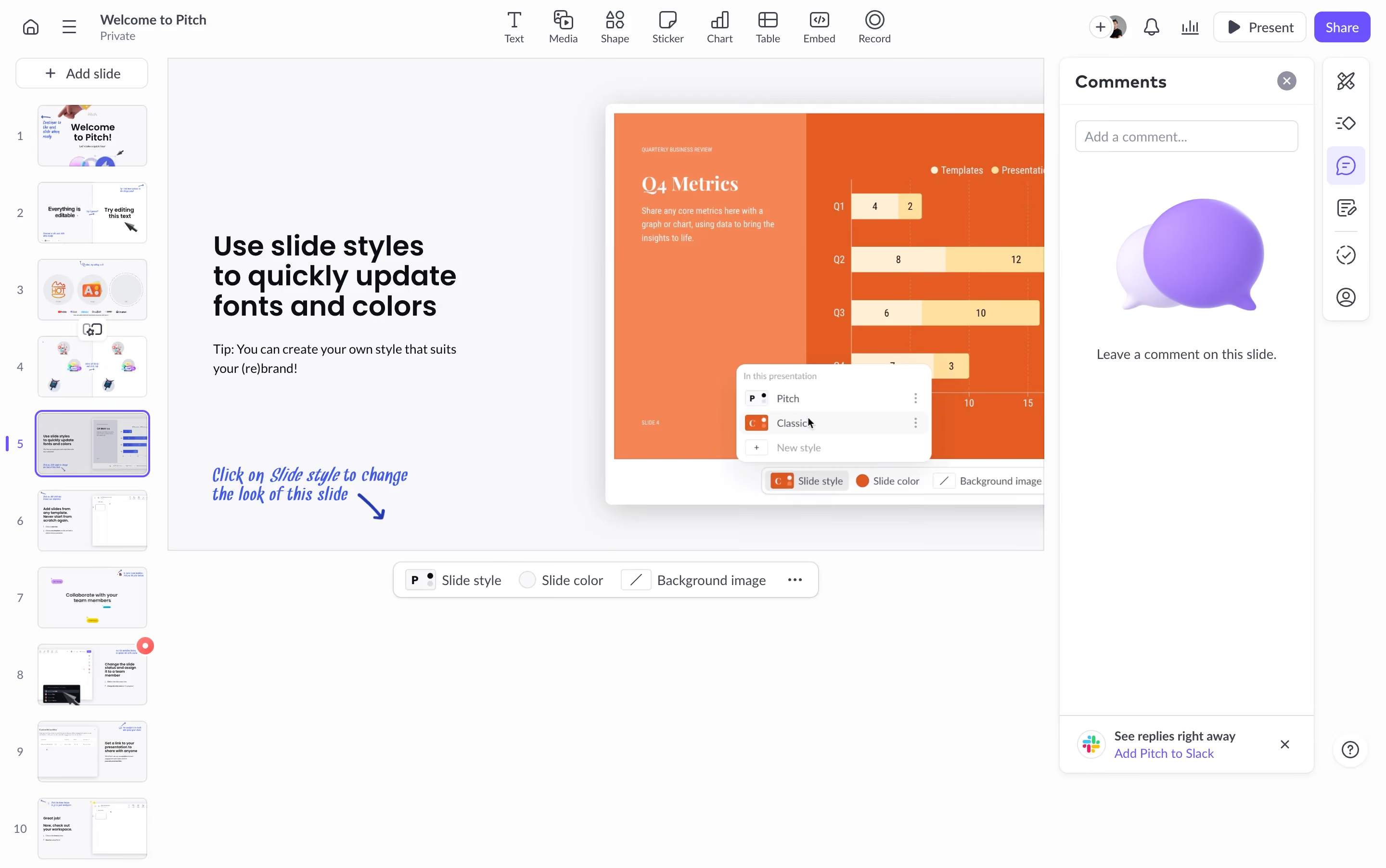
- **Style:** A light presentation editor with compact icon toolbars, a thumbnail rail, central slide canvas, and an open white comments panel.
- **Character:** Precise and productivity-focused. Violet marks collaboration and selection, while the slide's orange artwork provides the strongest color.
### Page composition
- **Capture and scale:** The screenshot measures 2880 × 1804 pixels, consistent with an estimated 2× capture. Following dimensions are estimated CSS pixels under that assumption.
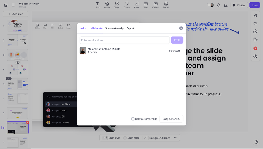
- **Shell:** A shallow top toolbar contains presentation identity left, insertion tools center, and collaboration/present/share controls right.
- **Workspace:** A roughly 170 px left thumbnail rail sits beside a large slide area. A roughly 265 px comments panel and narrow vertical tool strip occupy the right side.
- **Visible slide:** The selected fifth slide contains a bold instructional text block left and a large orange metrics-interface illustration right, with a handwritten blue annotation below.
- **Comments:** The panel contains heading/close, a small comment-entry field, a large violet speech-bubble illustration, empty-state sentence, and a Slack promotion at the bottom.
### Information hierarchy
- **Selection:** The fifth thumbnail uses a violet outline and small selection indicator.
- **Editing focus:** The slide content remains the main workspace, while comments are clearly separated in a white panel.
- **Collaboration:** Share is the strongest top action; the selected comments icon uses a pale violet background in the right tool strip.
### Typography
- **Family:** A neutral sans serif is visible in the editor; slide content also includes serif chart headings and a handwritten annotation. Exact families are unverified.
- **Interface:** Toolbar labels and thumbnail numbers are approximately 10–12 px CSS; panel heading around 18 px semibold.
- **Slide type:** The instructional heading is approximately 28–30 px bold with tight leading, and body copy roughly 14 px. These sizes describe the displayed slide, not necessarily its authoring coordinates.
- **Comments:** Empty-state and utility text are approximately 13–14 px.
### Colors & surfaces
- **Foundation:** Sampled sRGB #FCFCFD, #FFFFFF, and #F8F8FA define shell, comments panel, and canvas. Additional pale tones include #F8F8F9 and #F9F9FB.
- **Slide accent:** Sampled orange #FF7D44 and #F55000 dominate the embedded metrics illustration.
- **Editor accent:** Violet marks selected thumbnail, comments state, Share, and speech-bubble artwork; exact violet values are unverified.
- **Boundaries:** Thin cool-gray borders and soft shadows define panels and floating style controls.
### Components
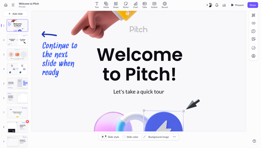
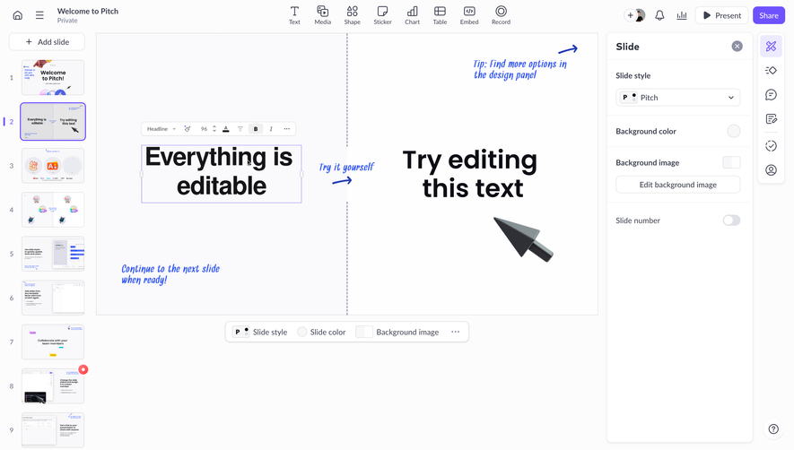
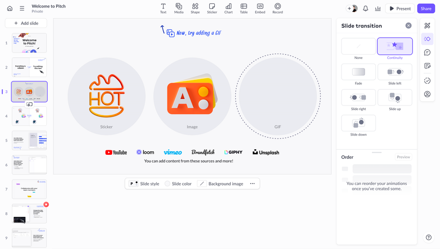
- **Thumbnail rail:** Ten visible numbered slide previews stack vertically with consistent gaps; the active thumbnail has a bright fine outline.
- **Insertion toolbar:** Small line icons sit above labels for text, media, shapes, stickers, charts, tables, embeds, and recording.
- **Comments panel:** A rounded white panel has a fine border, top heading row, input, centered empty illustration/copy, and separated bottom integration prompt.
- **Style toolbar:** A small floating rounded bar beneath the canvas exposes slide style, color, background, and overflow controls.
- **Right tool strip:** A narrow white rounded stack contains vertically arranged editing/collaboration icons.
### Visual rhythm
- **Spacing:** Keep toolbars compact and canvas surroundings open. Comment content has generous empty vertical space between input and lower promotion.
- **Alignment:** Align panel edges with the slide workspace and maintain consistent thumbnail numbering gutters.
- **Focus:** Avoid adding decorative cards to the editor shell; color should come primarily from the authored slide.
### Responsive
- **Observed state:** Only desktop is visible.
- **Recommended reflow:** Use collapsible thumbnail/comments drawers on narrow screens, preserving canvas space. Allow toolbars to group into menus.
- **Comment access:** Keep the comment composer and panel close control reachable without covering slide content.
### Adaptation guidance
- **Preserve:** Retain the thumbnail/canvas/comments relationship, restrained shell, violet collaboration states, and clear empty-state panel.
- **Adapt:** Use the new product's actual document content and collaboration tools.
- **Avoid:** Do not copy slide instructions or infer comment threads and hidden editing behavior absent from the screenshot.
Use this context to reproduce the reference's visual language: layout, typography, colors, spacing, borders, radii, and distinctive elements. The screenshot takes priority if descriptions conflict.
## Direction
{{preferences.fidelityInstructions}}
## Output
{{output.instructions}}
Deliver a polished, cohesive design with precise alignment, hierarchy, and spacing. Produce the requested visual artifact, not just a description. If unsupported, explain the limitation.