



```html

Thank you! Your submission has been received!
Oops! Something went wrong while submitting the form.
Get SaaSFrame Pro
Monthly
$18
Quarterly
$48
Yearly
$180
Upgrade to access this feature
Browse all screens & flows
Filter and search screens & flows
Access Figma files
Access mobile versions
Bookmark screens & flows
Join now
Phantombuster Blog Feed

Phantombuster
phantombuster
Designed by
No items found.

Bookmark
Bookmark
Design with AI
Thank you! Your submission has been received!
Oops! Something went wrong while submitting the form.
# Design from Reference: Phantombuster Blog Feed
Create an original, high-fidelity visual design inspired by the reference. Prioritize composition, typography, colors, spacing, and component styling over technical implementation.
## Reference
- **Product:** Phantombuster
- **Category:** Blog Feed
- **Screenshot:** https://cdn.prod.website-files.com/5e9dc792e1210c5325f7ebbc/62ecada152527c3509088a0f_1659677041956-5ea99625ecdbea07af69f5bf_screencapture-phantombuster-blog-2020-04-29-16_58_09.webp
Analyze the screenshot first. If inaccessible, request it rather than guessing.
## Content
{{content.instructions}}
{{content.data}}
Preserve essential messaging and factual accuracy. Adapt structure and copy length for visual balance; never invent product claims.
## Visual Design
### Overall aesthetic
- **Character:** Friendly long-form blog archive with cyan branding, dark teal text, illustrated banner art and a repeated white article-card format.
- **Evidence and scale:** Screenshot is 1440 × 11543 image pixels. Sizes estimate a 1× CSS capture; actual DPR and exact font identities are unverified. The entire tall feed and footer are visible across the inspected crops.
### Page composition
- **Header:** A pale cyan horizontal bar holds a mascot/wordmark left, category links in the middle and a rounded discovery action right. The All category is marked by a short underline.
- **Two-column content:** A narrow left sidebar around 236px wide contains article search and a goal-filter box. A wider right column around 784px carries the article feed, beginning near x446.
- **Repeated feed:** Each article card combines a wide illustrated banner, overlapping author portrait, byline, centered title, optional category chip, short excerpt, Read more link and a bottom-right date.
- **Lower page:** The long repeated feed ends above a full-width dark teal footer with brand links at left and a large mascot/contact illustration at right. A darker legal strip and corner support control finish the capture.
### Information hierarchy
- **Article priority:** Large dark teal titles provide the main scanning anchors, with imagery distinguishing adjacent entries.
- **Metadata:** Author portraits and bylines sit between image and title; category chips and pale dates remain smaller and less prominent.
- **Discovery routes:** Header categories, sidebar goal filters and search offer alternative paths before the feed; cyan Read more links provide consistent article-level actions.
- **Featured cue:** The top card includes a cyan ribbon/star at its upper-right image corner.
### Typography
- **Article titles:** Approximately 28px CSS bold sans-serif, centered, with compact 32px leading and frequent two-line wraps.
- **Excerpts and bylines:** Approximately 15–16px regular sans-serif; excerpts use about 24px leading while bylines sit directly below portraits.
- **Navigation and chips:** Header links and filter labels use a more condensed-looking bold sans-serif around 14–16px; small outlined chips are around 12px. Font families remain unverified.
- **Dates:** Around 14px in pale gray, right aligned at the card bottom.
### Colors & surfaces
- **Measured foundation:** White #FFFFFF fills the page/cards. Pale cyan #E8F9FD and #E7F8FB support header and illustration grounds.
- **Measured darks:** Teal #173F54 appears prominently in text, artwork and footer, while #242E38 supports some darker illustration panels.
- **Measured artwork accents:** Orange #F3A633, dark blue #1E5F90 and medium blue #2877B5 are large banner colors. Other banners add pink, green and gradients without changing the main UI palette.
- **UI emphasis:** Cyan links and rounded actions echo the mascot identity; very pale borders and restrained shadows separate white cards from the white page.
### Components
- **Search:** Approximately 236 × 50px CSS outlined field with a small search icon, muted placeholder and small corner radius.
- **Goal filter box:** Thin pale border, small radius, light shadow and approximately 12px internal inset. Six small outlined goal chips stack with generous vertical separation.
- **Article card:** Approximately 784px wide, typically 490–550px tall, radius near 8px, fine border and subtle lower shadow. Banner height is approximately 180px.
- **Author marker:** Circular portrait around 48px overlaps the banner/body boundary, centered over the byline.
- **Card actions:** Read more uses bold cyan text and a right arrow; category chips use dark teal outlines and minimal padding. Dates sit with roughly 24px right/bottom inset.
- **Footer contact:** A large white speech-bubble pill floats above a cyan/white mascot group. Link columns and a small Support pill provide utility destinations.
### Visual rhythm
- **Repeated spacing:** Approximately 40px separates cards. Within each card, short portrait/byline/title gaps give way to larger excerpt/action/date intervals.
- **Stable alignment:** Feed width, centered text and consistent banner heights create a strong vertical rhythm despite varied artwork.
- **Sidebar balance:** The sidebar occupies only the upper portion, leaving substantial white space beside later cards; the feed remains offset rather than recentered.
- **Footer transition:** A generous gap after the final card precedes the dark full-width footer, creating a clear endpoint.
### Responsive
- **Observed limit:** Only a wide archive rendering is shown; filtering results, search behavior, sticky positioning and mobile layouts are not established.
- **Recommended layout:** Move search and filters above the feed on smaller screens, with collapsible goal filters and a compact category menu.
- **Recommended cards:** Use fluid full-width cards, preserve banner aspect/crop, scale titles moderately and allow excerpts to grow naturally rather than fixing card heights.
- **Recommended footer:** Stack link groups and illustration, keeping the support control clear of content and large enough to tap.
### Adaptation guidance
- **Preserve the pattern:** Use a dependable article-card anatomy with colorful branded banners, overlapping author portraits and one cyan article action.
- **Control repetition:** Keep consistent spacing and metadata placement while allowing illustration color to distinguish stories.
- **Implementation:** Provide semantic article headings, accessible filter/search labels, descriptive image alternatives and stronger contrast where pale date text requires it. Captured article titles and historical dates are content examples, not current product guidance.
Use this context to reproduce the reference's visual language: layout, typography, colors, spacing, borders, radii, and distinctive elements. The screenshot takes priority if descriptions conflict.
## Direction
{{preferences.fidelityInstructions}}
## Output
{{output.instructions}}
Deliver a polished, cohesive design with precise alignment, hierarchy, and spacing. Produce the requested visual artifact, not just a description. If unsupported, explain the limitation.
Category
Patterns
No items found.
Tech Stack
Added on
April 29, 2020
Similar screens
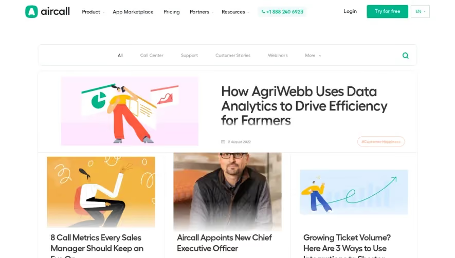


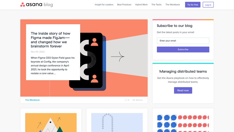

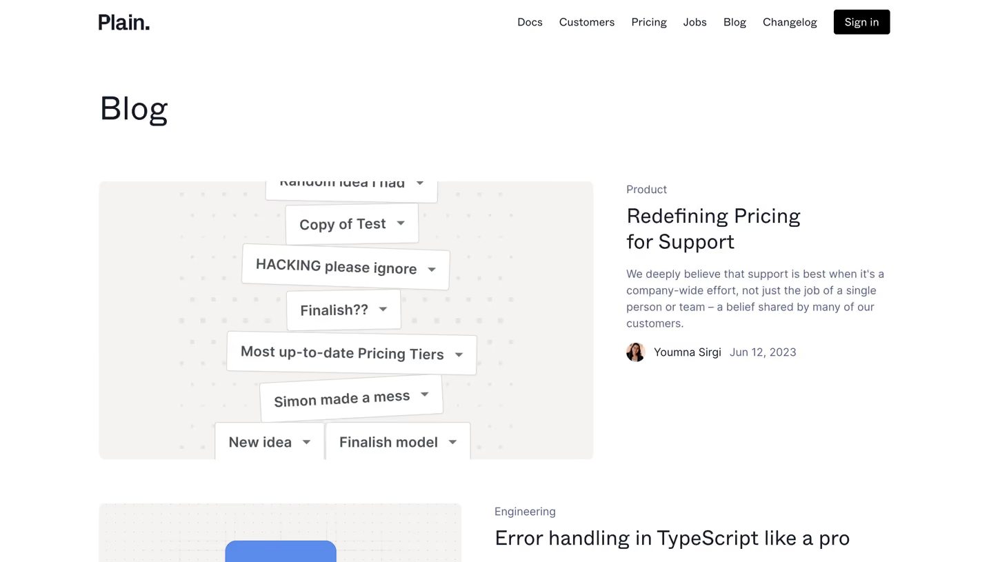

Upgrade to SaaSFrame Pro now to see similar examples.
Monthly
$18 /month
Billed $18 monthly
Browse all screens & flows
Filter and search screens & flows
Search text in screenshots
Access Figma files
Access mobile versions
Join now
Quarterly
$16 /month
Billed $48 quarterly
Browse all screens & flows
Filter and search screens & flows
Search text in screenshots
Access Figma files
Access mobile versions
Join now
Yearly
$15 /month
Billed $180 yearly
Browse all screens & flows
Filter and search screens & flows
Search text in screenshots
Access Figma files
Access mobile versions
Join now