Overall Style and Aesthetic
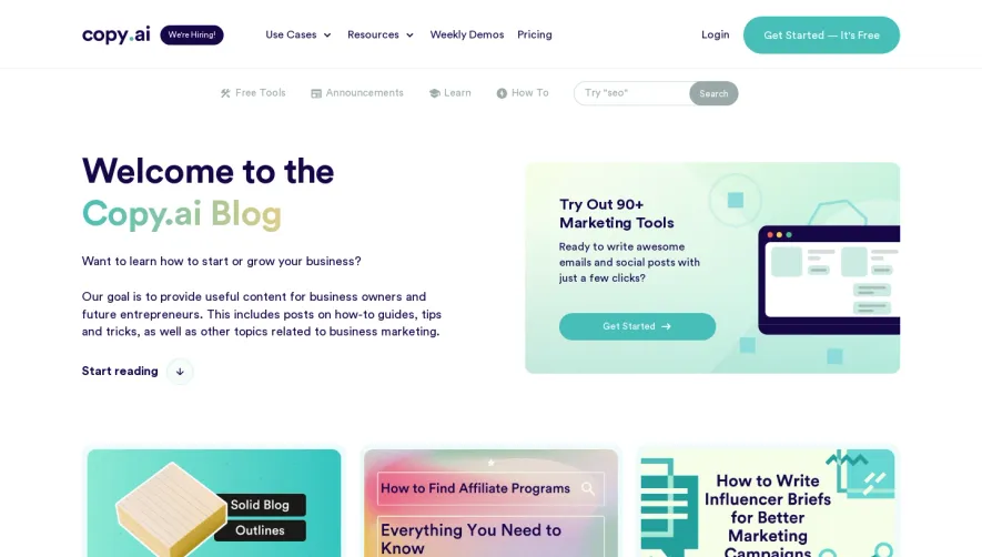
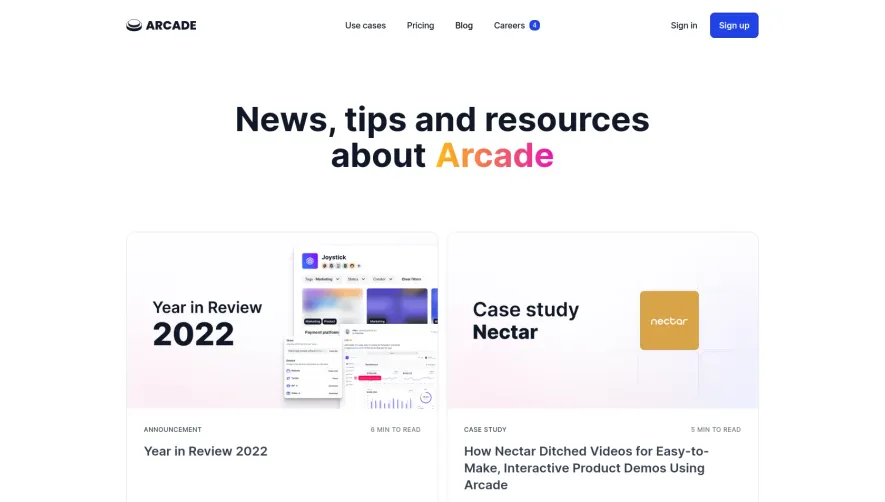
Aircall’s blog page showcases a clean, modern SaaS aesthetic, blending professionalism with inviting visual warmth. The design feels approachable yet credible, employing abundant white space, gentle shadows, and precisely aligned content blocks. Subtle gradients and soft illustrations evoke an innovative and energetic atmosphere, making the content both readable and visually appealing. Layout and Structure
The page is anchored by a spacious hero section: a featured article highlighted with large imagery and bold headlines. Content is segmented via clear grid layouts, guiding visitors through trending topics, latest posts, and curated category highlights. Generous card layouts establish visual rhythm and a sense of order, while sticky navigation ensures users can easily jump between sections. The persistent call-to-action for newsletter signup maximizes engagement without overwhelming the reading experience. Visual Elements
Custom illustrations and crisp iconography permeate the design, supporting wayfinding and infusing character. No stock photography or distracting animations; instead, thoughtfully chosen cover images for articles enhance clarity and topical relevance. Graphics reinforce the brand’s playful yet polished tone, and interactive hover states add tactile expressiveness. Color Palette and Typography
The palette balances Aircall’s signature vivid greens and blues with a neutral white and soft gray backdrop, drawing the eye to interactive elements. Minimal accent colors reinforce content hierarchy. Modern sans-serif typography, with strong headline weights and generous spacing, ensures scannability while maintaining a fresh, vibrant feel. User Experience Patterns and Unique Choices
Effortless navigation prevails, with concise CTAs and smooth scroll interactions. Notably, the minimalist footer distills only the essentials, reinforcing a less-is-more approach. The consistent use of branded, geometric illustrations—rather than generic imagery—strengthens brand recognition and boasts a memorable, contemporary SaaS web identity.