Design with AI
Generate a new design based on this screen using your own content.
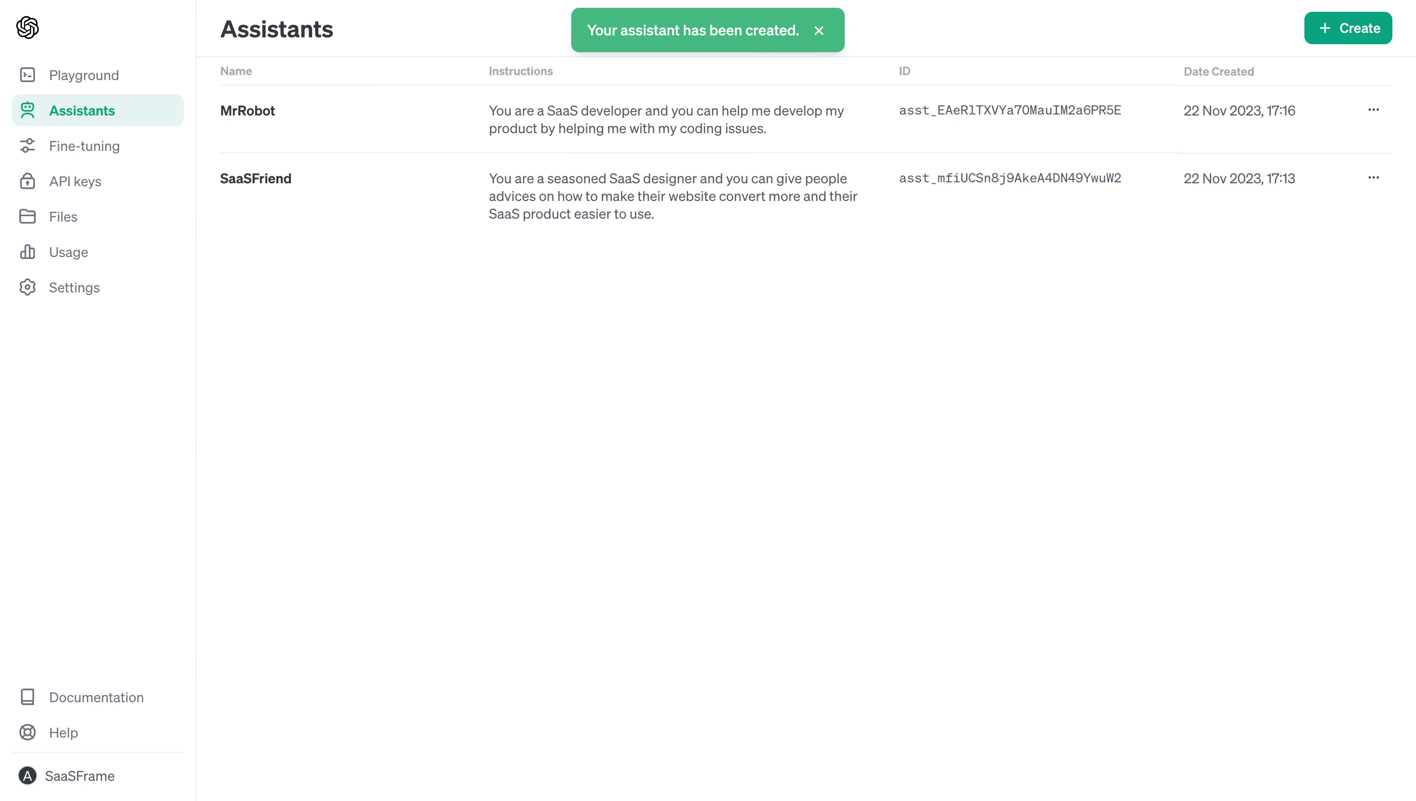
# Design from Reference: OpenAI New Assistant Created
Create an original, high-fidelity visual design inspired by the reference. Prioritize composition, typography, colors, spacing, and component styling over technical implementation.
## Reference
- **Product:** OpenAI
- **Category:** Table
- **Screenshot:** https://cdn.prod.website-files.com/5e9dc792e1210c5325f7ebbc/6acad58286f1bee9c365098a_6acad4fb3ce5f4104ebe3ae8_cms-a095aaaeb86867d0013b30ef.webp
Analyze the screenshot first. If inaccessible, request it rather than guessing.
## Content
{{content.instructions}}
{{content.data}}
Preserve essential messaging and factual accuracy. Adapt structure and copy length for visual balance; never invent product claims.
## Visual Design
### Overall aesthetic
- **Style:** Minimal assistant-management dashboard with white surfaces, green actions, and compact tabular content.
### Page composition
- **Canvas:** 2880 × 1630 image px; CSS estimates assume an unverified 2× capture.
- **Sidebar:** Approximately 200 CSS px wide with product mark, navigation, lower documentation/help, and account.
- **Main:** Assistants heading, green Create action, and table immediately beneath.
- **State:** Green success toast near the top center; two assistant records visible.
### Information hierarchy
- **Primary:** Assistants title and Create button.
- **Content:** Name, instructions, ID, date created, and row-menu columns.
- **Feedback:** Bright green creation toast.
- **Navigation:** Assistants selected with mint-tinted row and green icon/label.
### Typography
- **Family:** Neutral interface sans serif; exact family unverified.
- **Heading:** Approximately 24 CSS px, semibold under assumed 2×.
- **Body/table:** Approximately 14px.
- **Column labels:** Approximately 12px, muted.
- **IDs:** Approximately 13px monospace.
- **Toast:** Approximately 14px, semibold.
- **Precision:** Font metrics and scale are estimates.
### Colors & surfaces
- **Canvas:** #FFFFFF.
- **Toast:** #00BB7B.
- **Primary Create action:** #00A67D.
- **Selected navigation:** #E2F4F3.
- **Dividers:** #ECECF1.
- **Body text:** #54586B.
- **Secondary text:** #6E6E82.
- **Primary headings:** #333741.
- **Precision:** Colors sampled after profile conversion where applicable.
### Components
- **Table:** Minimal horizontal separators, no enclosing card or heavy grid.
- **Rows:** Bold name, multi-line instructions, monospaced identifier, date, and ellipsis.
- **Create:** Compact rounded green button with plus icon.
- **Toast:** Green rounded rectangle with white message and close X.
- **Sidebar:** Small outline icons and rounded selected background.
### Visual rhythm
- **Density:** Compact header/table at the top with large empty lower canvas.
- **Alignment:** Table columns and title share consistent main insets.
- **Contrast:** Green is concentrated in selected navigation, creation, and success feedback.
### Responsive
- **Observed:** Desktop only.
- **Recommendation:** Collapse sidebar and place long instructions/IDs in expandable rows or a horizontally scrollable table.
- **Feedback:** Keep toast within viewport margins.
### Adaptation guidance
- **Preserve:** Simple table hierarchy, restrained green action language, and clear success state.
- **Privacy:** Replace assistant names, instructions, IDs, and dates with intended content.
- **Scope:** Historical screenshot styling only; no claim about current product UI or API behavior.
Use this context to reproduce the reference's visual language: layout, typography, colors, spacing, borders, radii, and distinctive elements. The screenshot takes priority if descriptions conflict.
## Direction
{{preferences.fidelityInstructions}}
## Output
{{output.instructions}}
Deliver a polished, cohesive design with precise alignment, hierarchy, and spacing. Produce the requested visual artifact, not just a description. If unsupported, explain the limitation.