Overall Style and Aesthetic
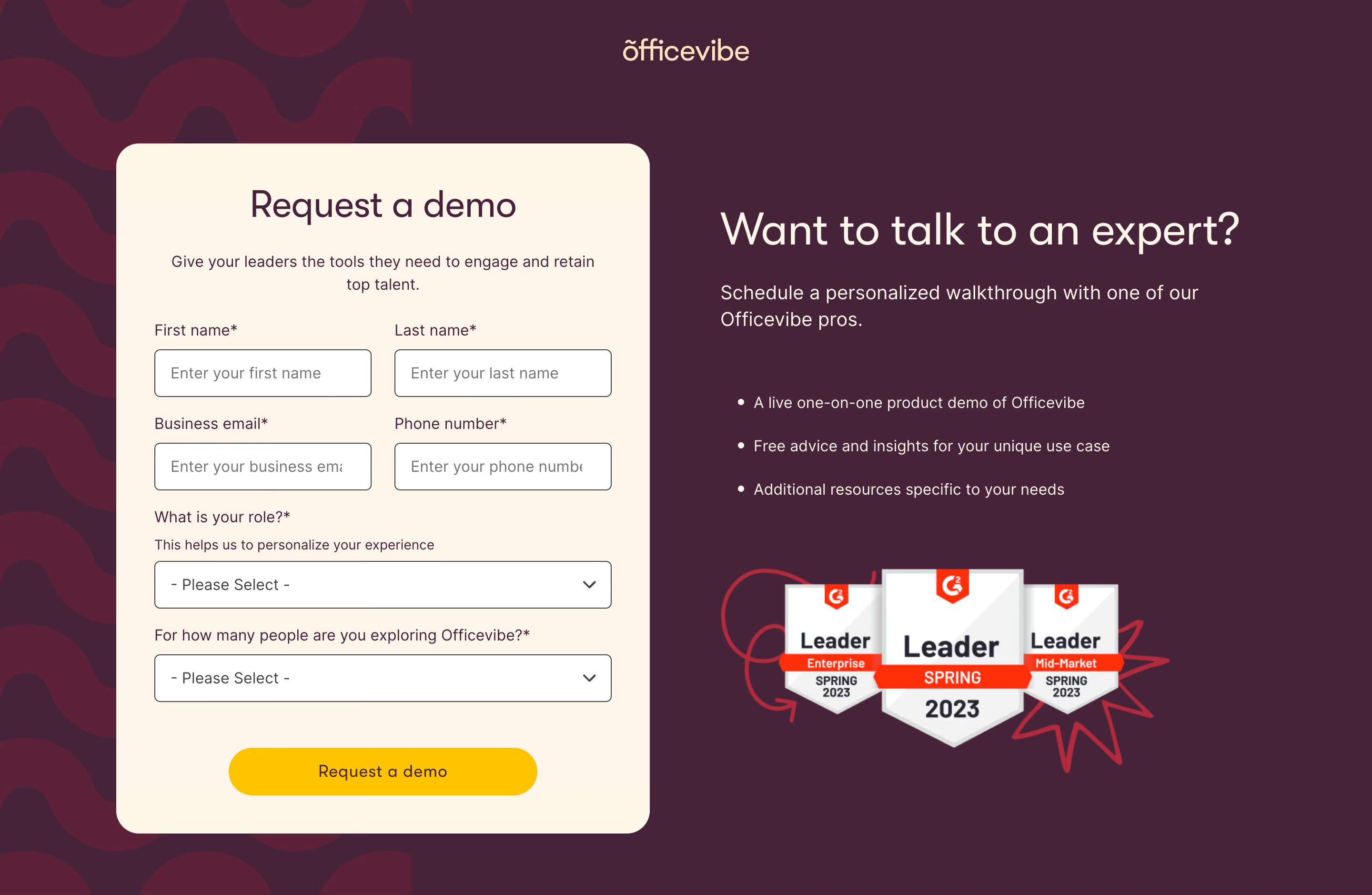
Officevibe’s demo page embraces a modern, friendly aesthetic that balances professional credibility with playful approachability. The design feels vibrant without overwhelming, using ample white space and understated backgrounds to highlight colorful illustrations and interactive elements. This welcoming vibe positions the SaaS solution as both trustworthy and people-centric—ideal for workplace engagement tools. Layout and Structure
The page unfolds in a well-defined, linear flow. A hero section introduces the product with a succinct headline, persuasive subtext, and a centrally placed CTA button. Below, content segments alternate between feature breakdowns, visual overviews, testimonial highlights, and a concise FAQ. Each block uses clear separation and generous padding, ensuring readers never feel visually crowded. Navigation is sticky and streamlined, anchoring experience even as users scroll. Visual Elements
Custom, expressive illustrations featuring abstract characters and workplace scenarios form the visual backbone. Subtle animations and hover effects enliven CTAs and icons, guiding interaction intuitively. Embedded video within the hero or feature section delivers quick product understanding without demanding extensive reading. Design accents—rounded shapes, asymmetric dividers, and large iconography—create visual interest and accessibility. Color Palette and Typography
A palette anchored in fresh greens, deep violets, and gentle grays creates contrast while maintaining harmony. Accent colors draw attention to buttons and highlights, directing user focus. Typography is modern and sans-serif, with a bold weight for headlines and refined body text. Well-defined hierarchy ensures easy scannability—headers pop while supportive copy feels crisp and readable. User Experience Patterns and Unique Touches
Persistent navigation, clear CTAs, and frictionless forms support seamless visitor journeys. Subtle microinteractions—like button ripples and content fades—offer delightful feedback. Unique design choices, such as playful staff avatars and the conversational demo request, reinforce a human-centered, energetic tone. Overall, Officevibe’s demo page masterfully blends clarity, engagement, and conversion focus—making it a standout SaaS inspiration.