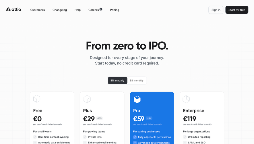
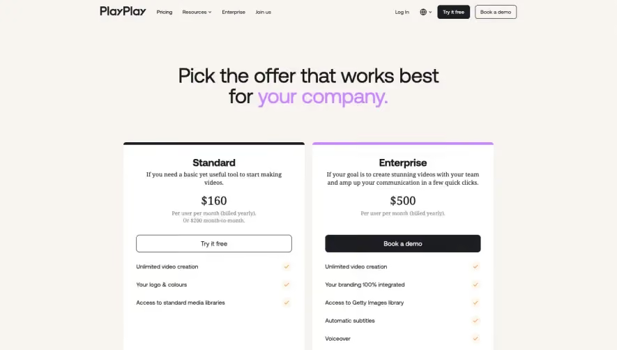
Generate a new design based on this screen using your own content.
Thank you! Your submission has been received!
Oops! Something went wrong while submitting the form.
# Design from Reference: Numbro Pricing Page
Create an original, high-fidelity visual design inspired by the reference. Prioritize composition, typography, colors, spacing, and component styling over technical implementation.
## Reference
- **Product:** Numbro
- **Category:** Pricing Page
- **Screenshot:** https://cdn.prod.website-files.com/5e9dc792e1210c5325f7ebbc/62f272cf12068ee72942d71b_1660054944113-f54b272b-2986-4ec2-b8d3-3ab9b3e2cec5-name%3DNumbroPricingPage.webp
Analyze the screenshot first. If inaccessible, request it rather than guessing.
## Content
{{content.instructions}}
{{content.data}}
Preserve essential messaging and factual accuracy. Adapt structure and copy length for visual balance; never invent product claims.
## Visual Design
Use this context to reproduce the reference's visual language: layout, typography, colors, spacing, borders, radii, and distinctive elements. The screenshot takes priority if descriptions conflict.
## Direction
{{preferences.fidelityInstructions}}
## Output
{{output.instructions}}
Deliver a polished, cohesive design with precise alignment, hierarchy, and spacing. Produce the requested visual artifact, not just a description. If unsupported, explain the limitation.
Numbro’s pricing page exudes a sleek, minimalist, and distinctly modern aesthetic. The visual approach balances a sense of professionalism with subtle vibrancy, giving the product a current and trustworthy edge. Whitespace is masterfully employed, highlighting core content and keeping the interface uncluttered. This minimalist strategy reinforces clarity and draws immediate attention to what matters most: pricing options and value.
Layout and Structure
The page structure is clean and intuitive, beginning with a straightforward header and navigation. The true hero section is the comparison grid featuring three primary pricing tiers, each presented in a tidy card layout. Essential features are crisply summarized, with toggle options for monthly or yearly billing. A compact FAQ, customer logos, and a utility-focused footer round out the journey, ensuring all user questions are immediately addressed.
Visual Elements
Illustrative icons punctuate the feature lists, providing quick, visual cues about core functionalities. Soft drop-shadows and subdued borders add depth without overwhelming. Subtle microinteractions—such as hover states on CTAs—create a tactile, interactive feel. The page abstains from busy animations, creating a calm, focused environment ideal for decision-making.
Color Palette and Typography
Numbro’s color scheme leans on cool blues anchored by white and gentle gray backgrounds, accented with energetic secondary hues for CTAs. Typography is crisply modern—likely a geometric sans-serif paired with bolder weights for headings, ensuring clear visual hierarchy and effortless scanability.
User Experience Patterns & Unique Design Choices
Navigation is sticky and persistent, with clear, high-contrast CTAs such as “Start Free Trial” inviting action. Billing toggles and comparison highlights make switching and assessing plans seamless. Standout design choices include the large, approachable plan icons that humanize each tier and the prominent “Free” option that lowers the barrier to entry. The overall tone feels confident yet approachable—conveying both innovation and reliability in one refined package.