
Thank you! Your submission has been received!
Oops! Something went wrong while submitting the form.
Get SaaSFrame Pro
Monthly
$18
Quarterly
$48
Yearly
$180
Upgrade to access this feature
Browse all screens & flows
Filter and search screens & flows
Access Figma files
Access mobile versions
Bookmark screens & flows
Join now
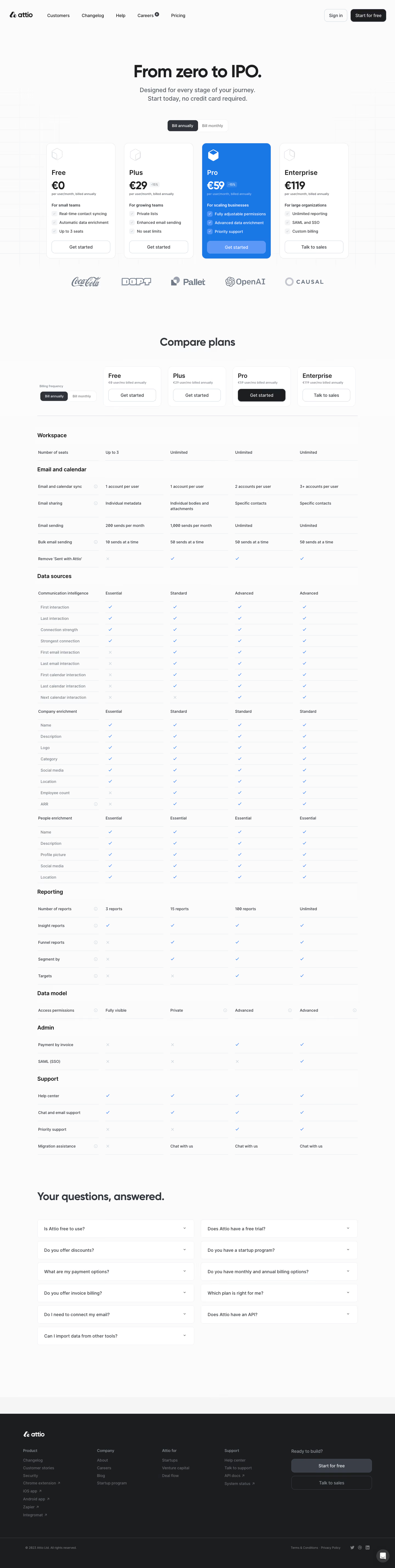

Attio Pricing Page

Attio
Customer relationship magic
Designed by
No items found.

Bookmark
Bookmark

Design with AI
Thank you! Your submission has been received!
Oops! Something went wrong while submitting the form.
# Design from Reference: Attio Pricing Page
Create an original, high-fidelity visual design inspired by the reference. Prioritize composition, typography, colors, spacing, and component styling over technical implementation.
## Reference
- **Product:** Attio
- **Category:** Pricing Page
- **Screenshot:** https://cdn.prod.website-files.com/5e9dc792e1210c5325f7ebbc/6acbb9fdd37e66e942ffbbfe_6acb70b22d777adaad1908f2_cms-ceccfb6c5ccbc0b79ee933a0.webp
Analyze the screenshot first. If inaccessible, request it rather than guessing.
## Content
{{content.instructions}}
{{content.data}}
Preserve essential messaging and factual accuracy. Adapt structure and copy length for visual balance; never invent product claims.
## Visual Design
### Overall aesthetic
- **Character:** A restrained pricing page uses an off-white canvas, softly rounded white cards and an extensive airy comparison matrix.
- **Accent strategy:** One saturated blue plan card creates a clear focal point; a dark charcoal footer provides the closing contrast. A faint technical grid decorates the hero background.
### Page composition
- **Capture:** The source measures 1440 × 5702 image pixels. Observed dimensions below approximate CSS only under an unverified 1× capture assumption.
- **Header:** A horizontal brand/navigation row places account actions at the far right.
- **Pricing hero:** A centered headline and two-line subtitle sit above a segmented billing selector and four equal plan cards. Five muted customer marks follow the cards.
- **Comparison:** A centered heading introduces a five-column matrix: feature labels plus four plan columns. Compact plan-summary cards and another billing selector precede the rows.
- **Feature groups:** Workspace, email/calendar, data sources, reporting, data model, admin and support sections organize the long table. Data-source subgroups contain indented detail rows.
- **FAQ and footer:** Eleven collapsed questions form two columns. A full-width charcoal footer contains four link groups and a right-hand two-action block, followed by legal/social details and a chat launcher.
### Information hierarchy
- **Opening promise:** A large centered headline leads into smaller muted explanatory copy.
- **Plan cards:** Cube-like icons, plan names, large prices, billing qualifiers, audience labels and three benefits create a repeatable scan pattern.
- **Featured plan:** The blue third card uses white content, distinguishing it from the surrounding neutral plans.
- **Detailed evaluation:** The comparison uses bold group headings, darker parent rows and lighter indented details, with blue checks and pale crosses.
- **FAQ:** A large left-aligned heading precedes individually bordered question boxes.
### Typography
- **Family:** A rounded-looking sans serif is used throughout; exact font identity is unverified.
- **Display:** The hero heading appears approximately 60 px, bold, with tight tracking. Major lower headings are around 40 px.
- **Plan roles:** Names are approximately 24 px and semibold; prices are around 38–40 px, bold. Billing qualifiers are notably smaller, around 11–12 px.
- **Body and matrix:** Benefits, table values, navigation and FAQ labels are approximately 14–16 px with 20–24 px leading.
- **Footer:** Small muted labels and links create a lower-emphasis information layer.
### Colors & surfaces
- **Measured foundation:** ICC-aware sRGB sampling yields #FBFBFB, #FCFCFC and #FFFFFF across the page and cards.
- **Measured accent:** Blue #1977E6 fills the featured plan and supports inclusion marks.
- **Measured boundaries:** Pale #E4E7EB and #ECEEF1 define card outlines and table rules.
- **Measured dark surface:** #1C1D1F anchors the footer and dark actions.
- **Contrast:** Neutral cards use dark text and muted gray qualifiers; the featured card reverses to white and pale blue text.
### Components
- **Billing selector:** A small two-segment rounded control uses a dark selected segment and a white unselected segment. Annual billing is visually selected.
- **Plan cards:** Four roughly 250 px wide observed cards have approximately 18 px padding, 16 px corners and thin borders. Actions align near the bottom.
- **Feature bullets:** Small rounded-square check containers precede three concise benefits on each card.
- **Comparison headers:** Four compact rounded plan-summary cards repeat names, qualifiers and actions above aligned columns.
- **Matrix rows:** Fine horizontal rules stop and restart between columns, leaving narrow gutters. Blue checks, pale crosses and occasional information icons supplement text values.
- **FAQ boxes:** Two columns of white rounded rectangles use fine gray borders, generous horizontal padding and small right-side chevrons.
- **Footer actions:** A filled gray Start for free button and outlined sales button stack beneath a short prompt. Small external-link arrows appear beside selected footer links.
- **Chat control:** A circular dark launcher with a white message icon sits at the bottom right.
### Visual rhythm
- **Opening space:** Large gaps separate the headline, billing control, plan cards and customer marks.
- **Comparison cadence:** Regular ruled rows keep a dense feature inventory orderly; larger heading gaps distinguish categories.
- **Column consistency:** Plan cards and comparison columns maintain a stable four-tier relationship, while the label column stays separate.
- **Closing break:** The FAQ's boxed two-column layout interrupts the table rhythm before the dark footer.
### Responsive
- **Evidence boundary:** Only the desktop page is shown; responsive behaviors are recommendations.
- **Plan layout:** Stack or horizontally browse plans while keeping names and actions visible.
- **Comparison access:** Use a scrollable matrix or accessible plan selector, preserving each value's feature and tier association.
- **FAQ and footer:** Collapse questions and footer groups to one column, with full-width actions where useful.
- **Long labels:** Allow feature and question text to wrap rather than reducing type size.
### Adaptation guidance
- **Pricing system:** Reuse concise plan summaries followed by a detailed grouped matrix and FAQs for users who need deeper comparison.
- **Featured-tier clarity:** Maintain one strong accent treatment and a consistent neutral style for the other tiers.
- **Data management:** Treat screenshot prices, discounts and limits as captured content rather than current commercial facts; populate implementations from maintained data.
- **Accessible comparison:** Use semantic table relationships and text equivalents for checks/crosses, with clear accordion focus/expanded states.
- **Scale validation:** Confirm the assumed 1× capture scale before assigning CSS dimensions and spacing tokens.
Use this context to reproduce the reference's visual language: layout, typography, colors, spacing, borders, radii, and distinctive elements. The screenshot takes priority if descriptions conflict.
## Direction
{{preferences.fidelityInstructions}}
## Output
{{output.instructions}}
Deliver a polished, cohesive design with precise alignment, hierarchy, and spacing. Produce the requested visual artifact, not just a description. If unsupported, explain the limitation.


Category
Patterns
No items found.
Tech Stack



Added on
March 5, 2023
Similar screens
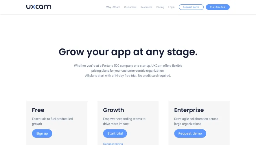


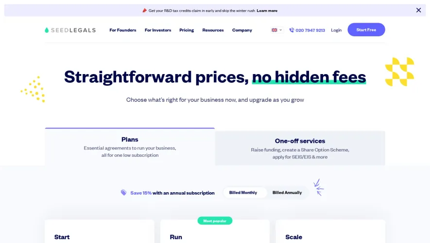

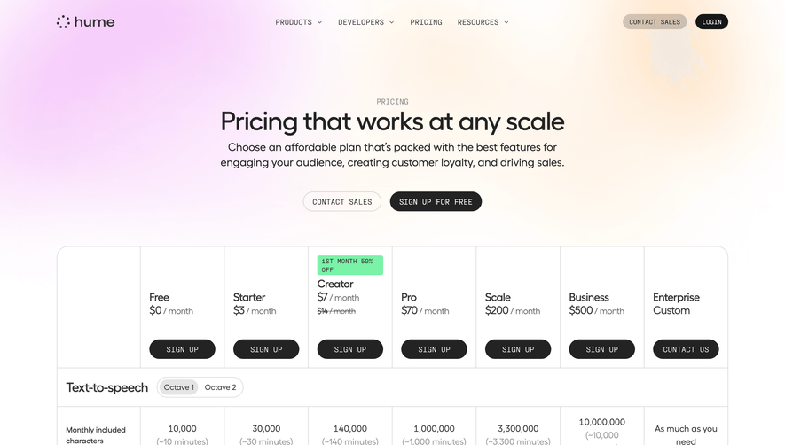

Upgrade to SaaSFrame Pro now to see similar examples.
Monthly
$18 /month
Billed $18 monthly
Browse all screens & flows
Filter and search screens & flows
Search text in screenshots
Access Figma files
Access mobile versions
Join now
Quarterly
$16 /month
Billed $48 quarterly
Browse all screens & flows
Filter and search screens & flows
Search text in screenshots
Access Figma files
Access mobile versions
Join now
Yearly
$15 /month
Billed $180 yearly
Browse all screens & flows
Filter and search screens & flows
Search text in screenshots
Access Figma files
Access mobile versions
Join now