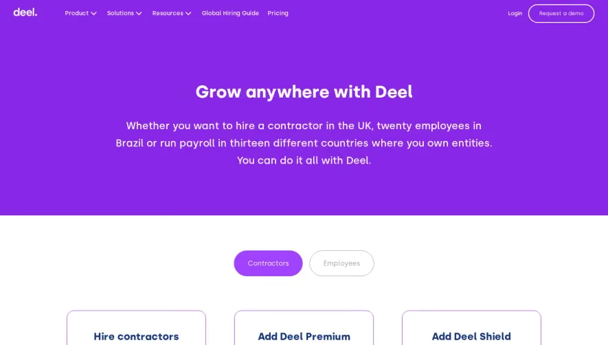
Generate a new design based on this screen using your own content.
Thank you! Your submission has been received!
Oops! Something went wrong while submitting the form.
# Design from Reference: Nord VPN Pricing Page
Create an original, high-fidelity visual design inspired by the reference. Prioritize composition, typography, colors, spacing, and component styling over technical implementation.
## Reference
- **Product:** Nord VPN
- **Category:** Pricing Page
- **Screenshot:** https://cdn.prod.website-files.com/5e9dc792e1210c5325f7ebbc/6acb6aefbf2e69a0c03b6ca0_6acb6a22b206c0d3f8f256dd_cms-cc4561e736927f297b9d6cd7.webp
Analyze the screenshot first. If inaccessible, request it rather than guessing.
## Content
{{content.instructions}}
{{content.data}}
Preserve essential messaging and factual accuracy. Adapt structure and copy length for visual balance; never invent product claims.
## Visual Design
Use this context to reproduce the reference's visual language: layout, typography, colors, spacing, borders, radii, and distinctive elements. The screenshot takes priority if descriptions conflict.
## Direction
{{preferences.fidelityInstructions}}
## Output
{{output.instructions}}
Deliver a polished, cohesive design with precise alignment, hierarchy, and spacing. Produce the requested visual artifact, not just a description. If unsupported, explain the limitation.
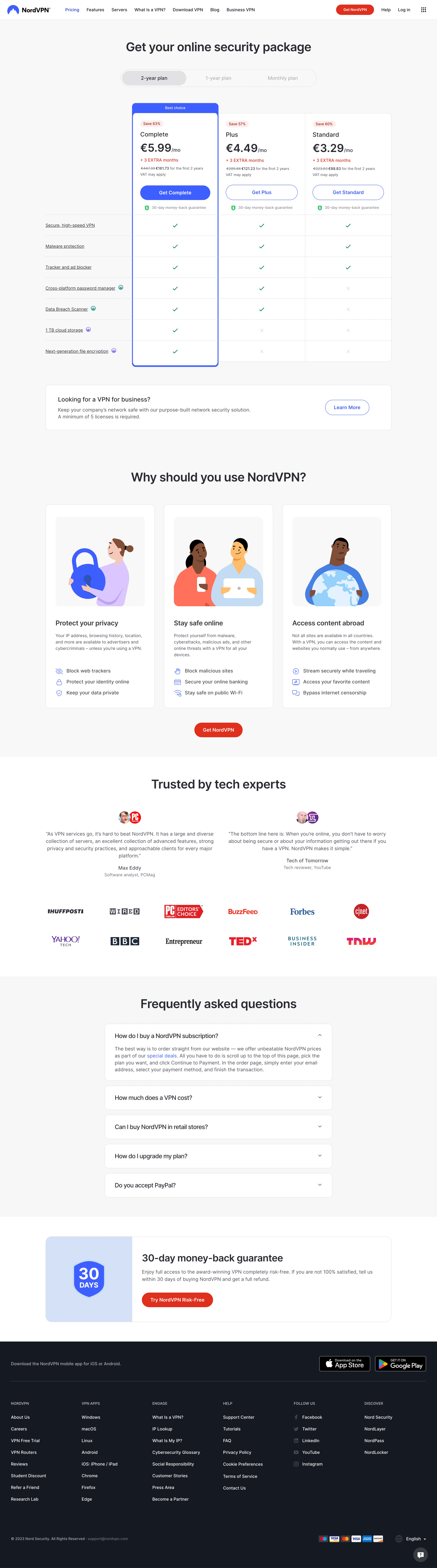
NordVPN's pricing page exudes a polished, modern professionalism with a distinctly minimalist touch. The interface is intentionally uncluttered, channeling focus toward the brand’s signature blue gradients and deep, contrasting backgrounds. This streamlined visual philosophy signals trust, security, and sophistication—essential qualities for cybersecurity SaaS.
Layout and Structure
The layout is vertically oriented and highly scannable, beginning with a high-impact hero banner that reinforces branding alongside the core value proposition. Pricing plans are front-and-center, presented in an accessible card format with concise plan details and plan toggles. Supporting sections highlight additional features and customer support trust signals, while a robust footer offers deep navigation without overwhelming users.
Visual Elements
Illustrations and soft gradients inject a sense of digital warmth, counterbalanced by crisp, vector-based icons that clarify each feature. Subtle micro-animations—such as the active tab indicator and hover effects on CTAs—add interactivity without distracting from content. Occasional team photography humanizes the brand and breaks up the page visually.
Color Palette and Typography
Dominated by rich blues and whites, the palette communicates reliability and safety. Accent greens and reds are used strategically for calls to action and limited-time offers, attracting the eye naturally. The font selection—a modern, geometric sans-serif—conveys clarity, with clear typographic hierarchy through bold headlines, distinct plan names, and easily readable body copy.
User Experience Patterns and Notable Choices
Navigation is effortlessly intuitive, with sticky headers and prominent CTAs that guide users toward action. Pricing selection is seamless, enhanced by toggles for plan duration and currencies. Subtle urgency cues (“Save 63%”) encourage conversion, while transparent feature lists build trust. The overall tone is reassuring yet energetic, reinforcing NordVPN’s reputation as a forward-thinking, user-first software provider.