Overall Style and Aesthetic
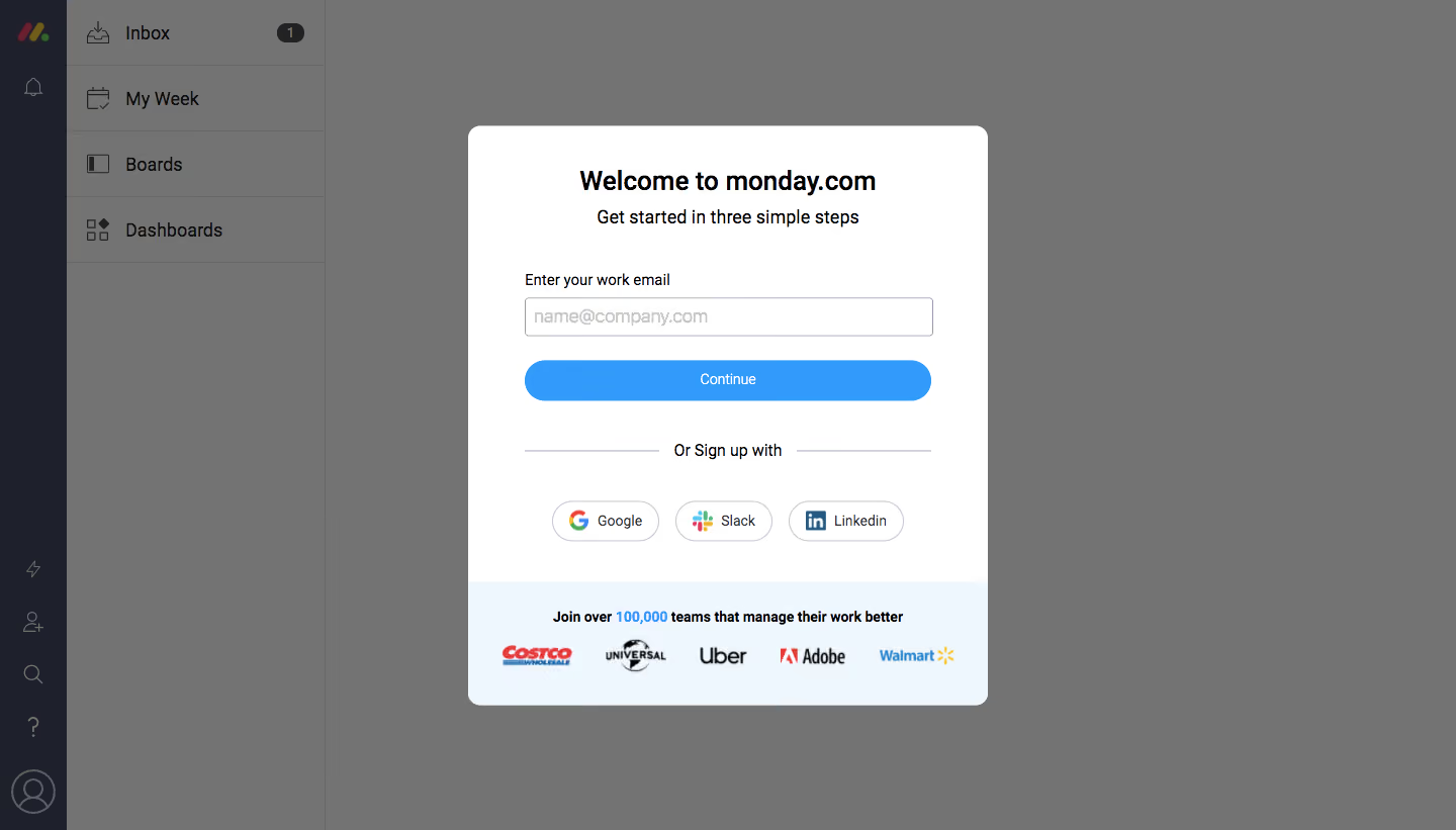
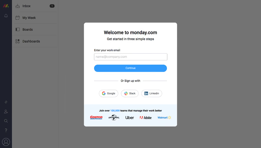
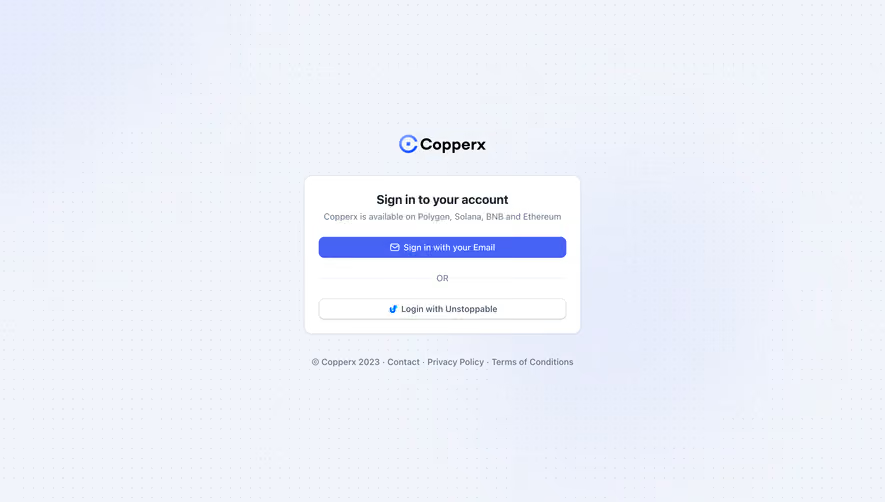
Monday.com’s signup page is a masterclass in minimalist, modern design, exuding clarity and professionalism while feeling approachable and energetic. The interface is intentionally uncluttered, with bold white space and thoughtfully placed brand colors—a balance that delivers both freshness and focus. Layout and Structure
The layout centers entirely on user flow: a dominant single-column form occupies the page, putting the user task front and center. There’s no hero image or distracting content; every element is tuned for rapid conversion. Peripheral navigation is removed, focusing attention solely on signup, while a subtle branding header grounds the page within the monday.com ecosystem. Visual Elements
Visual hierarchy is achieved with brand colors—vivid blues, greens, and yellows highlight key actions like the “Continue” button, fostering intuitive navigation. Discreet icons for email providers and password visibility enhance usability while reducing cognitive load. The absence of illustrative content or photography zeros in on interaction over distraction. Color Palette and Typography
Monday.com’s signature palette—crisp whites, deep navy, and vibrant accents—conveys both trust and dynamism. Fonts are clean, sans-serif (likely Inter or similar), with clear sizing and contrast that establish a well-defined hierarchy, ensuring essential actions and cues stand out instantly. User Experience Patterns
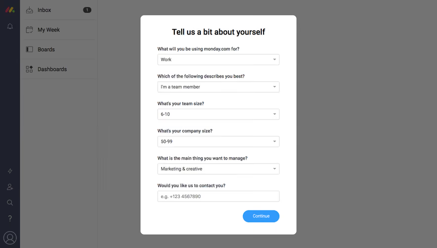
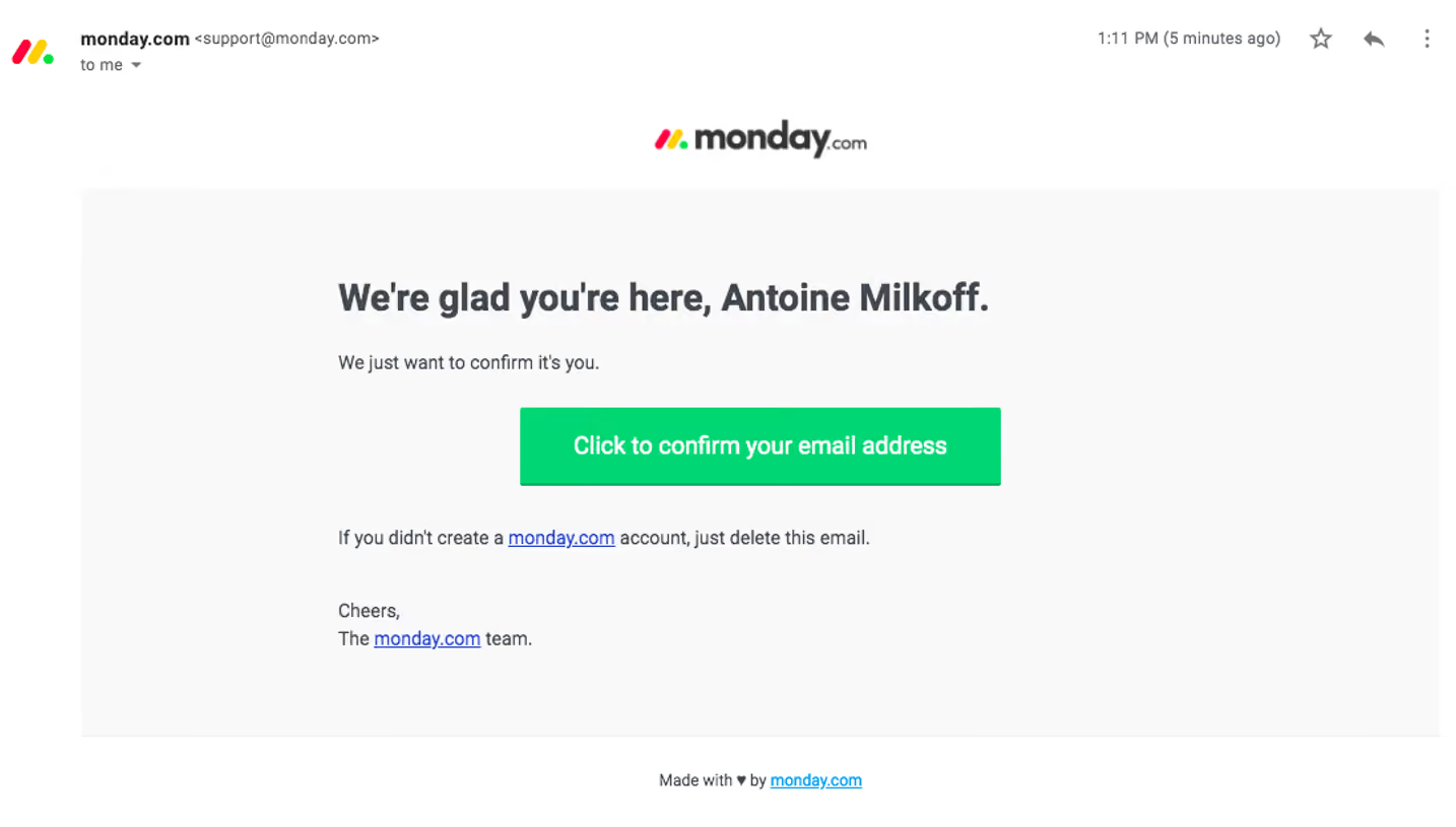
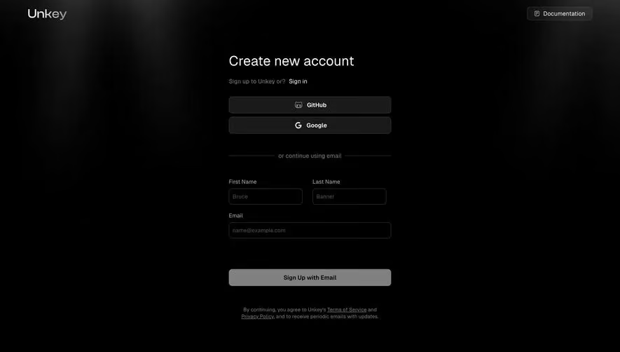
This signup page exemplifies frictionless UX: minimal fields, social sign-in options, responsive form feedback, and a sticky CTA. Microcopy reinforces clarity and security, while unobtrusive policy links support user confidence without overwhelming the flow. Unique or Notable Design Choices
The fearless embrace of whitespace, laser focus on a single CTAs, and delightful micro-interactions (like button color transitions and real-time input validation) embody a modern SaaS onboarding ethos—fast, friendly, and user-obsessed. The page’s tone radiates innovation and trust, setting a high bar for SaaS conversion pages.