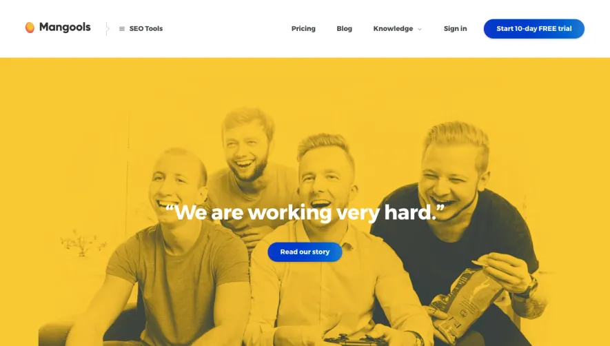
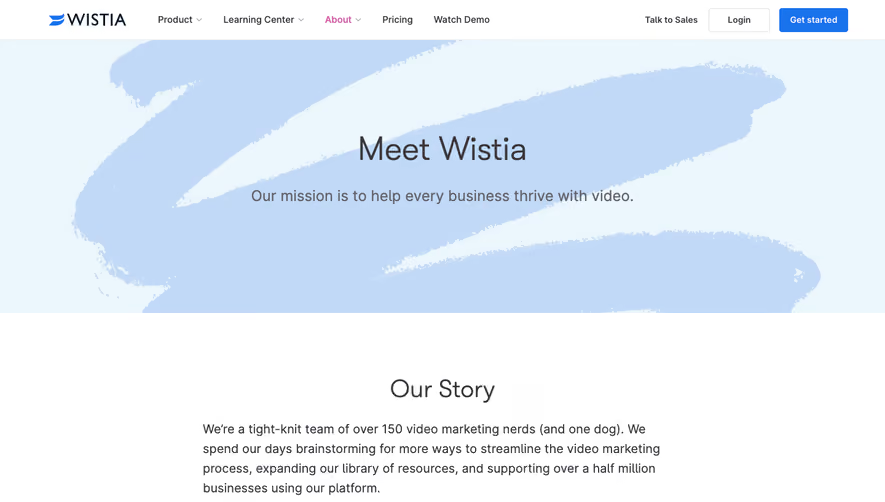
Generate a new design based on this screen using your own content.
Thank you! Your submission has been received!
Oops! Something went wrong while submitting the form.
# Design from Reference: Mapbox About Page
Create an original, high-fidelity visual design inspired by the reference. Prioritize composition, typography, colors, spacing, and component styling over technical implementation.
## Reference
- **Product:** Mapbox
- **Category:** About Page
- **Screenshot:** https://cdn.prod.website-files.com/5e9dc792e1210c5325f7ebbc/62ecbb5e51782c2480408289_1659680847815-screenshot-device-e2eb165ab88c6d42111204c798684dd1-1659680526635.webp
Analyze the screenshot first. If inaccessible, request it rather than guessing.
## Content
{{content.instructions}}
{{content.data}}
Preserve essential messaging and factual accuracy. Adapt structure and copy length for visual balance; never invent product claims.
## Visual Design
Use this context to reproduce the reference's visual language: layout, typography, colors, spacing, borders, radii, and distinctive elements. The screenshot takes priority if descriptions conflict.
## Direction
{{preferences.fidelityInstructions}}
## Output
{{output.instructions}}
Deliver a polished, cohesive design with precise alignment, hierarchy, and spacing. Produce the requested visual artifact, not just a description. If unsupported, explain the limitation.
Mapbox’s About/Company page embodies a sleek, modern aesthetic that feels both innovative and approachable. The look is minimalist yet vibrant, leveraging ample white space to keep the content digestible and the visuals impactful. Everything exudes professionalism, with subtle hints of energy and movement that align with Mapbox’s tech-forward identity.
Layout and Structure
The layout is cleanly segmented, opening with an engaging hero section featuring concise copy and bold visuals. As you scroll, sections unfold with company highlights, values, and leadership in a logical flow. Modular content blocks maintain a visual rhythm, and there are no cluttered points—each section is well-spaced and directed toward an intuitive narrative about Mapbox’s mission and team.
Visual Elements
Dynamic animations—like gentle transitions and animated stats—guide the eye. Hero imagery incorporates high-quality photography layered with branded graphic elements, conveying both human warmth and technical prowess. Custom icons and subtle map motifs reinforce brand identity while staying non-intrusive.
Color Palette and Typography
The page leverages a restrained palette of deep blues, teals, and soft grays, offset by bursts of vibrant accent colors. Bold headings use sans-serif fonts with excellent legibility, while body text is lighter but still crisp, establishing a clear visual hierarchy.
User Experience Patterns
Sticky, minimal navigation ensures users can always access other pages without distraction. Calls to action (CTAs) are prominent yet tasteful, and subtle hover effects offer points of interactivity. Smooth scroll transitions and logical content progression enhance engagement without overwhelming the viewer.
Unique or Notable Design Choices
What truly distinguishes this page is its balance between energetic animation and calm professionalism. The seamless integration of mapping visuals with cultural storytelling and the strategic use of whitespace make the whole experience inviting and memorable, positioning Mapbox as both trustworthy and innovative.