Design with AI
Generate a new design based on this screen using your own content.
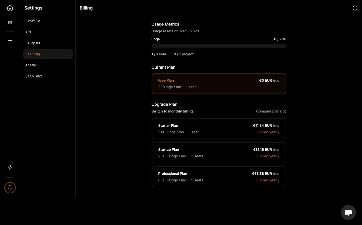
# Design from Reference: Logsnag Billing settings
Create an original, high-fidelity visual design inspired by the reference. Prioritize composition, typography, colors, spacing, and component styling over technical implementation.
## Reference
- **Product:** Logsnag
- **Category:** Settings
- **Screenshot:** https://cdn.prod.website-files.com/5e9dc792e1210c5325f7ebbc/6acbbe43476aea3982e3fbae_6acbbd76aa23dc1cf5a8e512_cms-d11bb54ec3df47c004101eec.webp
Analyze the screenshot first. If inaccessible, request it rather than guessing.
## Content
{{content.instructions}}
{{content.data}}
Preserve essential messaging and factual accuracy. Adapt structure and copy length for visual balance; never invent product claims.
## Visual Design
### Overall aesthetic
- **Character:** A near-black billing screen uses sparse white text, orange selection accents and thin dark outlines.
- **Tone:** Compact plan rows and minimal decoration make the page feel technical and utilitarian.
### Page composition
- **Capture:** The source is 1440 × 898 pixels. Dimensions approximate image pixels; CSS scale is unverified.
- **Shell:** A narrow icon rail sits beside a roughly 220-pixel Settings column.
- **Main:** A top Billing title/refresh row precedes a centered approximately 535-pixel-wide stack.
- **Content:** Usage metrics, current free plan and three upgrade-plan rows form distinct groups.
- **Support:** A circular chat control sits at bottom right.
### Information hierarchy
- **Usage:** Reset note, log count and thin progress bar precede seat/project counts.
- **Current plan:** Orange label and border distinguish the active free tier.
- **Upgrade:** Three equal rows show plan names/limits left and prices/billing cadence right.
- **Utilities:** Monthly-billing switch text and compare-plans link sit above options.
### Typography
- **Families:** Main content uses sans serif; settings navigation has a monospaced appearance. Exact identities are unverified.
- **Headings:** Approximately 16–18 pixels and semibold.
- **Plan roles:** Names/prices around 14 pixels, stronger than gray limit/cadence text.
- **Helpers:** Small usage and reset text remains compact.
### Colors & surfaces
- **Measured canvas:** Black #000000 dominates.
- **Measured current-plan surface:** Very dark brown #0D0601 supports active-tier emphasis.
- **Measured boundaries:** #171717, #1F1F1F and #2A2A2A distinguish tracks, outlines and controls.
- **Measured warm detail:** #40200E contributes orange-brown border tones; brighter orange text marks selection and yearly billing.
### Components
- **Usage bar:** A thin dark rounded track spans the content width with count aligned right.
- **Plan rows:** Approximately 535 × 82 pixels with rounded corners and dark outlines.
- **Current row:** Brown-tinted fill and orange-brown border distinguish the free tier.
- **Sidebar state:** Billing sits in a dark rounded selection row with orange text.
- **Refresh:** A simple circular-arrow icon aligns at the far right of the top bar.
### Visual rhythm
- **Grouping:** Broad gaps separate usage, current plan and upgrade options.
- **Row cadence:** Upgrade rows repeat with roughly 14-pixel gaps.
- **Alignment:** Left labels and right prices remain consistent across every plan.
### Responsive
- **Observed state:** Only desktop is supplied; compact behavior is unverified.
- **Recommended shell:** Collapse navigation and make the central stack fluid.
- **Recommended rows:** Allow price/cadence to wrap below plan details rather than overlap.
### Adaptation guidance
- **Preserve restraint:** Keep black surfaces, thin outlines and selective orange emphasis.
- **State fidelity:** Match the current free tier without inferring purchase or billing changes.
- **Content scope:** Treat prices and limits as captured values.
- **Accessibility:** Maintain readable contrast and label progress/plan-selection controls.
Use this context to reproduce the reference's visual language: layout, typography, colors, spacing, borders, radii, and distinctive elements. The screenshot takes priority if descriptions conflict.
## Direction
{{preferences.fidelityInstructions}}
## Output
{{output.instructions}}
Deliver a polished, cohesive design with precise alignment, hierarchy, and spacing. Produce the requested visual artifact, not just a description. If unsupported, explain the limitation.