Generate a new design based on this screen using your own content.
Thank you! Your submission has been received!
Oops! Something went wrong while submitting the form.
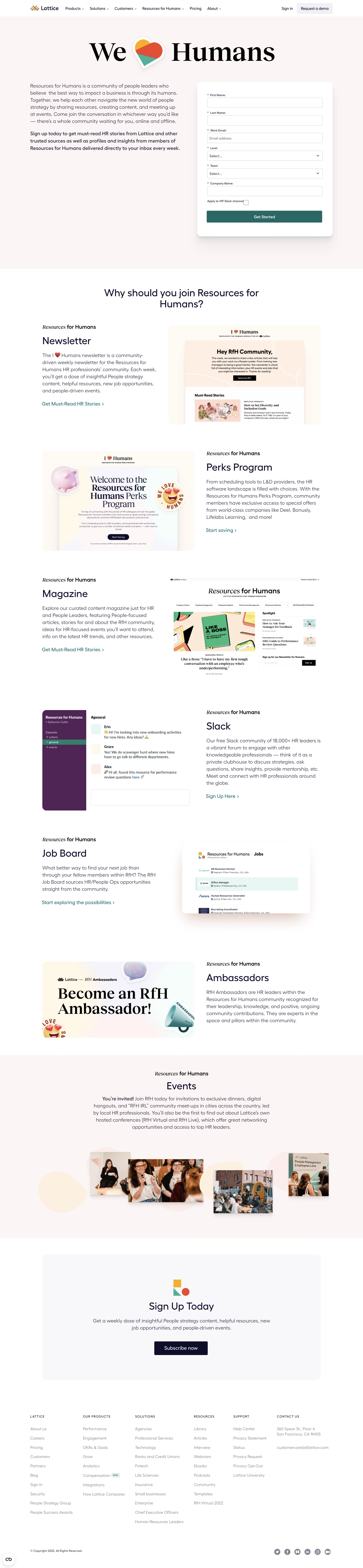
# Design from Reference: Lattice Newsletter Page
Create an original, high-fidelity visual design inspired by the reference. Prioritize composition, typography, colors, spacing, and component styling over technical implementation.
## Reference
- **Product:** Lattice
- **Category:** Newsletter Page
- **Screenshot:** https://cdn.prod.website-files.com/5e9dc792e1210c5325f7ebbc/6acb6c135391d62536b671c4_6acb6a9c112c5e6c5b4adf23_cms-755ec8eb8ee725fbb0836c1c.webp
Analyze the screenshot first. If inaccessible, request it rather than guessing.
## Content
{{content.instructions}}
{{content.data}}
Preserve essential messaging and factual accuracy. Adapt structure and copy length for visual balance; never invent product claims.
## Visual Design
Use this context to reproduce the reference's visual language: layout, typography, colors, spacing, borders, radii, and distinctive elements. The screenshot takes priority if descriptions conflict.
## Direction
{{preferences.fidelityInstructions}}
## Output
{{output.instructions}}
Deliver a polished, cohesive design with precise alignment, hierarchy, and spacing. Produce the requested visual artifact, not just a description. If unsupported, explain the limitation.
Lattice’s “Humans of Lattice” page embodies a polished, contemporary feel that feels both warm and inviting—striking a balance between professional and playful. Leveraging minimalist design choices with ample white space, the site manages to feel dynamic and approachable without sacrificing clarity or trustworthiness.
Layout and Structure
The page follows a clean, linear structure. The hero section immediately spotlights diverse employee photography, grounding the SaaS product in authentic human stories. This leads into featured employee profiles organized in a grid, each profile card quickly drawing users in. Testimonial quotes are interspersed, and a strong closing section features a call-to-action, with a concise, highly scannable footer.
Visual Elements
Vibrant, candid photography of real people brings energy and humanity to the experience, while simple geometric patterns and subtle iconography add brand character. No cluttered stock images—each visual is purposefully selected to reinforce authenticity. Smooth hover states and gentle motion effects enliven interactions, guiding the user’s attention organically.
Color Palette and Typography
A sophisticated palette—anchored by crisp whites, soft grays, and the brand’s signature yellow and blue accents—keeps the page fresh and engaging. Typography is modern, using clean sans-serifs for body and headings, with thoughtful weight and size contrast ensuring effortless hierarchy and legibility.
User Experience and Unique Choices
Clear top navigation streamlines discovery, while primary CTAs are visually prominent but never aggressive. Scroll-triggered animations subtly reinforce user progress. The choice to foreground real employee stories—rather than product features—creates a relatable, people-first impression that’s both memorable and on-brand. The overall tone is progressive and inclusive, radiating credibility and warmth.