Overall Style and Aesthetic
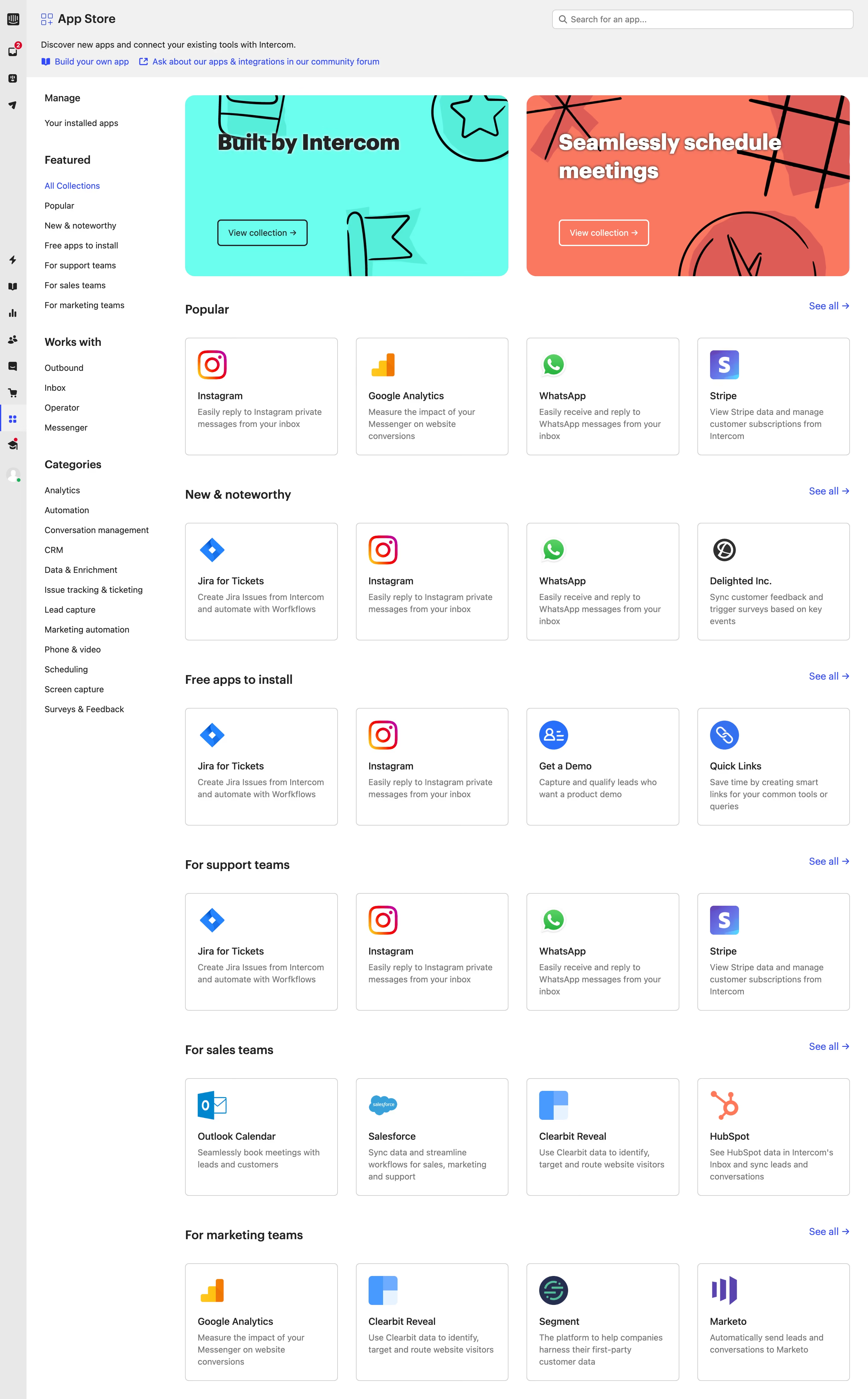
Intercom’s App Store page exemplifies a refined, modern SaaS aesthetic. The design eschews clutter for a clean, spacious environment, prioritizing readability and focus. White backgrounds paired with generous padding convey a sense of openness, while subtle shadows and card elements add tactile depth without visual noise. The overall feel is professional yet approachable—balancing utility with a touch of friendly vibrance. Layout and Structure
The layout is intentionally simple but effective. A prominent search bar and category filters anchor the header, instantly guiding users to discovery. The central area displays app tiles in a clean, grid-based arrangement—each app given ample whitespace to stand apart. There's no lengthy hero section or testimonials, placing user needs and tasks front and center. Navigation remains sticky and persistent, ensuring effortless exploration. Visual Elements
Intercom leverages crisp, universally recognizable icons for each app, often featuring brand colors or logos to enhance findability. Animations are restrained but purposeful, like hover states that highlight elements and gently scale cards for interactivity. Small accent illustrations in category filter bars inject visual interest without detracting from core content. Color Palette and Typography
A bright, neutral foundation is accented by Intercom’s signature blue and soft, friendly gradients. Key calls-to-action and interactive elements stand out in vibrant blue, guiding users intuitively. Typography is modern and sans-serif, with a clear hierarchy: bold headers, legible body copy, and unobtrusive labels create logical visual flow. User Experience Patterns
UX is centered on speed and intuitiveness. Filtering and searching are instant, with results updating dynamically. Every app card doubles as a direct portal to more info or installation, ensuring low-friction tasks. Navigation is ever-present but unobtrusive, while sticky CTAs encourage engagement. Unique and Notable Choices
What stands out is Intercom’s purposeful restraint—abundant white space, focused content, and a utilitarian grid that spotlights third-party apps over marketing. This non-distracting approach not only streamlines user journeys but also reflects Intercom’s confidence as a platform and partner ecosystem. Tone and Feel
The site breathes trust and clarity, using warmth and hints of playfulness to support engagement. It invites exploration without overwhelm, embodying innovation and ease—a stellar model for SaaS designers seeking a harmonious, user-first platform showcase.