Generate a new design based on this screen using your own content.
Thank you! Your submission has been received!
Oops! Something went wrong while submitting the form.
# Design from Reference: Hiver Thank You Page
Create an original, high-fidelity visual design inspired by the reference. Prioritize composition, typography, colors, spacing, and component styling over technical implementation.
## Reference
- **Product:** Hiver
- **Category:** Thank You Page
- **Screenshot:** https://cdn.prod.website-files.com/5e9dc792e1210c5325f7ebbc/6acad848b3daa04f542762e8_6acad7cb1d50254551a1d817_cms-35c0daf66527b7fa2f246e9a.webp
Analyze the screenshot first. If inaccessible, request it rather than guessing.
## Content
{{content.instructions}}
{{content.data}}
Preserve essential messaging and factual accuracy. Adapt structure and copy length for visual balance; never invent product claims.
## Visual Design
Use this context to reproduce the reference's visual language: layout, typography, colors, spacing, borders, radii, and distinctive elements. The screenshot takes priority if descriptions conflict.
## Direction
{{preferences.fidelityInstructions}}
## Output
{{output.instructions}}
Deliver a polished, cohesive design with precise alignment, hierarchy, and spacing. Produce the requested visual artifact, not just a description. If unsupported, explain the limitation.
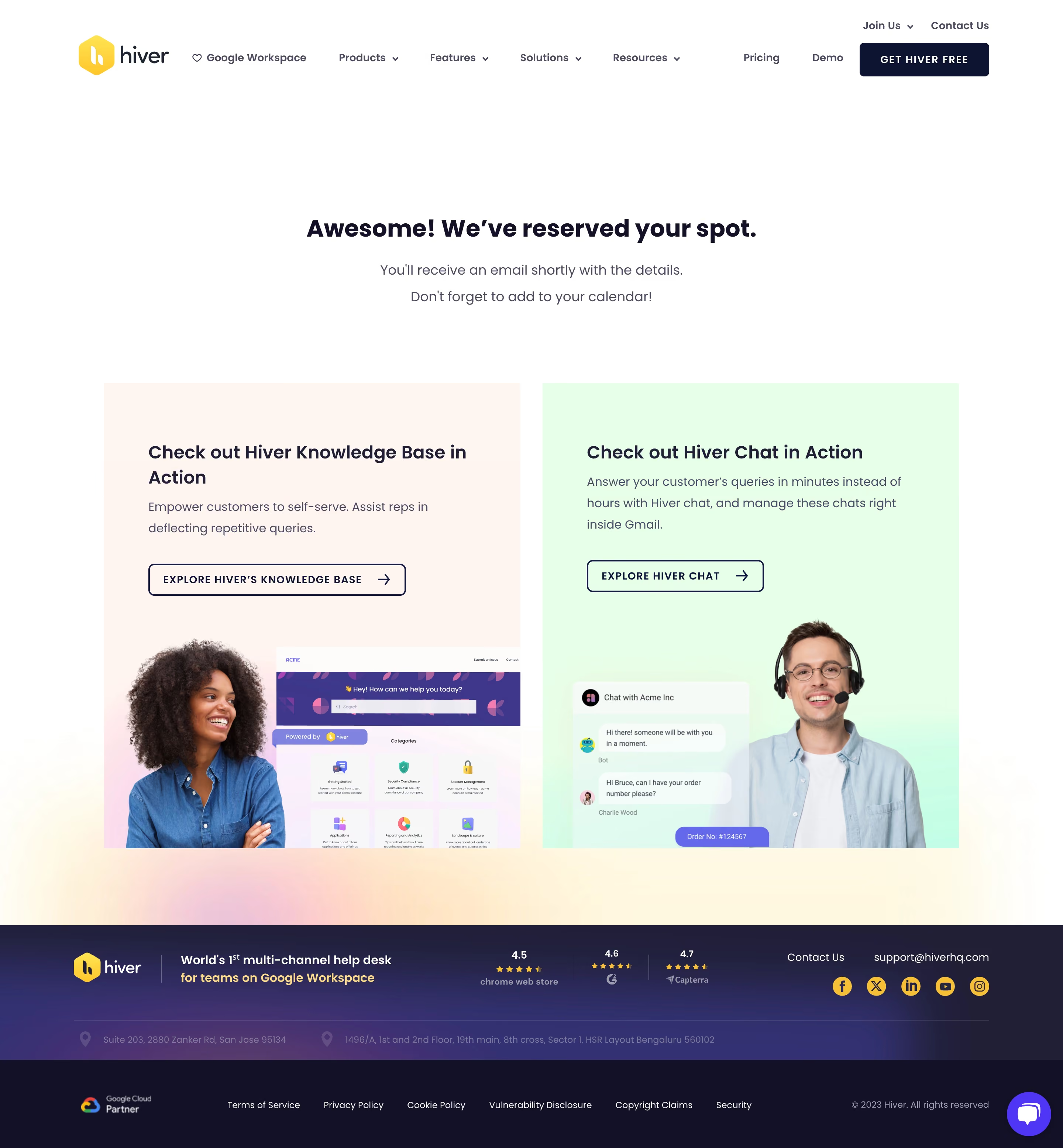
Hiver’s event thank-you page embraces a modern, minimalist aesthetic. The design is clean, uncluttered, and professional, punctuated by generous white space which lets content breathe. The visual tone projects warmth and authenticity, fitting for a SaaS brand invested in building trust and relationships.
Layout and Structure
The structure is classic and focused: a prominent hero section takes center stage, instantly confirming event registration with a welcoming message and featuring event branding. Below, supporting content is succinct—no distracting elements, just clear gratitude and essential event information. The absence of extraneous sections (like testimonials or pricing) keeps attention on the event experience.
Visual Elements
Brand illustrations, subtle icons, and event-specific graphics add personality without overwhelming. There are no heavy animations or videos, which supports fast load times and clarity. A tasteful use of event logos and branded visuals enhances memorability.
Color Palette and Typography
A vibrant yet restrained palette—anchored by Hiver’s signature yellow paired with deep, calming blues—creates a sense of energy and trust. Typography is clean, with bold headlines providing strong hierarchy, while friendly sans-serif body text ensures readability. Calls to action and links are emphasized with consistent accent colors.
User Experience Patterns
Navigation is intuitive, with clear calls-to-action (such as calendar links or event details) and a concise confirmation message. Forms are minimal, reducing friction for the user. Quick-scroll behavior and above-the-fold messaging make important info immediately accessible.
Unique or Notable Design Choices
The page distinguishes itself with branded event artwork and a positive tone, amplifying excitement while projecting reliability. The welcoming message and succinct content focus leave a lasting impression, guiding users efficiently while celebrating their engagement. For anyone designing SaaS event or confirmation pages, Hiver’s approach is an example of how minimalism and clarity can serve both user experience and brand identity.