Overall Style and Aesthetic
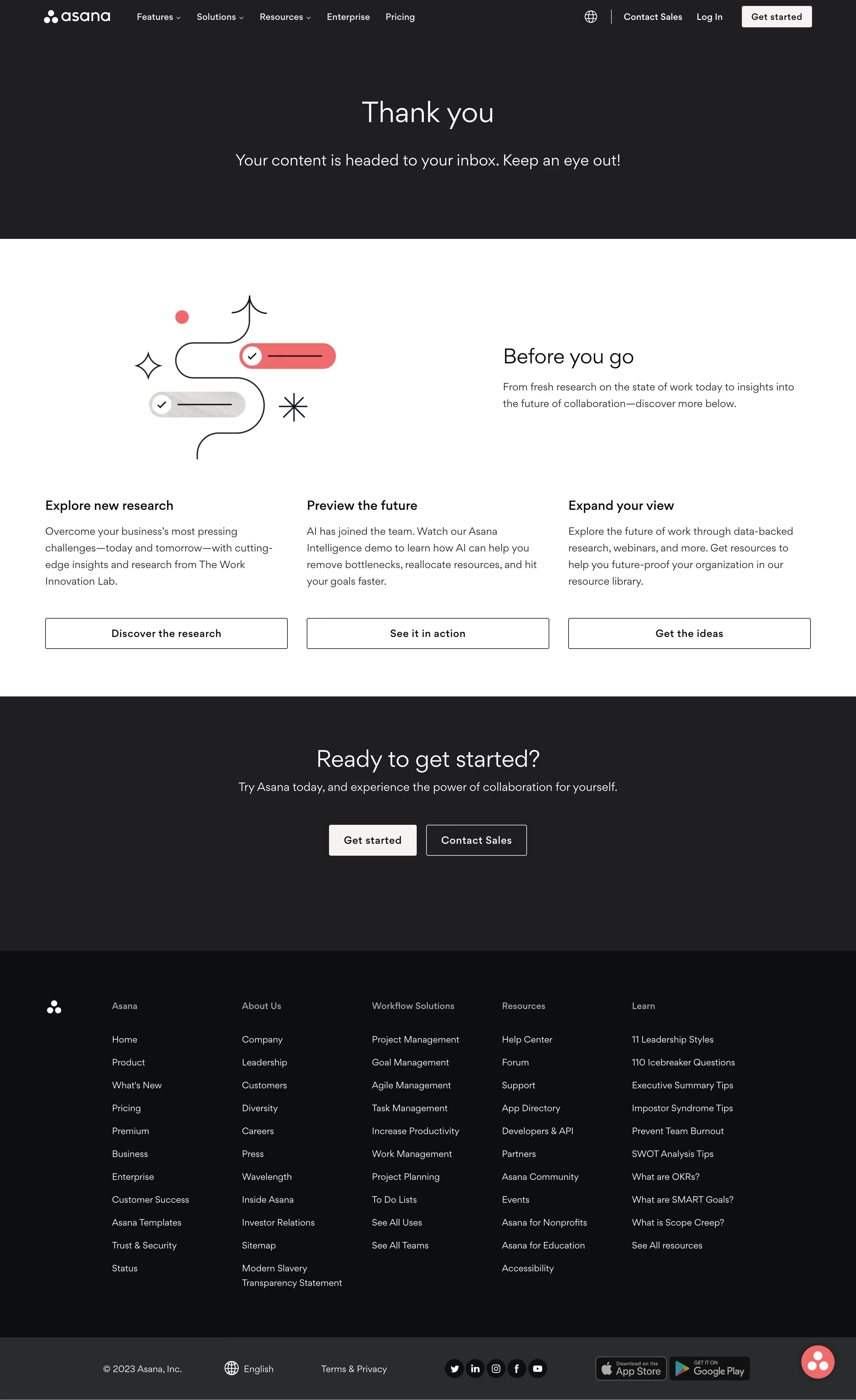
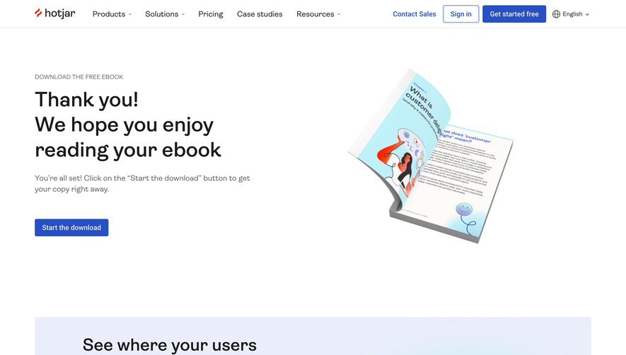
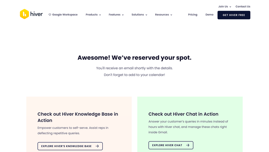
Asana’s thank-you page embraces a clean, modern minimalism with a professional yet friendly vibe. Generous whitespace, well-balanced alignment, and soft drop shadows contribute to a feeling of calm and trustworthiness—an aesthetic hallmark for SaaS brands aiming to put users at ease. Layout and Structure
The structure is focused and purposeful. A central hero section thanks the user with a cheerful illustration and clear headline, while supportive messaging and a single, bold call-to-action direct visitors to their next step. There’s no visual clutter: navigation is minimal, placing all attention on the core message and CTA. The page concludes with a concise, accessible footer reinforcing Asana’s brand without distraction. Visual Elements
Custom illustrations, gently animated in Asana’s signature style, infuse personality and warmth. Rounded shapes and soft color gradients reflect a sophisticated yet approachable look. The absence of stock photography keeps the focus on illustration, reinforcing a cohesive, branded experience. Color Palette and Typography
Brand colors—lavender, mint, periwinkle, and coral—are used thoughtfully for highlights and CTA buttons, creating visual interest without overwhelming the senses. Clean sans-serif fonts, varied in size and weight, clearly establish hierarchy. The use of bold headings with approachable, legible body text guides the user intuitively. User Experience Patterns
Streamlined navigation and a prominent CTA simplify the user journey. Scroll is intentionally minimized, focusing user attention and reducing friction. Unique or Notable Design Choices
The distinctive use of custom motion and illustrations, paired with friendly tone and gentle transitions, sets the page apart. It feels supportive, celebrating the user’s action—a reminder that SaaS UX can be both delightful and reassuring.