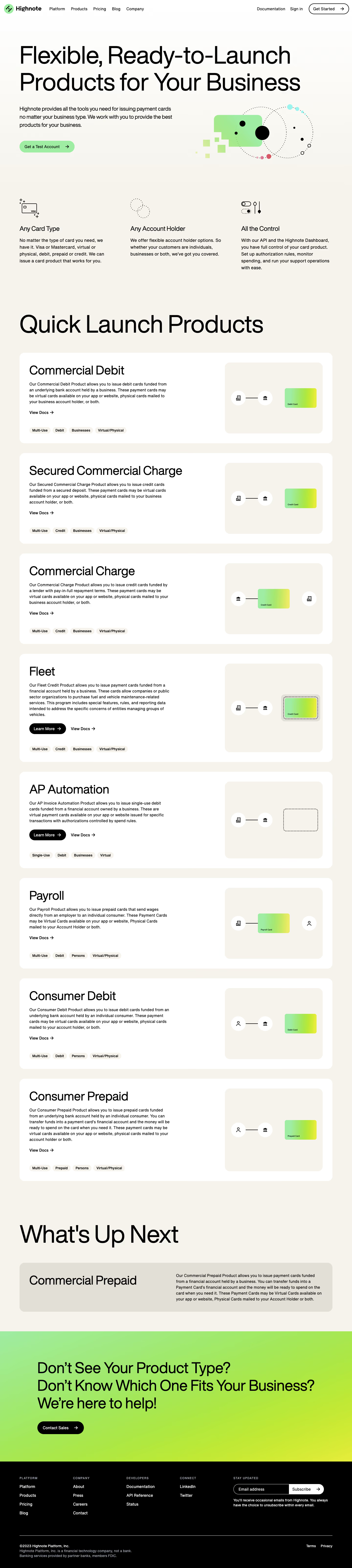


1. Header: The page begins with a header containing the logo of HighNote, the company name, and a navigation menu comprising of the ‘Products,’ ‘Solutions,’ ‘Pricing,’ ‘Blog,’ and ‘Request a Demo’ tabs. 2. Hero Image: Beneath the header, the page displays an engaging hero image advertising the HighNote product. 3. Product Features: The first section of the page after the hero image highlights the main features of HighNote's products. The features include real-time feedback capturing, 1:1 coaching capabilities, recording and playback capability, etc. 4. Product Catalog: Next, an overview of the HighNote products catalog is presented in three categories, namely ‘Sales,’ ‘Customer Success,’ and ‘Product.’ Each category has a brief description of the type of products available and a button to ‘Learn More’. 5. Sales: The ‘Sales’ category contains four products, including Sales Feedback, Call Coaching, Deal Reviews, and Role Plays. 6. Customer Success: The ‘Customer Success’ category highlights four products, including Customer Feedback, Success Coaching, Churn Risk, and Renewal Coaching. 7. Product: The ‘Product’ category presents four products, including Product Feedback, Product Coaching, User Testing, and User Onboarding. 8. Pricing Plan: After the product overview is a guide to highnote's pricing plans. HighNote offers three pricing plans, The Essential Plan, The Professional Plan, and The Enterprise Plan. Each plan highlights the different features it includes and its respective price. 9. Testimonies: The ‘Testimonies’ section showcases the feedback customers have given about the HighNote product. These impressions show a consensus that the product is user-friendly and has transformed their business outcome positively. 10. Call to Action: Following the testimonies is a ‘Request a Demo’ section, encouraging visitors to try out the HighNote product. The page concludes with a footer containing links to the company's terms and conditions, privacy policy, and the HighNote logo.

Thank you! Your submission has been received!
Oops! Something went wrong while submitting the form.
Get SaaSFrame Pro
Monthly
$18
Quarterly
$48
Yearly
$180
Upgrade to access this feature
Browse all screens & flows
Filter and search screens & flows
Access Figma files
Access mobile versions
Bookmark screens & flows
Join now
Highnote Features Page

Highnote
Modern card issuer processor
Designed by
No items found.

Bookmark
Bookmark
Design with AI
Thank you! Your submission has been received!
Oops! Something went wrong while submitting the form.
# Design from Reference: Highnote Features Page
Create an original, high-fidelity visual design inspired by the reference. Prioritize composition, typography, colors, spacing, and component styling over technical implementation.
## Reference
- **Product:** Highnote
- **Category:** Features Page
- **Screenshot:** https://cdn.prod.website-files.com/5e9dc792e1210c5325f7ebbc/6acbbda2d6be908889c4e613_6acbbccd857cbd7f46b5cd13_cms-fc7dddbb72d8c1f9adcf5026.webp
Analyze the screenshot first. If inaccessible, request it rather than guessing.
## Content
{{content.instructions}}
{{content.data}}
Preserve essential messaging and factual accuracy. Adapt structure and copy length for visual balance; never invent product claims.
## Visual Design
### Overall aesthetic
- **Character:** A spacious product catalogue combines oversized black typography, warm ivory backgrounds, soft white cards and playful geometric payment illustrations.
- **Brand expression:** Green-to-yellow gradients, dotted orbital shapes and simple line icons bring energy to an otherwise restrained editorial layout. The black footer creates a strong closing contrast.
### Page composition
- **Capture scale:** The source is 1440 × 6406 image pixels. Dimensions below are observed pixels; using them as CSS values assumes a 1× capture scale, which is unverified.
- **Header:** A slim full-width navigation places the logo at the left, five navigation links beside it, and documentation, sign-in and an outlined Get Started pill at the right.
- **Hero:** A large two-line headline spans most of a roughly 1280 px content width, inset approximately 80 px. Below it, a short text/action block sits left of an abstract illustration.
- **Benefit row:** Three evenly spaced columns present line icons, short headings and compact descriptions before the catalogue heading.
- **Catalogue:** Eight stacked white product cards cover commercial debit, secured commercial charge, commercial charge, fleet, AP automation, payroll, consumer debit and consumer prepaid. Each pairs a wider text column with a right-hand diagram panel.
- **Closing regions:** A large upcoming-products heading precedes a muted horizontal commercial-prepaid panel. A full-width gradient sales section leads into a black multi-column footer and legal row.
### Information hierarchy
- **Display headings:** Very large, regular-weight headings distinguish the hero and major catalogue sections. Product names are substantially smaller but remain dominant inside each card.
- **Card scan order:** Product title, description, documentation/action links and classification chips form the left-column sequence; the diagram provides a parallel visual explanation.
- **Action priority:** The hero uses a green test-account pill. Selected catalogue cards add black Learn More pills alongside plain documentation links; the final sales section uses a black contact button.
- **Footer hierarchy:** Small uppercase gray category labels sit above white navigation links. A subscription form occupies the wider rightmost area.
### Typography
- **Family:** The interface uses a neutral sans serif with tight display spacing; exact font identity is unverified.
- **Display scale:** Hero and major section headings appear approximately 96–104 px in the source, regular weight, with close line spacing and slightly negative tracking.
- **Product headings:** Card titles are approximately 48 px with 54–58 px line height. Benefit headings are approximately 26 px.
- **Body roles:** Hero supporting copy is approximately 22 px with 32 px line height; card descriptions and navigation are around 16 px with 24 px line height.
- **Small labels:** Classification chips and footer labels are around 13–14 px. Chips use heavier text; footer categories use uppercase letters and wider tracking.
### Colors & surfaces
- **Measured neutrals:** ICC-aware sRGB sampling yields warm ivory #F5F3EB, white #FFFFFF and black #000000 as dominant surfaces and text colors.
- **Upcoming panel:** Measured #E2DFD6 forms the muted commercial-prepaid panel and supports a quieter visual priority than the white live-product cards.
- **Accent treatment:** Mint green transitions toward bright lime/yellow in card illustrations and the closing sales band. The hero graphic adds small cyan and pink dots.
- **Surface separation:** Catalogue cards and diagram panels rely on contrasting fills and rounded corners rather than visible shadows or heavy borders.
### Components
- **Navigation pills:** Get Started is a white outlined pill with a right arrow; the hero test-account action is filled green. Both use generous horizontal padding and fully rounded ends.
- **Product cards:** Cards span approximately 1280 px, with about 40 px internal padding, 20–24 px corner radii and roughly 40 px vertical gaps. Heights vary with description length.
- **Diagram panels:** Warm ivory panels approximately 400 px wide contain white circular organization/person/bank icons, thin black connectors and small gradient payment cards. Fleet adds a dotted card enclosure; AP automation uses a dotted virtual-card outline.
- **Classification chips:** Four compact ivory pills typically sit along the bottom of each text column, describing reuse, funding type, account-holder type and delivery format.
- **Upcoming product:** The muted panel uses a title on the left and explanatory copy on the right, without the full live-product diagram/chip treatment.
- **Sales section:** A broad mint-to-yellow band contains a three-line message and black pill button, with substantial inset padding.
- **Footer form:** A long rounded email field has a white outline on black and an attached white Subscribe segment with an arrow.
### Visual rhythm
- **Large-scale cadence:** Generous blank space separates the hero, benefit columns and catalogue heading. Repeated card silhouettes create a steady rhythm through the long page.
- **Card alignment:** Titles, paragraphs, actions and chips share a left edge; all diagram panels align to a consistent right column despite changing illustrations.
- **Internal spacing:** Product title-to-copy gaps are approximately 16–20 px; actions follow below the paragraph, while chip rows sit lower with a larger breathing gap.
- **Closing contrast:** The quiet upcoming panel, saturated sales band and black footer create three clearly differentiated closing beats.
### Responsive
- **Evidence boundary:** Only the desktop layout is captured; responsive behaviors are recommendations.
- **Layout collapse:** Stack the hero text/illustration, benefit columns, product text/diagram pairs and upcoming-product columns on smaller screens.
- **Typography:** Reduce display headings with a fluid scale while retaining a clear hierarchy; allow product names to wrap without crowding adjacent diagrams.
- **Navigation and chips:** Use a compact navigation menu and wrap classification chips. Maintain comfortable tap targets on pill actions.
- **Footer:** Stack link groups and the subscription form, allowing the email input to fill the available width without squeezing the submit label.
### Adaptation guidance
- **Reusable catalogue system:** Build a single product-card pattern with optional secondary action, variable description length, configurable chips and a distinct diagram slot.
- **Illustration grammar:** Reuse circular entity icons, thin connectors, dotted outlines and gradient cards to explain relationships consistently.
- **Preserve editorial scale:** Keep wide margins and large section headings, but validate the observed pixel dimensions against the intended CSS viewport before implementation.
- **Differentiate availability:** Use the quieter upcoming-product panel to separate future offerings from the repeated live catalogue without relying solely on color.
- **Accessibility:** Pair arrows with visible action labels, maintain readable text contrast over gradients and give diagrams explanatory alternatives where they convey information.
Use this context to reproduce the reference's visual language: layout, typography, colors, spacing, borders, radii, and distinctive elements. The screenshot takes priority if descriptions conflict.
## Direction
{{preferences.fidelityInstructions}}
## Output
{{output.instructions}}
Deliver a polished, cohesive design with precise alignment, hierarchy, and spacing. Produce the requested visual artifact, not just a description. If unsupported, explain the limitation.
Category
Patterns
No items found.
Tech Stack
Added on
February 14, 2023
Similar screens





Upgrade to SaaSFrame Pro now to see similar examples.
Monthly
$18 /month
Billed $18 monthly
Browse all screens & flows
Filter and search screens & flows
Search text in screenshots
Access Figma files
Access mobile versions
Join now
Quarterly
$16 /month
Billed $48 quarterly
Browse all screens & flows
Filter and search screens & flows
Search text in screenshots
Access Figma files
Access mobile versions
Join now
Yearly
$15 /month
Billed $180 yearly
Browse all screens & flows
Filter and search screens & flows
Search text in screenshots
Access Figma files
Access mobile versions
Join now