Overall Style and Aesthetic
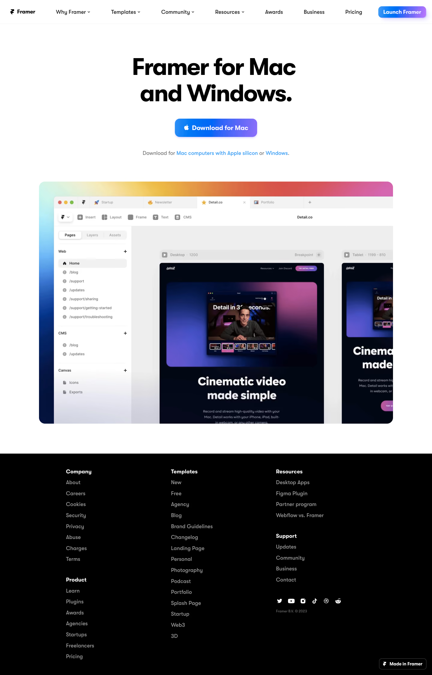
Framer’s downloads page radiates a hyper-modern, product-first aesthetic that epitomizes minimalist SaaS design. The interplay of generous whitespace, crisp lines, and intentional simplicity creates a breathable, focused interface. Everything feels clean and purposeful, positioning Framer as both innovative and accessible to new users and design professionals alike. Layout and Structure
The page employs a streamlined, vertically stacked structure. The hero section dominates above the fold, featuring a bold statement and primary download CTAs front and center. Subsequent sections showcase supported platforms with clear, modular groupings. There’s no feature overload—just targeted, action-driven content, with the footer quietly offering navigation and brand details without distraction. Visual Elements
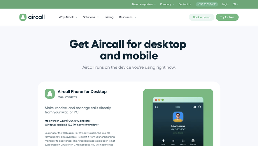
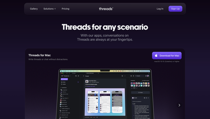
Custom, subtly-animated 3D device mockups serve as the page’s visual anchors, highlighting platform versatility. Microinteractions and smooth hover effects offer delightful feedback, reinforcing polish without overwhelming users. Branded system icons and elegant SVG illustrations punctuate the UI, ensuring visual harmony while providing intuitive cues. Color Palette and Typography
A futuristic monochrome palette—deep charcoals and soft grays, punctuated by Framer’s electric blue—amplifies clarity and focus. Headings are sharp and geometric, while body text is proportionate and airy, giving each section clear hierarchy and maximum readability. User Experience Patterns & Notable Design Choices
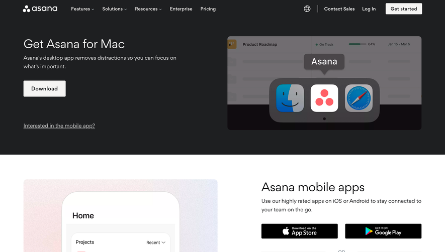
Navigation is frictionless: sticky elements keep CTAs accessible, while informative labels guide each interaction. Notably, each platform’s download option is visually distinct yet unified, allowing users to scan and act with confidence. The tone is quietly assertive: trustworthy, progressive, and elegantly sure of its value.