
Thank you! Your submission has been received!
Oops! Something went wrong while submitting the form.
Get SaaSFrame Pro
Monthly
$18
Quarterly
$48
Yearly
$180
Upgrade to access this feature
Browse all screens & flows
Filter and search screens & flows
Access Figma files
Access mobile versions
Bookmark screens & flows
Join now
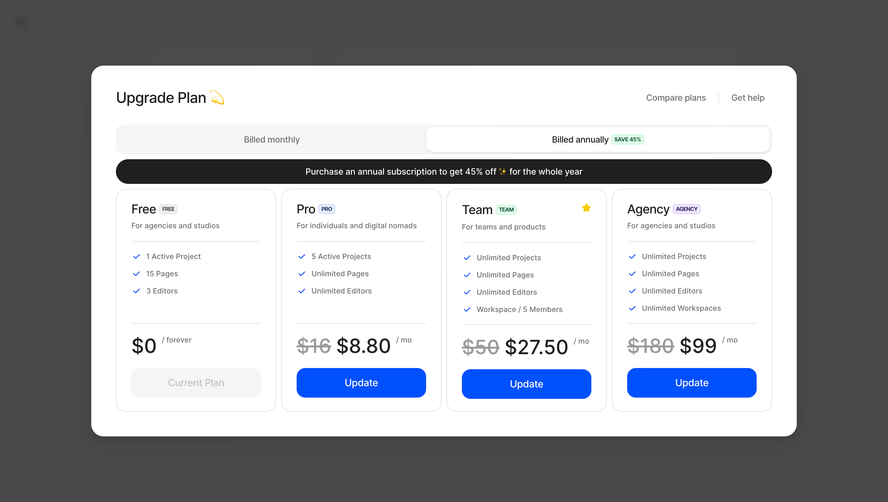
FlowMapp Upgrade Plan

FlowMapp
UX tools for web design
Designed by
No items found.

Bookmark
Bookmark

Design with AI
Thank you! Your submission has been received!
Oops! Something went wrong while submitting the form.
# Design from Reference: FlowMapp Upgrade Plan
Create an original, high-fidelity visual design inspired by the reference. Prioritize composition, typography, colors, spacing, and component styling over technical implementation.
## Reference
- **Product:** FlowMapp
- **Category:** Upgrading
- **Screenshot:** https://cdn.prod.website-files.com/5e9dc792e1210c5325f7ebbc/6acad7e71025e911ae520e90_6acad76ffbf1299940aaadd5_cms-b8fa557ce8da7a95ef7e0ec4.webp
Analyze the screenshot first. If inaccessible, request it rather than guessing.
## Content
{{content.instructions}}
{{content.data}}
Preserve essential messaging and factual accuracy. Adapt structure and copy length for visual balance; never invent product claims.
## Visual Design
### Overall aesthetic
- **Character:** A plan-upgrade modal uses a large white surface over a dim gray backdrop, with bold blue actions and compact comparison cards.
- **Capture scale:** The screenshot measures 2880 × 1630 pixels. Approximate CSS dimensions assume a 1440 × 815 viewport at 2× density; this is unverified.
- **Tone:** Billing controls, discount messaging and aligned cards make the upgrade choice direct and transactional.
### Page composition
- **Modal shell:** A centered roughly 1140 × 600px CSS rounded rectangle occupies most of the viewport.
- **Header:** Upgrade Plan and a small decorative icon sit left; Compare plans and Get help align right.
- **Billing:** A full-width monthly/annual segmented control sits above a dark promotional pill.
- **Plans:** Four equal cards present Free, Pro, Team and Agency.
- **Card structure:** Each card contains title/badge, audience sentence, feature list, price area and bottom action.
- **Backdrop:** The underlying app is darkened and indistinct.
### Information hierarchy
- **Billing state:** Billed annually is visibly selected and includes a small green savings badge.
- **Promotion:** A dark horizontal strip reinforces the annual discount.
- **Plan comparison:** Titles and prices are strongest within each card; small colored badges identify tiers.
- **Recommendation:** A small star appears near the Team title.
- **Current plan:** Free shows a muted Current Plan action; paid plans show blue Update actions.
- **Captured terms:** Displayed discounts and prices are source-image content, not verified current offers.
### Typography
- **Family:** A neutral sans-serif is visible; exact identity is unverified.
- **Modal title:** Approximately 24px CSS, medium weight.
- **Plan names:** Approximately 22px medium.
- **Price:** Approximately 34px, with old prices struck through in lighter gray and smaller billing units.
- **Features:** Approximately 13px with 28px row cadence.
- **Buttons:** Approximately 16px medium, white on blue.
- **Badges and audience copy:** Small 10–13px text.
### Colors & surfaces
- **Modal/cards:** Sampled #FFFFFF supplies the primary surface.
- **Backdrop:** Sampled #494949 supplies the dim surrounding field.
- **Promotion:** Sampled #1F1F1F supplies the dark discount strip.
- **Pale controls:** Sampled #F5F5F5 supplies the billing track and current-plan action.
- **Primary blue:** Sampled #0052FF supplies paid-plan actions and feature checkmarks.
- **Text:** Dark gray titles contrast with muted gray descriptions and struck-through prices.
- **Badges:** Small green, blue and lavender tints differentiate plan labels.
### Components
- **Billing segmented control:** Approximately 48px high with large rounded ends; the active annual half is white with subtle elevation.
- **Promotion bar:** A dark full-width pill around 40px high contains centered white text.
- **Plan cards:** Four approximately 260px-wide cards use thin gray outlines, around 16px radii and 24px padding.
- **Feature lists:** Blue checkmarks align before compact text, with horizontal rules separating title/features/pricing.
- **Price block:** Old and new prices appear on one line, followed by a small monthly unit.
- **Update buttons:** Wide blue rectangles around 48px high use roughly 14px radii.
- **Current-plan button:** A matching pale-gray control appears disabled.
### Visual rhythm
- **Modal padding:** Approximately 40px surrounds the content.
- **Card gaps:** Narrow 8–10px gutters create a continuous comparison row.
- **Internal alignment:** Card titles, feature lists, prices and actions align consistently despite varying feature counts.
- **Band spacing:** Billing and promotion controls sit close together above the cards.
- **Backdrop isolation:** Broad gray margins frame the modal without competing content.
### Responsive
- **Evidence limit:** Only a desktop annual-billing state is observed; selection and checkout behavior are unverified.
- **Card recommendation:** Stack plans or provide an accessible horizontal comparison at narrow widths.
- **Billing recommendation:** Keep the selected period and savings label clear when controls wrap.
- **Modal recommendation:** Allow vertical scrolling within viewport margins on short screens.
- **Price recommendation:** Preserve old/new price relationships without clipping or shrinking essential text.
### Adaptation guidance
- **Pricing consistency:** Generate billing, discounts and card prices from one shared data source.
- **State semantics:** Expose selected billing period and disabled current-plan action accessibly.
- **Comparison clarity:** Keep features, audience and price separated into consistent card regions.
- **Accessibility:** Use labeled dialog controls, visible focus and explicit action names for each tier.
- **Scope:** The screenshot shows upgrade choices only; payment or subscription changes are not established.
Use this context to reproduce the reference's visual language: layout, typography, colors, spacing, borders, radii, and distinctive elements. The screenshot takes priority if descriptions conflict.
## Direction
{{preferences.fidelityInstructions}}
## Output
{{output.instructions}}
Deliver a polished, cohesive design with precise alignment, hierarchy, and spacing. Produce the requested visual artifact, not just a description. If unsupported, explain the limitation.


Category
Tech Stack

Added on
November 3, 2023
Similar screens



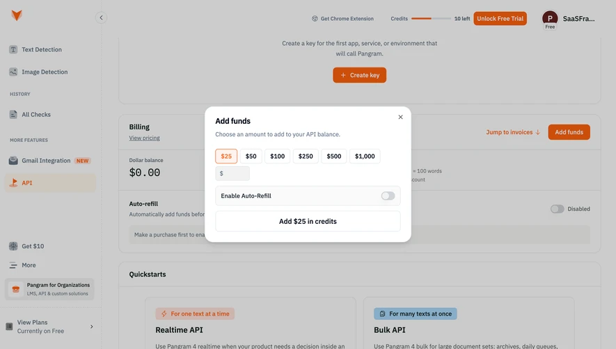



Upgrade to SaaSFrame Pro now to see similar examples.
Monthly
$18 /month
Billed $18 monthly
Browse all screens & flows
Filter and search screens & flows
Search text in screenshots
Access Figma files
Access mobile versions
Join now
Quarterly
$16 /month
Billed $48 quarterly
Browse all screens & flows
Filter and search screens & flows
Search text in screenshots
Access Figma files
Access mobile versions
Join now
Yearly
$15 /month
Billed $180 yearly
Browse all screens & flows
Filter and search screens & flows
Search text in screenshots
Access Figma files
Access mobile versions
Join now