Design with AI
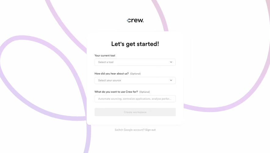
Generate a new design based on this screen using your own content.
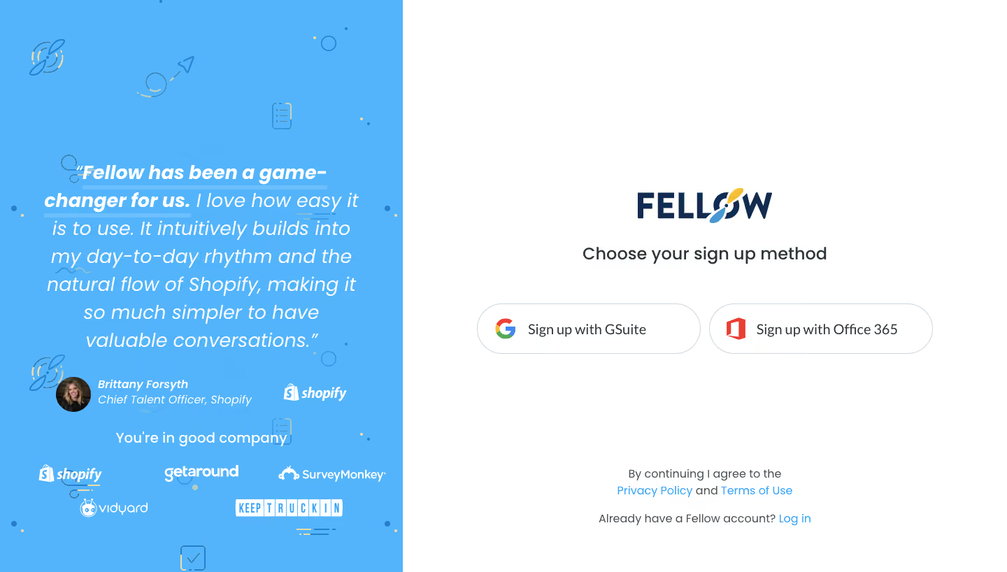
# Design from Reference: Fellow Signup Page
Create an original, high-fidelity visual design inspired by the reference. Prioritize composition, typography, colors, spacing, and component styling over technical implementation.
## Reference
- **Product:** Fellow
- **Category:** Signup
- **Screenshot:** https://cdn.prod.website-files.com/5e9dc792e1210c5325f7ebbc/6acbd03e8f05a14579f046d7_6acbcd118892d3072b744472_cms-bde7fe64cbe985b779524e3e.webp
Analyze the screenshot first. If inaccessible, request it rather than guessing.
## Content
{{content.instructions}}
{{content.data}}
Preserve essential messaging and factual accuracy. Adapt structure and copy length for visual balance; never invent product claims.
## Visual Design
### Overall aesthetic
- **Style:** Split signup page with a bright-blue testimonial panel and a sparse white authentication area.
### Page composition
- **Canvas:** 1440 × 818 screenshot px.
- **Left panel:** Approximately 40% width with italic quote, avatar/attribution, customer marks, and small line-art motifs.
- **Right panel:** Centered logo, signup-method heading, two provider pills, then legal and login links near bottom.
### Information hierarchy
- **Primary:** Choice of signup provider.
- **Trust:** Large testimonial and customer logos occupy the supporting panel.
- **Secondary:** Terms/privacy and existing-account link are clearly separated below.
### Typography
- **Family:** Rounded sans serif; exact family unverified.
- **Quote:** Approximately 28px italic with 40px line-height; opening phrase bold.
- **Signup heading:** Approximately 24px, medium.
- **Provider labels:** Approximately 18px.
- **Legal:** Approximately 16px.
- **Precision:** Screenshot font estimates.
### Colors & surfaces
- **Canvas:** #FFFFFF.
- **Blue panel:** #53B3FB and #52B2FB.
- **Primary brand navy:** #132B4F.
- **Body:** #2B363B.
- **Provider outlines:** #CCD6DB.
- **Panel text:** White.
- **Precision:** Flat samples affected by compression.
### Components
- **Providers:** Large white outlined pills, roughly 320 × 70 screenshot px each, multicolor brand marks.
- **Testimonial avatar:** Circular photo beside italic attribution.
- **Motifs:** Small blue outlined productivity shapes and dots.
- **Links:** Bright blue inline text.
- **No form fields:** Only GSuite and Office 365 methods visible.
### Visual rhythm
- **Whitespace:** Large empty areas surround right-side authentication controls.
- **Balance:** Dense quote/proof area contrasts with minimal signup choices.
- **Alignment:** Provider pair centered horizontally; legal text centered near bottom.
### Responsive
- **Observed:** Desktop only.
- **Recommendation:** Stack providers and prioritize authentication; move testimonial below or collapse it.
- **Touch:** Retain generous pill height and full-width options.
### Adaptation guidance
- **Preserve:** Provider-first entry and separate trust panel.
- **Content:** Use supported providers and authorized testimonials.
- **Behavior:** Authentication and policy acceptance are not demonstrated.
Use this context to reproduce the reference's visual language: layout, typography, colors, spacing, borders, radii, and distinctive elements. The screenshot takes priority if descriptions conflict.
## Direction
{{preferences.fidelityInstructions}}
## Output
{{output.instructions}}
Deliver a polished, cohesive design with precise alignment, hierarchy, and spacing. Produce the requested visual artifact, not just a description. If unsupported, explain the limitation.