





1. Header Section: The topmost section of the page consists of the company logo, a navigation bar, and a call-to-action button to sign up for the app. The logo is centered, and the navigation items are on the right-hand side of the header. 2. Hero Section: This section occupies the majority of the page and features an image of the app interface along with a headline, subheadline, and a call-to-action button. The headline is a bold statement that sums up the app's purpose, while the subheadline offers more explanation. 3. Features Section: This section displays the app's features using a series of icons and text. Each feature is separated by vertical lines that divide the section into three columns. The section features six essential features such as goal setting, check-ins, coaching, feedback, reporting and insights, and customized reminders. 4. Experience Section: This section is split into two columns, with the left column showcasing an image of the app interface, while the right column shows a short paragraph about how the app can help users manage their work more efficiently. 5. Customers Section: This section highlights the top brands that use the app, and it is divided into two columns. Each column showcases client logos, along with a testimonial from that particular client. 6. Getting Started Section: This section is a call-to-action section that asks users to sign up for the app. It features a text box where users can enter their email address and a button that invites them to either schedule a demo or get started immediately. 7. Footer Section: At the bottom of the page is the footer section, which features links to social media profiles, the company blog, and a small paragraph about the company. The footer also contains quick links to various pages of the website, such as the contact page, privacy policy, and terms of service.

Thank you! Your submission has been received!
Oops! Something went wrong while submitting the form.
Get SaaSFrame Pro
Monthly
$18
Quarterly
$48
Yearly
$180
Upgrade to access this feature
Browse all screens & flows
Filter and search screens & flows
Access Figma files
Access mobile versions
Bookmark screens & flows
Join now
Fellow Landing Page

Fellow
Great Meetings Start Here
Designed by
No items found.

Bookmark
Bookmark
Design with AI
Thank you! Your submission has been received!
Oops! Something went wrong while submitting the form.
# Design from Reference: Fellow Landing Page
Create an original, high-fidelity visual design inspired by the reference. Prioritize composition, typography, colors, spacing, and component styling over technical implementation.
## Reference
- **Product:** Fellow
- **Category:** Landing Page
- **Screenshot:** https://cdn.prod.website-files.com/5e9dc792e1210c5325f7ebbc/62eca44c5cf598f12bc28023_1659675184947-62ec9cafb0a5d86d9875cfbb_screenshot-device-c28322f03ea457191c9d227ed75c5334-1659619111853.webp
Analyze the screenshot first. If inaccessible, request it rather than guessing.
## Content
{{content.instructions}}
{{content.data}}
Preserve essential messaging and factual accuracy. Adapt structure and copy length for visual balance; never invent product claims.
## Visual Design
### Overall aesthetic
- **Character:** Friendly meeting-management marketing page combining a white editorial canvas, pastel blue and peach bands, rounded geometric sans-serif type, human portraits and floating product fragments.
- **Visual language:** Thin orbit rings, small diagonal marks, dots and waves frame circular portraits; white agenda cards and colored avatars make collaboration tangible.
- **Capture condition:** The full screenshot measures 1440 × 12129 image pixels. Several later illustration slots and resource-card image areas are visibly blank; their intended content cannot be established.
### Page composition
- **Header and hero:** A single horizontal navigation row places the black wordmark left, product/resource menus centrally and login plus a blue trial button right. The hero occupies approximately the first 586 image pixels, with a left text column and a larger right portrait/orbit collage.
- **Content width:** Most feature rows align to an approximately 1040 px centered container, leaving roughly 200 px side margins in the source image. The header and template-directory band use wider alignment.
- **Early sequence:** A white customer-logo strip follows the blue hero. A peach feature demonstration pairs six vertically stacked feature selectors with a large application screenshot; a four-person expert portrait row follows on white.
- **Feature narrative:** Five spacious alternating text/illustration rows cover meetings, action items, feedback, external guests and guidance. A centered template statement leads into a full-width blue directory with an introductory column and four columns of meeting categories.
- **Lower sequence:** Three equal meeting-type columns precede integration rows for Google Meet, Zoom, Slack and other apps, followed by a Google Docs comparison. An audience tab row, blue testimonial strip, review invitation, peach conversion band, three resource cards and five-column footer close the page.
- **Blank regions:** Slack, general integrations, comparison and review sections retain large white opposing columns in this capture. Resource cards show tall empty upper portions above their tags and text.
### Information hierarchy
- **Primary proposition:** A bold two-line hero heading leads immediately to a five-line explanatory paragraph and paired trial/demo actions. The portrait collage balances the text without introducing a second large headline.
- **Section hierarchy:** Centered section headings introduce major themes; feature rows use a small category label, a larger two- or three-line benefit heading, compact paragraph and blue text link.
- **Credibility layers:** Customer logos, named expert portraits, illustrated product examples and a large italic testimonial distribute evidence throughout the scroll.
- **Conversion hierarchy:** Filled blue trial buttons dominate outlined demo buttons in both hero and closing band. Smaller login and feature links remain tertiary.
- **Dense navigation:** The template directory and footer use aligned text columns with restrained emphasis, allowing many destinations without card containers.
### Typography
- **Family:** A geometric sans-serif with rounded forms and a single-storey lowercase appearance is visible. The exact family and loaded font files are unverified.
- **Hero:** Approximately 46–48 image px, weight 700, line-height about 59 px; paragraph roughly 21–22 px with 36 px line-height. These are image-based estimates, not verified CSS values.
- **Section headings:** Major titles are approximately 32–40 image px at medium or bold weight. Alternating-row headings are about 28–30 px with 39–41 px line-height; category labels are near 20 px at medium weight.
- **Supporting text:** Feature paragraphs and links are roughly 16–17 px with 27–28 px leading. Links use heavier weight and blue color. Navigation and footer links are smaller, approximately 13–15 px.
- **Special roles:** Expert names use larger blue text; roles are small and organization names bold. The testimonial uses italic text around 21–23 px with generous leading and a blue highlighted opening phrase.
- **Scale caution:** A one-image-pixel-to-one-CSS-pixel reading is only a working estimate for this 1440 px desktop capture; device scale and browser zoom are unknown.
### Colors & surfaces
- **Measured backgrounds:** ICC-aware conversion to sRGB yields white #FFFFFF, pastel blue #D7E1FB and peach #FFEDE1 as the dominant large surfaces.
- **Measured text and action tones:** Dark #161C1F appears in typography; saturated #283FCB appears in primary action areas. Thin blue-violet accents in rings, links and checkboxes are visually lighter than the filled trial buttons.
- **Product surfaces:** White floating cards contrast with pale gray #F4F6FA interface areas. The demonstration screenshot includes muted blue-gray #8996A8 and #8491A3 under its modal overlay.
- **Illustration accents:** Measured light blue #8CCCFF and muted violet #8174B3 occur within imagery; warm yellow, coral and teal details are secondary photographic/interface accents.
- **Depth:** Product fragments and resource cards use soft low-opacity shadows; section backgrounds remain flat, with no heavy panel borders around the main narrative.
### Components
- **Primary buttons:** Hero buttons are approximately 128 × 50 and 174 × 50 image px, with about 16–20 px horizontal padding and a small 3–4 px corner radius. The secondary action has a thin dark outline and transparent pastel fill.
- **Feature selector:** A vertical list uses small outline icons and generous row spacing. The first item is active on a white raised tile with a blue bottom rule; the adjacent screenshot displays a centered template-browser modal over a dimmed interface.
- **Portraits:** Four circular expert photographs are approximately 210 px in diameter in the source, evenly spaced with centered name, role and organization text below.
- **Product fragments:** White rounded agenda cards contain fine rules, blue outlined checkboxes, colored assignee chips and small circular avatars. Some cards overlap portraits or video-call tiles, with soft shadows separating layers.
- **Meeting-type columns:** Three peach circular icon grounds contain delicate line illustrations, followed by blue titles and short centered descriptions; no enclosing border is visible.
- **Audience tabs and quote:** Four horizontal audience choices sit above the testimonial. The active first choice has a white shadowed tile and blue underline; large white circular controls flank the blue quote band, but their behavior is not demonstrated.
- **Resource cards:** Three equal white cards have subtle shadows, tall blank media areas, small pale-blue category chips, two-line titles and blue reading links. Footer columns have bold labels and closely spaced plain links.
### Visual rhythm
- **Macro spacing:** Large white intervals separate alternating rows, often roughly 150–230 image px between content groups. This gives the unusually long page a slow, spacious reading pace.
- **Internal spacing:** Feature labels sit roughly 18–24 px above headings; paragraphs and links use approximately 20–30 px gaps. Button pairs have a narrow gap of about 8–10 px.
- **Alternation:** Left/right image placement repeatedly reverses across product and integration rows. Centered headings and colored horizontal bands reset the rhythm between these sequences.
- **Decorative restraint:** Rings and waves are concentrated around portraits or selected bands, while most body text sits against uninterrupted white.
- **Capture-specific gaps:** Preserve the distinction between deliberate spacious layout and visibly empty illustration/media areas; the screenshot alone cannot explain why those areas are blank.
### Responsive
- **Evidence limit:** Only a desktop screenshot is available. The following are implementation recommendations, not observed mobile behavior.
- **Navigation and hero:** Collapse the wide menu into an accessible menu, stack hero copy above the collage and let the paired actions wrap while retaining their priority.
- **Feature rows:** Use a single column with each heading and paragraph preceding its associated image. Scale product compositions as unified illustrations so tiny UI fragments do not become interactive targets.
- **Directories and grids:** Reduce expert portraits and meeting-type/resource grids from four or three columns to two and then one. Reflow template/footer links into readable groups rather than shrinking their type.
- **Spacing and tabs:** Reduce oversized desktop gaps substantially on narrow screens. Allow audience tabs to wrap or scroll with a clear selected state, and keep quote controls keyboard accessible.
### Adaptation guidance
- **Reusable structure:** Combine an outcome-led split hero, a compact proof strip, a visual feature selector and alternating benefit rows. Use blue and peach bands to distinguish directory, testimonial and conversion moments.
- **Illustration system:** Build a consistent kit of circular portraits, thin orbital lines, small avatars and white agenda cards. Keep decoration behind text and preserve readable contrast.
- **Content discipline:** Give every feature row one category, one benefit heading, a short paragraph and one destination. Keep navigation-heavy content in clearly aligned columns.
- **Production handling:** Supply and verify real images for any recreated media slots; do not infer the missing illustrations from section titles. Avoid reproducing the captured empty card tops as an intentional content treatment.
- **Accessibility and performance:** Preserve semantic heading order, descriptive link names, visible focus states and sufficient contrast for lighter links. Load long-page imagery efficiently and reserve its dimensions to prevent layout shifts.
Use this context to reproduce the reference's visual language: layout, typography, colors, spacing, borders, radii, and distinctive elements. The screenshot takes priority if descriptions conflict.
## Direction
{{preferences.fidelityInstructions}}
## Output
{{output.instructions}}
Deliver a polished, cohesive design with precise alignment, hierarchy, and spacing. Produce the requested visual artifact, not just a description. If unsupported, explain the limitation.
Category
Patterns
No items found.
Tech Stack
Added on
May 2, 2020
Similar screens
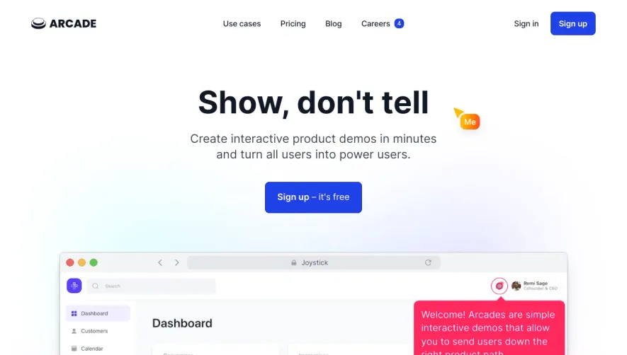


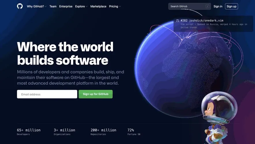



Upgrade to SaaSFrame Pro now to see similar examples.
Monthly
$18 /month
Billed $18 monthly
Browse all screens & flows
Filter and search screens & flows
Search text in screenshots
Access Figma files
Access mobile versions
Join now
Quarterly
$16 /month
Billed $48 quarterly
Browse all screens & flows
Filter and search screens & flows
Search text in screenshots
Access Figma files
Access mobile versions
Join now
Yearly
$15 /month
Billed $180 yearly
Browse all screens & flows
Filter and search screens & flows
Search text in screenshots
Access Figma files
Access mobile versions
Join now