
Thank you! Your submission has been received!
Oops! Something went wrong while submitting the form.
Get SaaSFrame Pro
Monthly
$18
Quarterly
$48
Yearly
$180
Upgrade to access this feature
Browse all screens & flows
Filter and search screens & flows
Access Figma files
Access mobile versions
Bookmark screens & flows
Join now
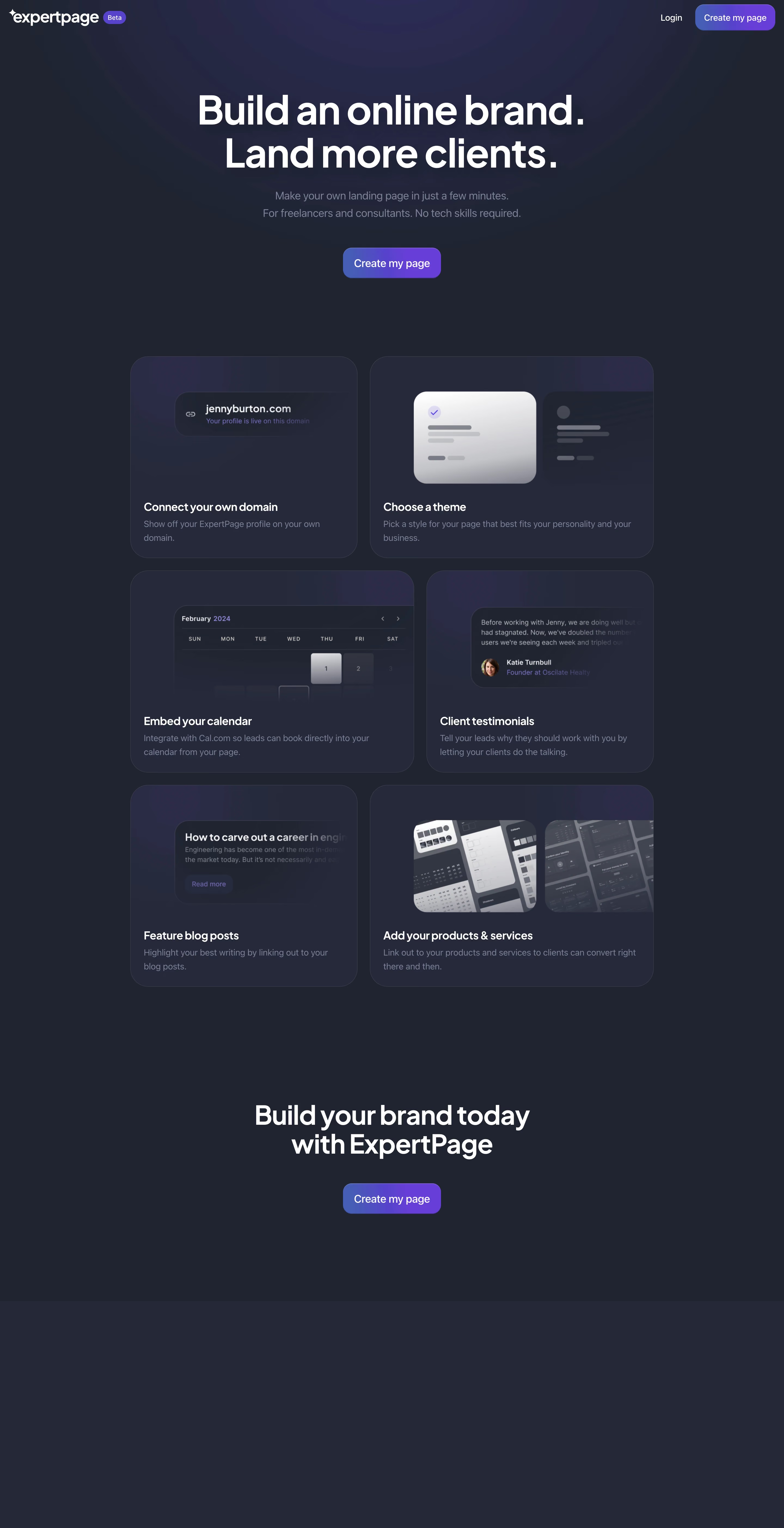
Expertpage Landing Page

Expertpage
Landing pages for freelancers & consultants
Designed by
No items found.

Bookmark
Bookmark

Design with AI
Thank you! Your submission has been received!
Oops! Something went wrong while submitting the form.
# Design from Reference: Expertpage Landing Page
Create an original, high-fidelity visual design inspired by the reference. Prioritize composition, typography, colors, spacing, and component styling over technical implementation.
## Reference
- **Product:** Expertpage
- **Category:** Landing Page
- **Screenshot:** https://cdn.prod.website-files.com/5e9dc792e1210c5325f7ebbc/6acada65a43009b06fe6f2fe_6acad9fca43009b06fe6d045_cms-40d21ad90ec2d06da31fe596.webp
Analyze the screenshot first. If inaccessible, request it rather than guessing.
## Content
{{content.instructions}}
{{content.data}}
Preserve essential messaging and factual accuracy. Adapt structure and copy length for visual balance; never invent product claims.
## Visual Design
### Overall aesthetic
- **Character:** Minimal dark product landing page with a centered large promise, blue-to-purple gradient actions and softly lit feature illustrations.
- **Evidence and scale:** Screenshot measures 2880 × 5608 image pixels. Sizes estimate a 1440px CSS canvas at 2× capture scale; actual DPR and font identity remain unverified.
### Page composition
- **Header:** White brand mark and small Beta badge sit at the far left; Login and a rounded gradient action sit at right.
- **Hero:** Centered two-line display headline, muted two-line explanation and one primary action occupy a broad dark region with subtle violet glow.
- **Feature grid:** Six rounded cards form three asymmetric two-column rows. Narrow/wide widths alternate while each card combines an upper product illustration and lower heading/body copy.
- **Closing:** A centered two-line brand-building statement and repeated action follow the grid.
- **Bottom surface:** A broad slightly lighter dark band appears below the closing section without visible links or text in the capture; no additional footer content can be established.
### Information hierarchy
- **Primary promise:** Large white hero lettering dominates before the gradient creation action.
- **Feature scan:** Domain, themes, calendar, testimonials, blog and product/service cards each have a concise white heading and muted explanation.
- **Illustration role:** UI-like examples communicate each feature visually without becoming interactive page controls.
- **Conversion repetition:** The same creation action appears in header, hero and closing, with consistent visual treatment.
### Typography
- **Hero:** Approximately 72px CSS bold sans-serif with compact leading near 80px and tight tracking.
- **Closing heading:** Around 48px semibold with compact two-line leading.
- **Feature headings:** Approximately 21–22px semibold; body around 16px with 26px leading.
- **Utilities:** Header links around 16px, badge around 12px; hero supporting copy around 20px with 32px leading. Exact font family and computed values remain unverified.
### Colors & surfaces
- **Measured ground:** Dark slate #1E2431 dominates, with #232838 and #25293B in raised cards/bottom surfaces.
- **Measured local depth:** Violet-tinted #2C2B48 appears in glow/illustration regions.
- **Measured emphasis:** White #FFFFFF handles display text. Saturated purple #6D3DDF and related #6E3CDF/#6F3DDF appear in gradient actions.
- **Contrast:** Muted gray-violet body text and low-contrast borders soften the surface. Illustrations use pale gray/white mockups fading into dark edges.
### Components
- **Gradient buttons:** Hero/closing actions approximately 180 × 56px CSS with 16px radii, white labels and subtle fine upper edge. The header uses a smaller variant.
- **Feature cards:** Approximately 420px and 520px alternating widths, around 370px high, radius near 32px, fine translucent borders and subtle violet gradients.
- **Domain example:** Dark rounded URL pill with link icon, bright domain line and smaller purple status line, cropped/faded toward one side.
- **Theme example:** Two miniature profile/theme cards, one light and one dark, with check indicator and skeleton-like content.
- **Other illustrations:** Calendar grid, testimonial snippet with circular portrait, article preview and tilted product-page mockups use consistent soft edge fades.
- **Card copy:** Approximately 24px side/bottom padding, white title and one-to-two lines of muted explanation.
### Visual rhythm
- **Container:** Feature grid spans approximately 960px CSS centered, with gaps near 24px.
- **Spacing:** Hero and feature grid have a broad gap near 140px; a similarly generous break leads to the final conversion.
- **Alternation:** Reversing the narrow/wide card positions creates movement while maintaining consistent row heights and copy baselines.
- **Whitespace:** The short page uses only a few content blocks, leaving breathing room around its strongest statements.
### Responsive
- **Observed limit:** Only desktop is visible; login, page creation and narrow-screen rendering are unobserved.
- **Recommended grid:** Stack feature cards into one column, normalize widths and keep illustration crops deliberate.
- **Recommended type/actions:** Scale hero text fluidly, retain readable muted descriptions and keep actions at comfortable touch sizes.
- **Recommended header:** Preserve brand, login and primary action without forcing compressed labels.
### Adaptation guidance
- **Preserve the pattern:** Use a dark slate foundation, restrained violet glow, large centered typography and a single gradient action.
- **Demonstrate features:** Keep each card to one clear capability with a quiet UI illustration and concise explanatory copy.
- **Implementation:** Ensure muted text/border contrast, real selectable headings and accessible action focus. Product feature claims in the capture require separate verification before reuse; illustration mockups do not prove working interactions.
Use this context to reproduce the reference's visual language: layout, typography, colors, spacing, borders, radii, and distinctive elements. The screenshot takes priority if descriptions conflict.
## Direction
{{preferences.fidelityInstructions}}
## Output
{{output.instructions}}
Deliver a polished, cohesive design with precise alignment, hierarchy, and spacing. Produce the requested visual artifact, not just a description. If unsupported, explain the limitation.


Category
Patterns
No items found.
Tech Stack
No items found.
Added on
September 15, 2023
Similar screens



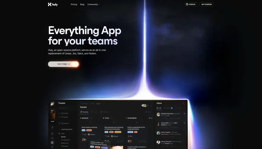



Upgrade to SaaSFrame Pro now to see similar examples.
Monthly
$18 /month
Billed $18 monthly
Browse all screens & flows
Filter and search screens & flows
Search text in screenshots
Access Figma files
Access mobile versions
Join now
Quarterly
$16 /month
Billed $48 quarterly
Browse all screens & flows
Filter and search screens & flows
Search text in screenshots
Access Figma files
Access mobile versions
Join now
Yearly
$15 /month
Billed $180 yearly
Browse all screens & flows
Filter and search screens & flows
Search text in screenshots
Access Figma files
Access mobile versions
Join now