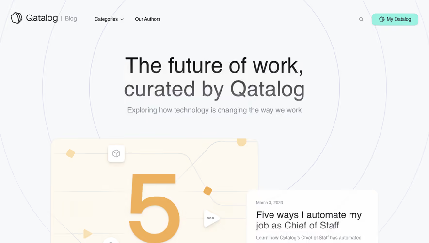
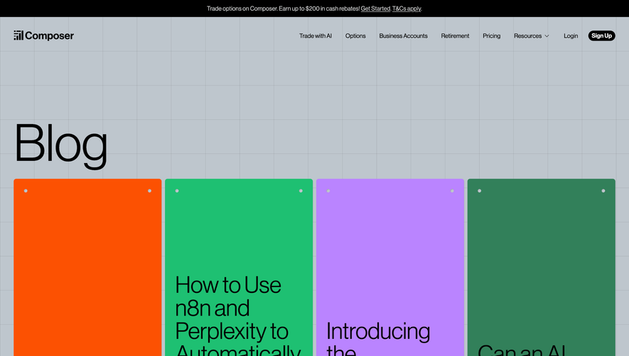
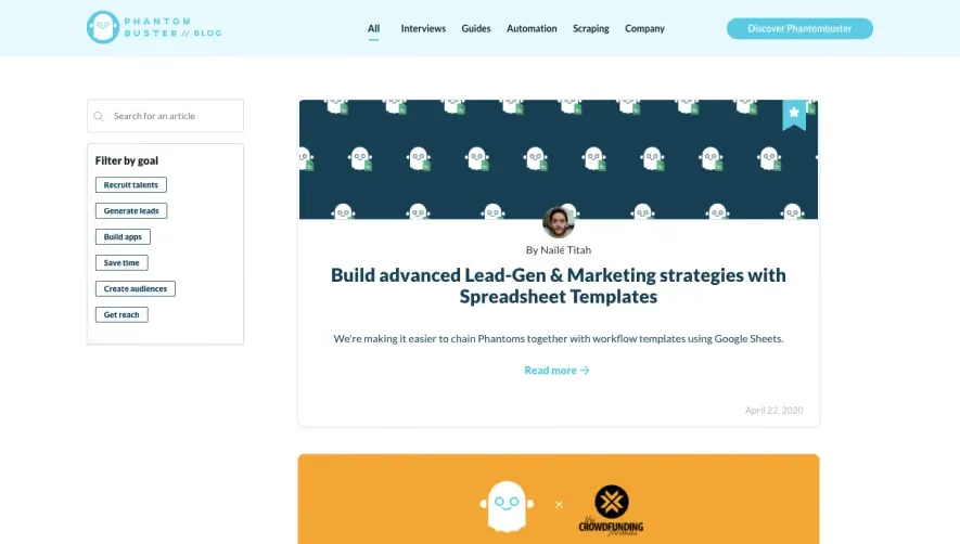
Generate a new design based on this screen using your own content.
Thank you! Your submission has been received!
Oops! Something went wrong while submitting the form.
# Design from Reference: Deel Blog Feed
Create an original, high-fidelity visual design inspired by the reference. Prioritize composition, typography, colors, spacing, and component styling over technical implementation.
## Reference
- **Product:** Deel
- **Category:** Blog Feed
- **Screenshot:** https://cdn.prod.website-files.com/5e9dc792e1210c5325f7ebbc/62ec9c893da29e4820f53b33_1659625332559-screenshot-device-b67423030dcfe86faec6ea7917d4dd3f-1659605571068.webp
Analyze the screenshot first. If inaccessible, request it rather than guessing.
## Content
{{content.instructions}}
{{content.data}}
Preserve essential messaging and factual accuracy. Adapt structure and copy length for visual balance; never invent product claims.
## Visual Design
Use this context to reproduce the reference's visual language: layout, typography, colors, spacing, borders, radii, and distinctive elements. The screenshot takes priority if descriptions conflict.
## Direction
{{preferences.fidelityInstructions}}
## Output
{{output.instructions}}
Deliver a polished, cohesive design with precise alignment, hierarchy, and spacing. Produce the requested visual artifact, not just a description. If unsupported, explain the limitation.
Deel’s blog page radiates a modern, polished professionalism with subtle playfulness. The layout leverages plenty of white space, clean lines, and vibrant accent colors that create a lively yet sophisticated tone—perfect for a SaaS audience seeking both trust and innovation. The careful restraint in visual clutter keeps the focus on content while exuding a sense of clarity and expertise.
Layout and Structure
The page greets users with a bold hero section featuring a clear headline and search functionality, inviting readers to dive directly into content. Posts are arranged in easily scannable cards, organized by topic, with visual hierarchy guiding the eye from featured articles to categorized lists below. There’s no intrusive advertising or pop-ups, maintaining a streamlined user flow. The structured footer balances navigational links and subtle brand reinforcement.
Visual Elements
Custom illustrations and stylized icons pepper the page, enhancing article previews without overwhelming. Each post card typically includes a custom artwork or sharp photography—adding visual interest and accentuating diversity of topics. Hover states and micro-animations bring elements to life as users interact, infusing the interface with dynamism while maintaining a lightweight load.
Color Palette and Typography
A primary deep blue anchors the palette, offset by vibrant splashes of orange and green, which signal interactivity and highlight key actions. Typography is crisp—bold headings in a geometric sans-serif font paired with legible, airy body text. The hierarchy is clear: headlines command attention, while summaries and metadata remain understated.
User Experience Patterns and Unique Touches
Navigation is seamless—persistent header menus, clear CTAs (“Subscribe,” “Read More”), and intuitive filtering offer effortless exploration. The search interaction is immediate, encouraging users to quickly uncover relevant content. Notably, the use of playful spot illustrations, dynamic avatars, and subtle gradient backgrounds create a uniquely personable and trustworthy feel, making the user’s journey both delightful and frictionless.