Design with AI
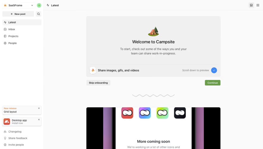
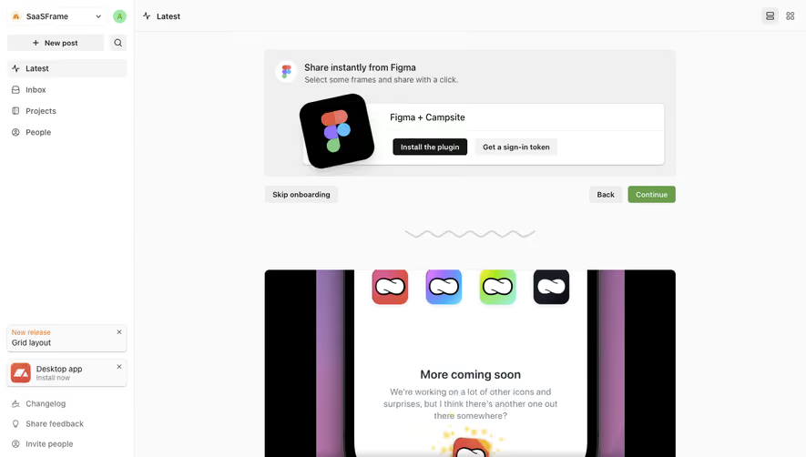
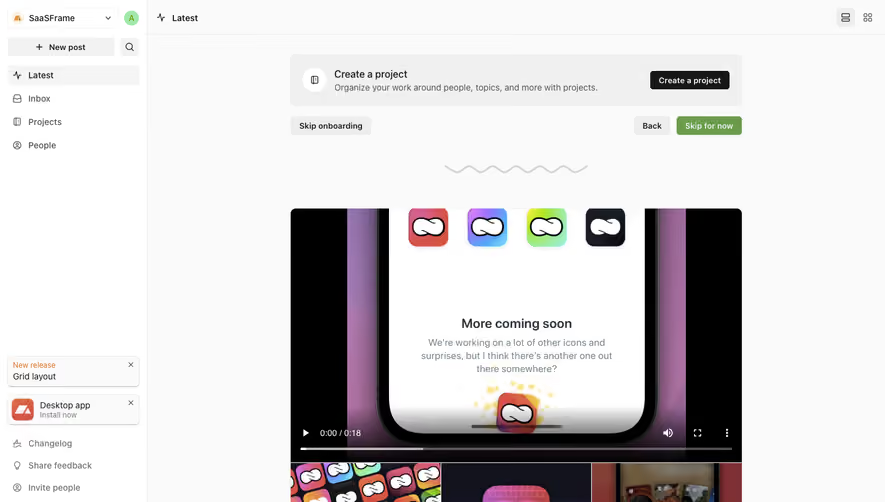
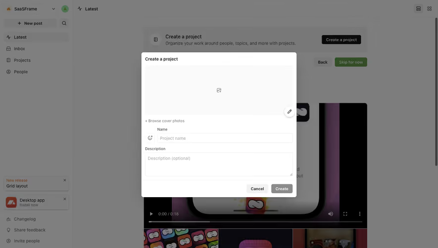
Generate a new design based on this screen using your own content.
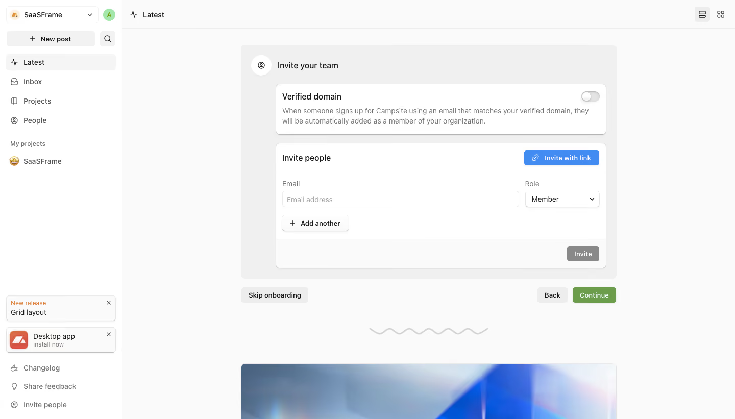
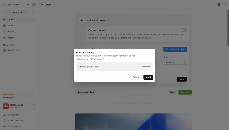
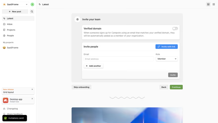
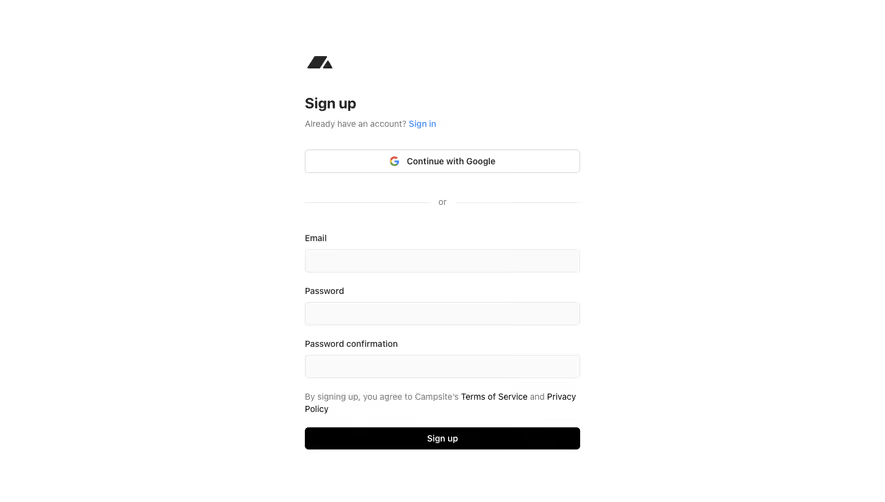
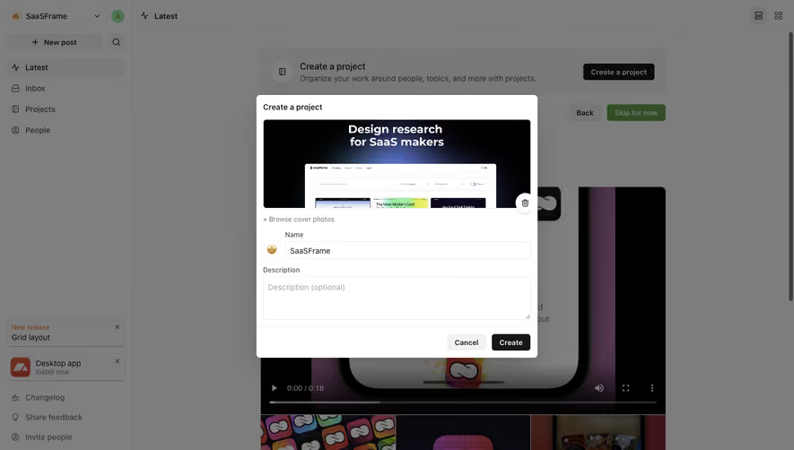
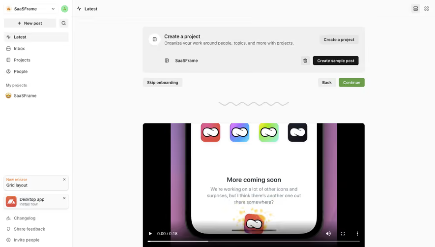
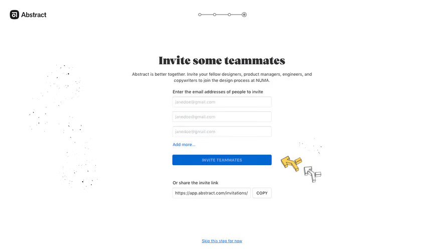
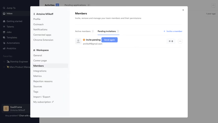
# Design from Reference: Campsite Invite Team Members
Create an original, high-fidelity visual design inspired by the reference. Prioritize composition, typography, colors, spacing, and component styling over technical implementation.
## Reference
- **Product:** Campsite
- **Category:** Invite Team Members
- **Screenshot:** https://cdn.prod.website-files.com/5e9dc792e1210c5325f7ebbc/6acbbbf7f023ce865170e2b5_6acbbb3f78267cb84ff8e7b9_cms-7f0542e3e18ed19d3b4e5bad.webp
Analyze the screenshot first. If inaccessible, request it rather than guessing.
## Content
{{content.instructions}}
{{content.data}}
Preserve essential messaging and factual accuracy. Adapt structure and copy length for visual balance; never invent product claims.
## Visual Design
### Overall aesthetic
- **Style:** Light collaboration dashboard with a gray onboarding wrapper, white bordered configuration cards and blue/green actions.
- **Scale:** Source 1440 × 821px; dimensions are screenshot pixels, with CSS scale unverified.
### Page composition
- **Shell:** A roughly 240px left rail contains workspace switcher, New post, navigation and lower announcements.
- **Onboarding:** A centered roughly 736px-wide Invite your team module contains verified-domain and invitation cards.
- **Navigation:** Skip onboarding sits below left, Back/Continue right; a wavy divider and partially visible feed media follow.
### Information hierarchy
- **Domain option:** Verified domain explains automatic joining and shows an off toggle.
- **Invitation:** Invite people includes a blue Invite with link action, email field, role select, Add another and disabled-looking Invite.
- **Progression:** Green Continue remains separate from invitation submission.
### Typography
- **Family:** Neutral sans-serif; exact font identity is unverified.
- **Roles:** Estimated module/card headings 16px medium, body/labels 14px and buttons 13px semibold.
- **Contrast:** Descriptions are gray, titles dark and primary link action white on blue.
### Colors & surfaces
- **Sampled palette:** ICC-aware sRGB samples include #FAFAFA, white #FFFFFF, #F0F0F0, #EDEDED and #F5F5F5.
- **Accents:** Blue identifies link invitation; green identifies Continue. Disabled Invite is gray.
- **Depth:** White cards use fine borders, small corners and subtle shadows.
### Components
- **Domain card:** Wide white panel with title/toggle on one row and two-line helper beneath.
- **Invite card:** Header action, email/role row, Add another and separate footer submit area.
- **Controls:** Email consumes most width; Member select occupies a narrow right column. Inputs around 32px high.
- **Outer module:** Pale-gray padded container with compact section icon and rounded corners.
### Visual rhythm
- **Grouping:** Two cards separate domain-based and direct invitation routes; footer controls distinguish onboarding navigation.
- **Alignment:** Form controls and inner card headings follow consistent padding.
### Responsive
- **Recommended adaptation:** Only desktop is observed. Collapse rail, stack email/role and wrap header actions.
- **Usability:** Keep Invite and Continue clearly distinct and preserve off/disabled state visibility.
### Adaptation guidance
- **Preserve:** Keep domain joining, direct email and shareable-link routes separate.
- **Adapt:** Use actual role options and verification state; do not imply a domain is verified from an off toggle.
Use this context to reproduce the reference's visual language: layout, typography, colors, spacing, borders, radii, and distinctive elements. The screenshot takes priority if descriptions conflict.
## Direction
{{preferences.fidelityInstructions}}
## Output
{{output.instructions}}
Deliver a polished, cohesive design with precise alignment, hierarchy, and spacing. Produce the requested visual artifact, not just a description. If unsupported, explain the limitation.