



1. The page opens up with a full-width hero section with a blurred background image that features the product, Blobr. The hero section displays the product's name, a tagline, and a CTA button for signing up. 2. The next section is a two-column grid with a heading that reads "What is Blobr." The left column has an image of the product, and the right column has a brief description of Blobr's features and functionalities. 3. The third section is another two-column grid with a heading that reads "Why Blobr." The left column has an image of the product in action, and the right column has a list of benefits and reasons why one should choose Blobr. 4. The next section is a full-width banner that reads "See how it works." It has a CTA button that takes the user to a page where they can view an explainer video. 5. The fifth section displays several companies that have used Blobr's product. Each company has its logo, name, and a short testimonial. 6. The sixth section is a three-column grid that highlights Blobr's key features. 7. The seventh section displays a pricing table that features various plans for Blobr's product. It shows the features of each plan side by side for easy comparison. 8. The eighth section is a full-width banner that reads "Start Building With Blobr." It has a CTA button that takes the user to a signup page. 9. The final section displays the logos of various media outlets that have featured Blobr's product. Overall, the page's structure is clean, minimalistic, and follows a logical flow that highlights the product, its features, and benefits in a concise and easy-to-read manner. It also provides ample opportunities for users to sign up and engage with the product.

Thank you! Your submission has been received!
Oops! Something went wrong while submitting the form.
Get SaaSFrame Pro
Monthly
$18
Quarterly
$48
Yearly
$180
Upgrade to access this feature
Browse all screens & flows
Filter and search screens & flows
Access Figma files
Access mobile versions
Bookmark screens & flows
Join now
Blobr Features Page

Blobr
More API usage, more subscribers
Designed by
No items found.

Bookmark
Bookmark
Design with AI
Thank you! Your submission has been received!
Oops! Something went wrong while submitting the form.
# Design from Reference: Blobr Features Page
Create an original, high-fidelity visual design inspired by the reference. Prioritize composition, typography, colors, spacing, and component styling over technical implementation.
## Reference
- **Product:** Blobr
- **Category:** Features Page
- **Screenshot:** https://cdn.prod.website-files.com/5e9dc792e1210c5325f7ebbc/6acb6c185391d62536b67263_6acb6aa6834771b57d1527a3_cms-1b338d355c1ff6446dcd0c22.webp
Analyze the screenshot first. If inaccessible, request it rather than guessing.
## Content
{{content.instructions}}
{{content.data}}
Preserve essential messaging and factual accuracy. Adapt structure and copy length for visual balance; never invent product claims.
## Visual Design
### Overall aesthetic
- **Style:** Technical SaaS feature page with bold black headings, blue rectangular actions, alternating white/pale-gray sections, and detailed product mockups.
- **Character:** Straightforward sans-serif typography, large open two-column rows, soft gray illustration containers, and one black explanatory band.
- **Decoration:** A provider/consumer infinity-style diagram replaces decorative artwork; most visual detail comes from API UI examples.
### Page composition
- **Capture and scale:** 1440 × 9921 image px. CSS estimates assume approximately 1× capture; scale is unverified. Full image inspected in readable crops.
- **Header:** Brand left, product/customer/resource/company/pricing links, social links, login, and blue trial action right.
- **Hero:** Large centered two-line API-portal heading, supporting sentence, paired trial/pricing actions, then four muted customer logos.
- **Explanatory band:** Black full-width section with white heading, gray support copy, and broad infinity-like diagram joining API Providers and API Consumers around the brand mark.
- **Customer section:** White area with centered section heading and three alternating text/image rows for branded portal, API experience, and control panel.
- **External-team section:** Pale-gray area with three alternating rows for branded portal, interactive documentation, and dashboard.
- **Internal-team section:** White area with three alternating rows for simplified portal, API documentation, and centralized access/control.
- **Feature summary:** Centered API-economy heading and sentence above six pale cards in a three-by-two grid.
- **Closing CTA:** Broad black rounded panel with white heading, gray support line, white trial action, and underlined contact link.
- **Footer:** Pale-gray background with brand and three navigation groups, then fine legal row and small support portrait launcher.
### Information hierarchy
- **Hero promise:** Large heavy headline identifies target audiences before the calls to action.
- **Concept explanation:** Provider/consumer diagram gives the overarching model.
- **Audience grouping:** Customer, external-team, and internal-team headings structure repeated capability narratives.
- **Row anatomy:** Bold feature title, concise paragraph, small blue action, and complementary product visual.
- **Summary grid:** Small bold headings and muted descriptions condense six capabilities.
- **Closing conversion:** Reversed black panel provides the strongest final contrast.
- **Mockup role:** Rates, code, metrics, and account details within images are demonstration content rather than verified current data.
### Typography
- **Family:** Neutral proportional sans serif; exact identity is unverified.
- **Hero heading:** Approximately 64px bold with 72px line-height.
- **Section headings:** Approximately 48px bold with 58px leading.
- **Feature-row headings:** Approximately 34px bold with 42px line-height.
- **Main body:** Approximately 16px with 24px line-height.
- **Hero/support sentence:** Approximately 20–22px.
- **Summary cards:** Approximately 16px bold titles and 14px gray body with 24px leading.
- **Navigation/actions:** Approximately 14–16px medium.
- **Code:** Small monospaced text within mockups; exact family is unverified.
- **Precision:** CSS sizes and weights are visual estimates.
### Colors & surfaces
- **Canvas:** Sampled #FFFFFF.
- **Pale sections / illustration surrounds:** Sampled #F7F8FA and #F8F9FB.
- **Black band / closing panel:** Sampled #0A0A0A.
- **Diagram / code surfaces:** Sampled #222222.
- **Near-white details:** Sampled #FDFDFE and #FCFCFD.
- **Action blue:** Saturated sky-blue controls and links recur throughout.
- **Mockup accents:** Blue-violet subscription controls, green success/method chips, red delete/error chips, and multicolor usage bars.
- **Depth:** Thin pale outlines and soft shadows distinguish nested white mockup cards.
- **Sampling:** Listed hex values are measured screenshot surfaces after available profile handling; imagery contains additional local shades.
### Components
- **Hero actions:** Two approximately 232 × 50px rectangles with 6px radius; blue filled trial and white outlined/shadowed pricing.
- **Trust row:** Four muted logos distributed horizontally beneath a centered customer-count statement.
- **Infinity diagram:** Dark looping shape with central brand tile, blue/violet audience pills, eight numbered points, and small white labels.
- **Feature image containers:** Approximately 596 × 480px, pale or white fill, around 16px radius.
- **Portal mockup:** Left rail and product-card grid, with overlaid branding form for logo/name/color/domain.
- **Documentation mockup:** Dark request-code panel, pale response panel, method chip, status badge, and compact copy/try controls.
- **Workflow mockup:** Left numbered navigation and right request/parameter detail.
- **Analytics mockups:** Metric tiles, blue line/area chart with tooltip, and multicolor stacked bars with legend.
- **Access mockup:** Endpoint rows with checkboxes/method pills, dropdown chevrons, and call-limit/type fields.
- **Small trial actions:** Blue rectangles around 106 × 40px, white label, and 5px radius.
- **Summary cards:** Approximately 304px wide, 16px radius, around 40px padding, with no prominent icons.
- **Closing panel:** Approximately 1232 × 290px, 32px radius, centered heading/actions.
- **Support launcher:** Small circular portrait with green availability dot.
- **State limits:** Illustrated API controls are static; no endpoint call, key change, payment, or form submission is demonstrated.
### Visual rhythm
- **Container:** Most sections align within approximately 1232px centered width.
- **Alternating rows:** Text and image switch sides across each audience group.
- **Section spacing:** Large 100–140px-like padding and broad row gaps separate repeated narratives.
- **Color cadence:** Black explanatory band interrupts white hero; pale-gray external-team section distinguishes adjacent white groups.
- **Summary rhythm:** Equal cards and short copy provide a denser finish before the closing panel.
### Responsive
- **Observed state:** Desktop only; mobile and interactive behavior are unverified.
- **Rows recommendation:** Stack title/copy/action above each associated visual.
- **Diagram recommendation:** Simplify or provide a readable linear alternative to the large infinity illustration.
- **Grid recommendation:** Reduce summary cards to two then one column.
- **Typography recommendation:** Scale hero toward 36–40px and sections toward 30–32px.
- **Navigation/footer recommendation:** Collapse header links and stack footer groups.
### Adaptation guidance
- **Preserve:** Audience-based grouping, alternating capability rows, concrete product visuals, blue actions, and a high-contrast closing panel.
- **Starting geometry:** Approximately 1232px container, 596px image panels, 16px image radii, 34px feature headings, and 40–50px actions under the unverified 1× assumption.
- **Content fidelity:** Use supplied actual API capabilities and approved commercial claims.
- **Illustration fidelity:** Keep mockup controls inert unless implementing a real documented workflow; never infer behavior from sample code or endpoint buttons.
- **Privacy:** Replace demonstration account identifiers with approved sample content.
- **Implementation recommendation:** Provide semantic sections, accessible actions, image alternatives, and responsive technical examples.
Use this context to reproduce the reference's visual language: layout, typography, colors, spacing, borders, radii, and distinctive elements. The screenshot takes priority if descriptions conflict.
## Direction
{{preferences.fidelityInstructions}}
## Output
{{output.instructions}}
Deliver a polished, cohesive design with precise alignment, hierarchy, and spacing. Produce the requested visual artifact, not just a description. If unsupported, explain the limitation.
Category
Patterns
No items found.
Tech Stack
Added on
March 17, 2023
Similar screens
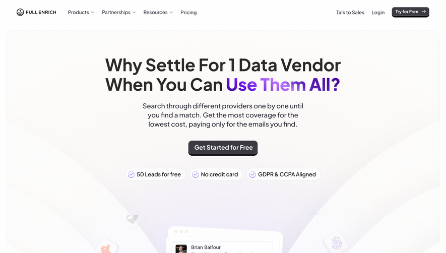


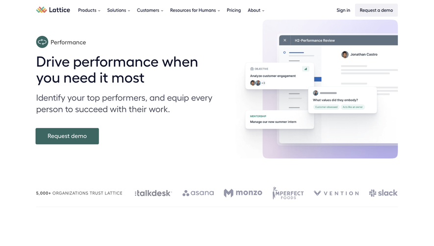

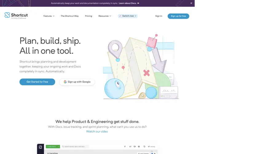

Upgrade to SaaSFrame Pro now to see similar examples.
Monthly
$18 /month
Billed $18 monthly
Browse all screens & flows
Filter and search screens & flows
Search text in screenshots
Access Figma files
Access mobile versions
Join now
Quarterly
$16 /month
Billed $48 quarterly
Browse all screens & flows
Filter and search screens & flows
Search text in screenshots
Access Figma files
Access mobile versions
Join now
Yearly
$15 /month
Billed $180 yearly
Browse all screens & flows
Filter and search screens & flows
Search text in screenshots
Access Figma files
Access mobile versions
Join now