Design with AI
Generate a new design based on this screen using your own content.
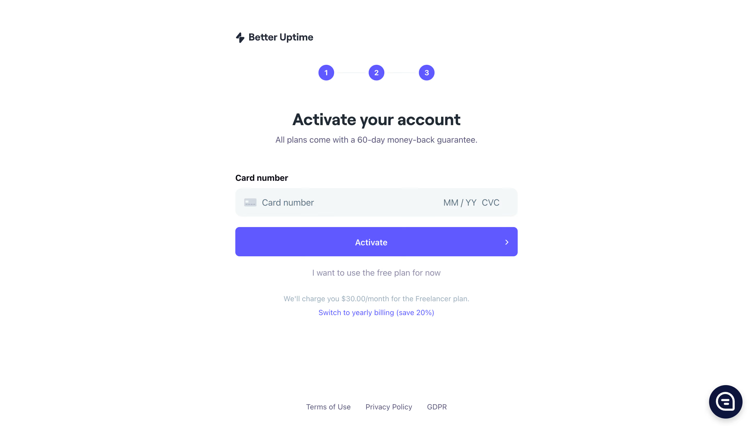
# Design from Reference: Better Stack etter Uptime Account Setup
Create an original, high-fidelity visual design inspired by the reference. Prioritize composition, typography, colors, spacing, and component styling over technical implementation.
## Reference
- **Product:** Better Stack
- **Category:** Account Setup
- **Screenshot:** https://cdn.prod.website-files.com/5e9dc792e1210c5325f7ebbc/6acb6ae5bf2e69a0c03b6b7f_6acb6a04096561906c247b22_cms-72b3af0ba1a6d62f6f163558.webp
Analyze the screenshot first. If inaccessible, request it rather than guessing.
## Content
{{content.instructions}}
{{content.data}}
Preserve essential messaging and factual accuracy. Adapt structure and copy length for visual balance; never invent product claims.
## Visual Design
### Overall aesthetic
- **Style:** A minimal account-activation/payment step on white, using a narrow centered form and a single vivid violet action.
- **Character:** Professional and quiet. A compact progress indicator and low-emphasis billing details support the task without decorative imagery.
### Page composition
- **Capture and scale:** The screenshot is 2880 × 1642 pixels, consistent with an estimated 2× capture. Following dimensions are estimated CSS pixels under that assumption.
- **Frame:** The central form is approximately 540 px wide. The Better Uptime lockup aligns with its left edge near the top, while the progress indicator, heading, and supporting sentence are centered.
- **Sequence:** Three numbered progress circles precede the activation heading and guarantee line. A card-number label and combined payment field lead to a full-width Activate button, a free-plan alternative, and two small billing-information lines.
- **Footer:** Three legal links are centered near the lower edge, with a circular dark support control at bottom right. No enclosing form card is present.
### Information hierarchy
- **Primary task:** The activation heading establishes the step; the violet button is the strongest colored element.
- **Field priority:** The payment label is bold and left aligned. Card number, expiration, and security-code placeholders share one continuous input surface.
- **Alternatives:** The free-plan text is secondary, and billing amount/period information is tertiary. A violet yearly-billing link remains identifiable below.
### Typography
- **Family:** A neutral sans serif is visible; the exact font is unverified.
- **Headings:** The main heading is approximately 30–32 px CSS, weight 700, with compact 38 px line-height. Brand text is about 18 px semibold.
- **Controls and support:** Labels and controls are around 16 px. Supporting copy is approximately 15–16 px, while billing notes and legal links are around 13–14 px.
- **Alignment:** Use centered explanatory and billing copy, with the form label and payment content left aligned.
### Colors & surfaces
- **Foundation:** Sampled sRGB #FFFFFF defines the page and #F3F7F8 the payment field.
- **Primary accent:** Sampled violet #6059FF fills the numbered progress circles and primary button, and colors the billing-switch link.
- **Ink:** Sampled #202B36 and #212839 support dark brand/heading text, #0D153C the dark support control, and #575777 the softer explanatory tone.
- **Subtle text:** Billing notes use a pale blue-gray, visibly lighter than ordinary copy; its exact hex value is unverified.
### Components
- **Progress:** Three small violet circles with white numbers are connected by fine pale horizontal lines. Each is approximately 30 px in diameter.
- **Payment field:** A roughly 56 px-high pale rounded field uses a 12–14 px radius, a small card icon left, and expiration/security placeholders right.
- **Primary action:** The full-width button is approximately 56 px high with a 7–8 px radius, centered bold label, and a small right chevron at the far edge.
- **Support and legal:** A navy circular support button has a white outlined icon and soft shadow. Legal links are plain text with generous horizontal gaps.
### Visual rhythm
- **Vertical spacing:** Allow about 45–55 px between progress and heading, around 50 px before the field label, and roughly 20 px between input and button.
- **Secondary stack:** The free-plan alternative and billing notes form a centered, progressively quieter stack with 20–30 px intervals.
- **Negative space:** Keep broad white margins around the form and a large gap before the legal footer.
### Responsive
- **Observed state:** Only desktop is visible.
- **Recommended reflow:** Use a fluid form capped near 540 px with 20–24 px mobile gutters. Preserve readable payment subfields and allow billing notes and legal links to wrap.
- **Task access:** Keep both activation and the free-plan alternative clearly accessible without overlap from the support control.
### Adaptation guidance
- **Preserve:** Retain the simple progress-to-form sequence, pale integrated payment surface, violet primary action, and understated billing explanation.
- **Adapt:** Use actual payment-provider fields, plan details, trial terms, and available alternatives supplied for the new product.
- **Avoid:** Do not infer validation, completed-step states, or payment outcomes that are not shown.
Use this context to reproduce the reference's visual language: layout, typography, colors, spacing, borders, radii, and distinctive elements. The screenshot takes priority if descriptions conflict.
## Direction
{{preferences.fidelityInstructions}}
## Output
{{output.instructions}}
Deliver a polished, cohesive design with precise alignment, hierarchy, and spacing. Produce the requested visual artifact, not just a description. If unsupported, explain the limitation.