Overall Style and Aesthetic
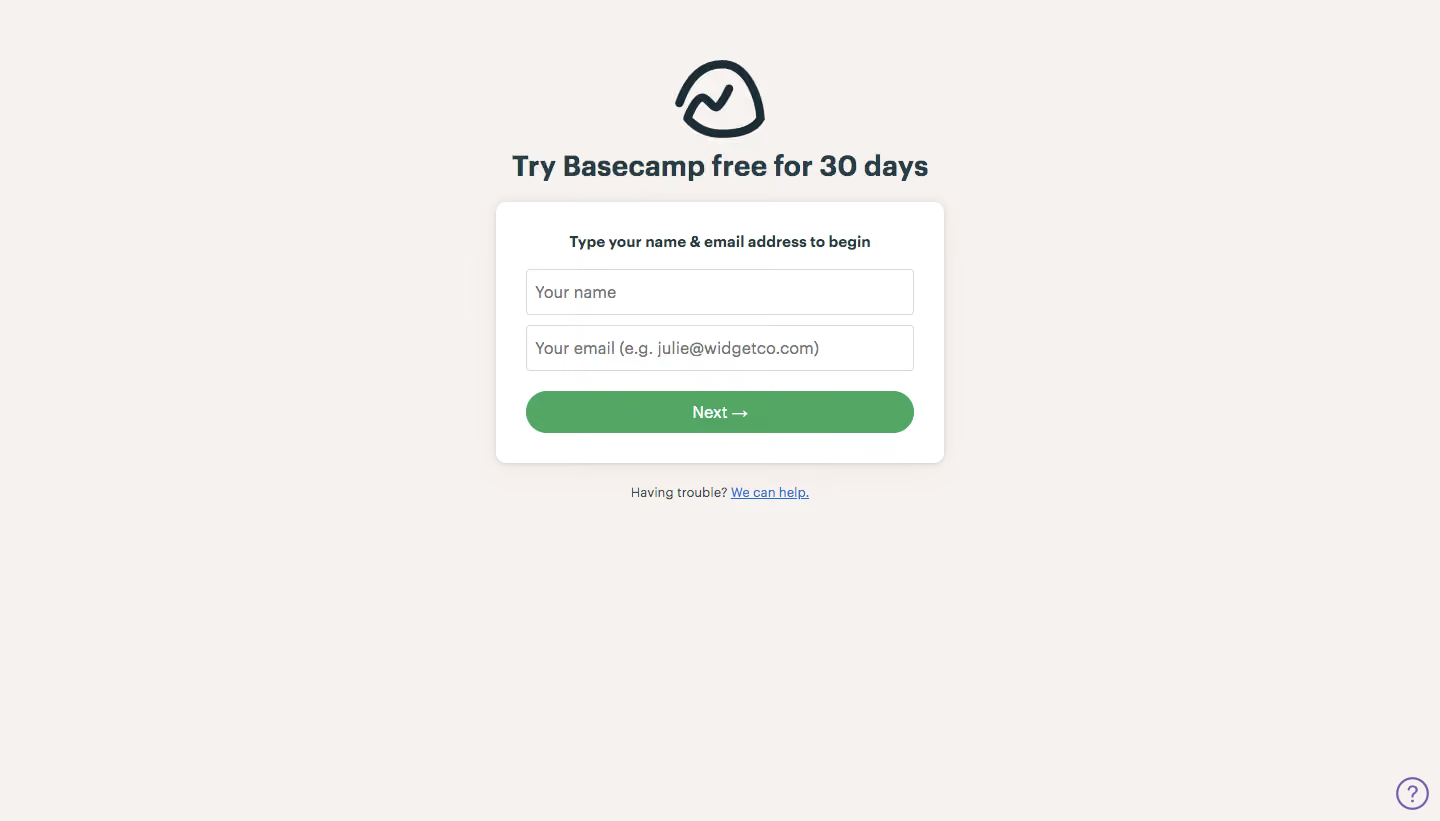
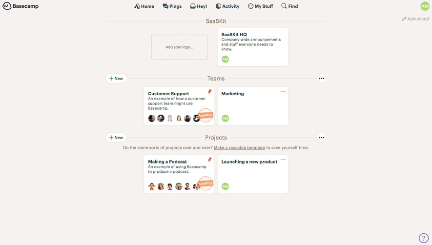
Basecamp’s signup page embraces a clean, modern, and approachable design. The minimalist aesthetic focuses on clarity and comfort, ensuring users aren’t overwhelmed. Ample white space gives the content room to breathe, while subtle pops of brand colors inject warmth and friendliness, which supports a tone that feels inviting and dependable. Layout and Structure
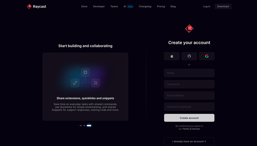
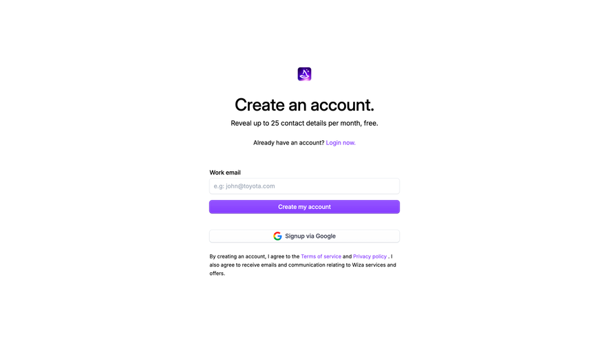
The page structure is streamlined for efficiency: a prominent hero section immediately presents the signup form alongside benefit-oriented copy and a visually engaging illustration. There are no distracting extras—no pricing tables, testimonials, or dense feature lists—only concise copy that reassures the user and nudges them toward action. The sticky header with a logo and navigation provides subtle brand presence, while a compact footer offers key links for support and company info. Visual Elements
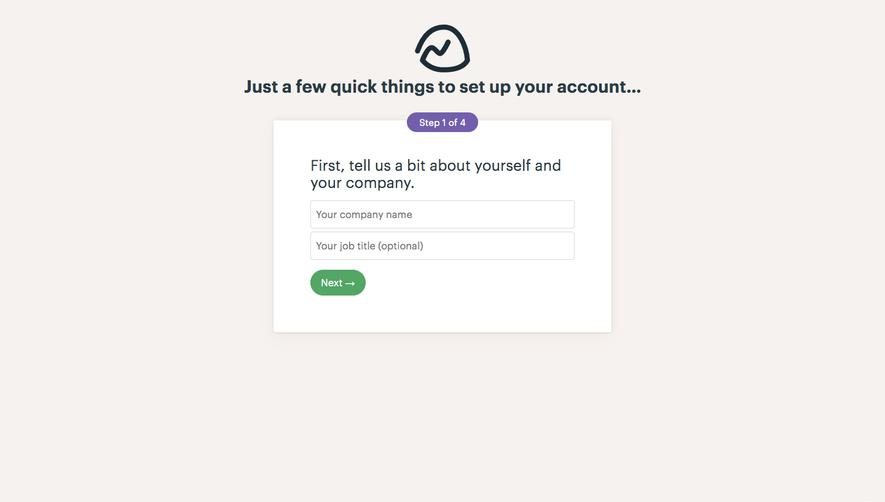
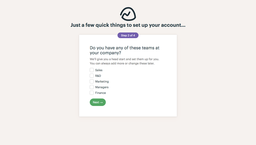
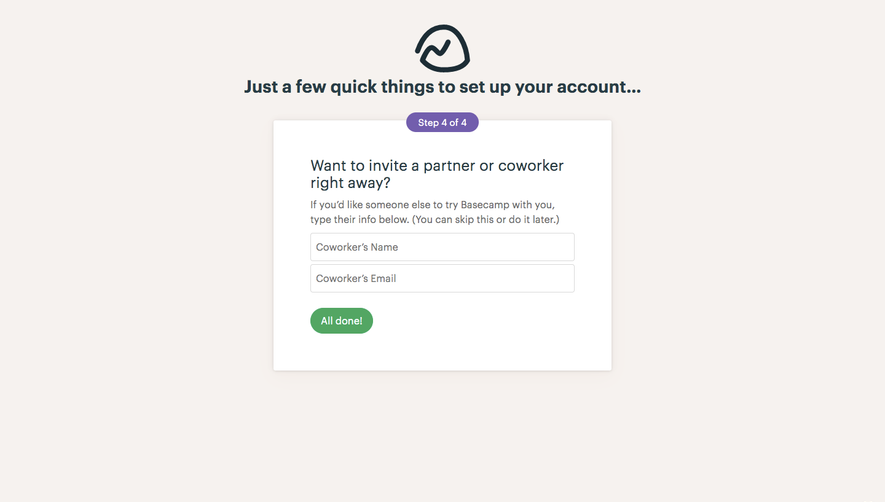
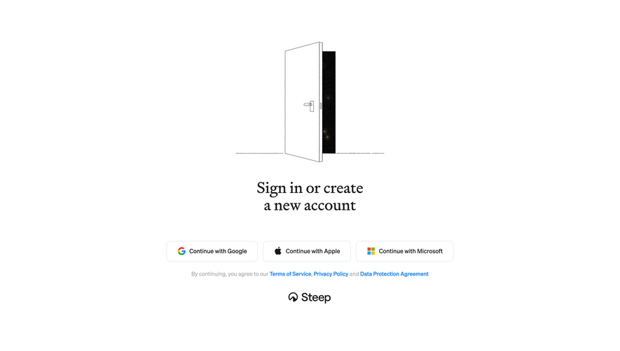
Illustrative graphics add personality without detracting from the form’s simplicity. The hero illustration feels handcrafted and quirky, giving the brand an approachable and memorable touch. Gentle animations draw attention to CTAs and indicate progress through the simple, multi-step form, quietly enhancing usability. Color Palette and Typography
Basecamp’s palette mixes crisp whites with soft grays, grounded by a confident but subdued blue for primary actions. Accent colors from the brand’s illustration palette bring life without clutter. Typography is purposeful: a prominent, highly-legible sans-serif for headings and simple body copy maintains clarity and hierarchy throughout the page. User Experience Patterns
Frictionless navigation and a straightforward, single-focus form make the experience intuitive. Microcopy beneath the form fields boosts trust, clarifying privacy and commitment. Primary CTAs are bold and unmistakable, standing out with color contrast and spacious touch targets. Responsive design ensures usability across devices, while subtle progress indicators build confidence for every signup step. Unique or Notable Design Choices
Basecamp’s choice to forgo testimonials and in-depth feature breakdowns on the signup page is bold and focused, reducing cognitive load for new users. The quirky, hand-drawn illustration style differentiates the brand, while friendly microcopy and a frictionless form turn signup into a welcoming, human experience. The design radiates trustworthiness and simplicity, inspiring users to take action without distraction.