Design with AI
Generate a new design based on this screen using your own content.
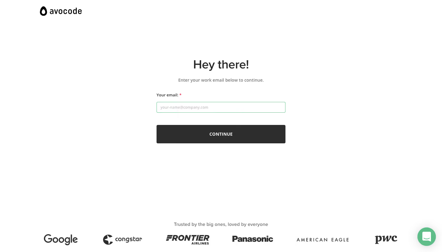
# Design from Reference: Avocode Signup Page
Create an original, high-fidelity visual design inspired by the reference. Prioritize composition, typography, colors, spacing, and component styling over technical implementation.
## Reference
- **Product:** Avocode
- **Category:** Signup
- **Screenshot:** https://cdn.prod.website-files.com/5e9dc792e1210c5325f7ebbc/6acbd0408f05a14579f046fe_6acbcd23d6be908889c90a5e_cms-53fa3b9723d4cc3a3c0ae4c1.webp
Analyze the screenshot first. If inaccessible, request it rather than guessing.
## Content
{{content.instructions}}
{{content.data}}
Preserve essential messaging and factual accuracy. Adapt structure and copy length for visual balance; never invent product claims.
## Visual Design
### Overall aesthetic
- **Character:** A minimal work-email signup screen with a white canvas, dark action and quiet green input/chat accents.
- **Trust:** A bottom row of large grayscale customer logos adds reassurance without competing with the form.
### Page composition
- **Capture:** The source measures 1440 × 821 image pixels. A 1× CSS scale is plausible but unverified.
- **Brand:** The Avocode symbol/wordmark sits at upper left with broad surrounding whitespace.
- **Form:** A roughly 420-pixel-wide group is centered in the upper-middle viewport, containing greeting, instruction, one labeled email field and a full-width action.
- **Bottom region:** A centered trust statement sits above six customer logos; a green chat launcher floats at lower right.
### Information hierarchy
- **Greeting:** “Hey there!” is the dominant heading.
- **Instruction:** A muted sentence asks for work email before continuing.
- **Field:** A bold Your email label includes a red required asterisk, followed by an empty green-outlined input.
- **Action:** CONTINUE is the only filled form action; the trust region is secondary.
### Typography
- **Family:** A rounded sans serif is visible; exact identity is unverified.
- **Heading:** Approximately 38 image pixels, semibold.
- **Instruction:** Around 14 pixels, medium, in gray.
- **Label/action:** Labels are approximately 13 pixels; the button label is around 14 pixels, bold and uppercase.
- **Trust:** The reassurance line is around 14 pixels, with partner logos using their own artwork.
### Colors & surfaces
- **Measured palette:** ICC-aware sRGB sampling yields white #FFFFFF, dark action/text #2D2D2D/#2E2E2E and green #5EBD89.
- **Secondary tones:** Muted gray supports instruction/placeholders; a small red asterisk marks required status.
- **Treatment:** No enclosing card or shadow appears. Input and button have small corners around 3–4 pixels.
### Components
- **Email field:** A roughly 420 × 35-pixel white input has a fine green border and light example-address placeholder.
- **Continue:** A matching-width dark rectangle around 60 pixels high has centered white text.
- **Trust logos:** Six grayscale brands occupy one evenly spaced row, visually aligned despite varied wordmark shapes.
- **Chat:** A circular green launcher with white speech-bubble symbol sits clear of the form.
### Visual rhythm
- **Spacing:** A generous gap separates greeting/instruction from the field, and about 40 pixels separates input and action.
- **Alignment:** Label, input and button share edges; heading and instruction center above them.
- **Whitespace:** A large blank region between form and trust logos keeps the page sparse.
### Responsive
- **Recommendation:** Make the form fluid within comfortable phone gutters and preserve a large action target.
- **Recommendation:** Wrap customer logos into two or three rows and keep chat from overlapping content. No mobile rendering is shown.
### Adaptation guidance
- **Preserve:** Retain the single-field progression, explicit work-email instruction and restrained trust region.
- **Implement:** Provide accessible email labeling, validation and visible focus states; the green border alone does not establish behavior.
- **Clarity:** Keep customer logos secondary and avoid adding extra fields before the initial email step.
Use this context to reproduce the reference's visual language: layout, typography, colors, spacing, borders, radii, and distinctive elements. The screenshot takes priority if descriptions conflict.
## Direction
{{preferences.fidelityInstructions}}
## Output
{{output.instructions}}
Deliver a polished, cohesive design with precise alignment, hierarchy, and spacing. Produce the requested visual artifact, not just a description. If unsupported, explain the limitation.