Overall Style and Aesthetic
Atlas.co’s pricing page encapsulates a sleek, modern minimalist aesthetic. Clean lines, ample white space, and subtle color accents project professionalism, while understated micro-interactions lend a touch of playfulness. The design projects quiet confidence—elegant, approachable, and undeniably contemporary—making visitors feel at ease while evaluating options. Layout and Structure
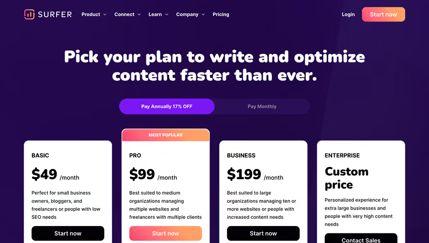
The page gracefully guides the user through a clear information hierarchy. A concise hero section introduces the value proposition, followed by a visually engaging pricing table centered on the page. Each pricing tier is easy to scan, paired with feature checklists and prominent CTAs. Supporting elements, such as FAQs and a straightforward footer, streamline decision-making without distraction. Visual Elements
Distinctive, map-inspired illustrations reinforce the product’s geo-centric theme, while gentle animations and interactive hover states add dynamism without overwhelming the eye. Custom icons accompany feature lists, enhancing clarity and lending visual consistency. Photography is minimal, maintaining focus on UI and supporting graphics. Color Palette and Typography
A harmonious palette of calming blues, fresh teals, and restrained neutrals creates a sense of trust and clarity. Typography balances a modern sans-serif for headlines with legible body text, using weight and scale to establish contrast and guide attention naturally from one section to the next. User Experience Patterns
Sticky navigation, intuitive toggles (annual vs. monthly billing), and inviting CTAs streamline the journey. Forms are succinct and unobtrusive, and visual feedback reassures users as they interact. Scroll speed feels calibrated for clarity, not rush. Unique or Notable Design Choices
What stands out is the seamless integration of brand identity—map motifs, soft geometric patterns, and playful yet professional iconography—all adding coherence and memorability. The page feels fresh, transparent, and user-empowering, cultivating an air of innovation and reliability perfectly suited for a next-generation SaaS product.