Design with AI
Generate a new design based on this screen using your own content.
# Design from Reference: Appcues Thank You Page
Create an original, high-fidelity visual design inspired by the reference. Prioritize composition, typography, colors, spacing, and component styling over technical implementation.
## Reference
- **Product:** Appcues
- **Category:** Thank You Page
- **Screenshot:** https://cdn.prod.website-files.com/5e9dc792e1210c5325f7ebbc/6acad845b3daa04f542762ab_6acad7cafbf1299940aac26a_cms-ca3fb3c63835e0278db1abb4.webp
Analyze the screenshot first. If inaccessible, request it rather than guessing.
## Content
{{content.instructions}}
{{content.data}}
Preserve essential messaging and factual accuracy. Adapt structure and copy length for visual balance; never invent product claims.
## Visual Design
### Overall aesthetic
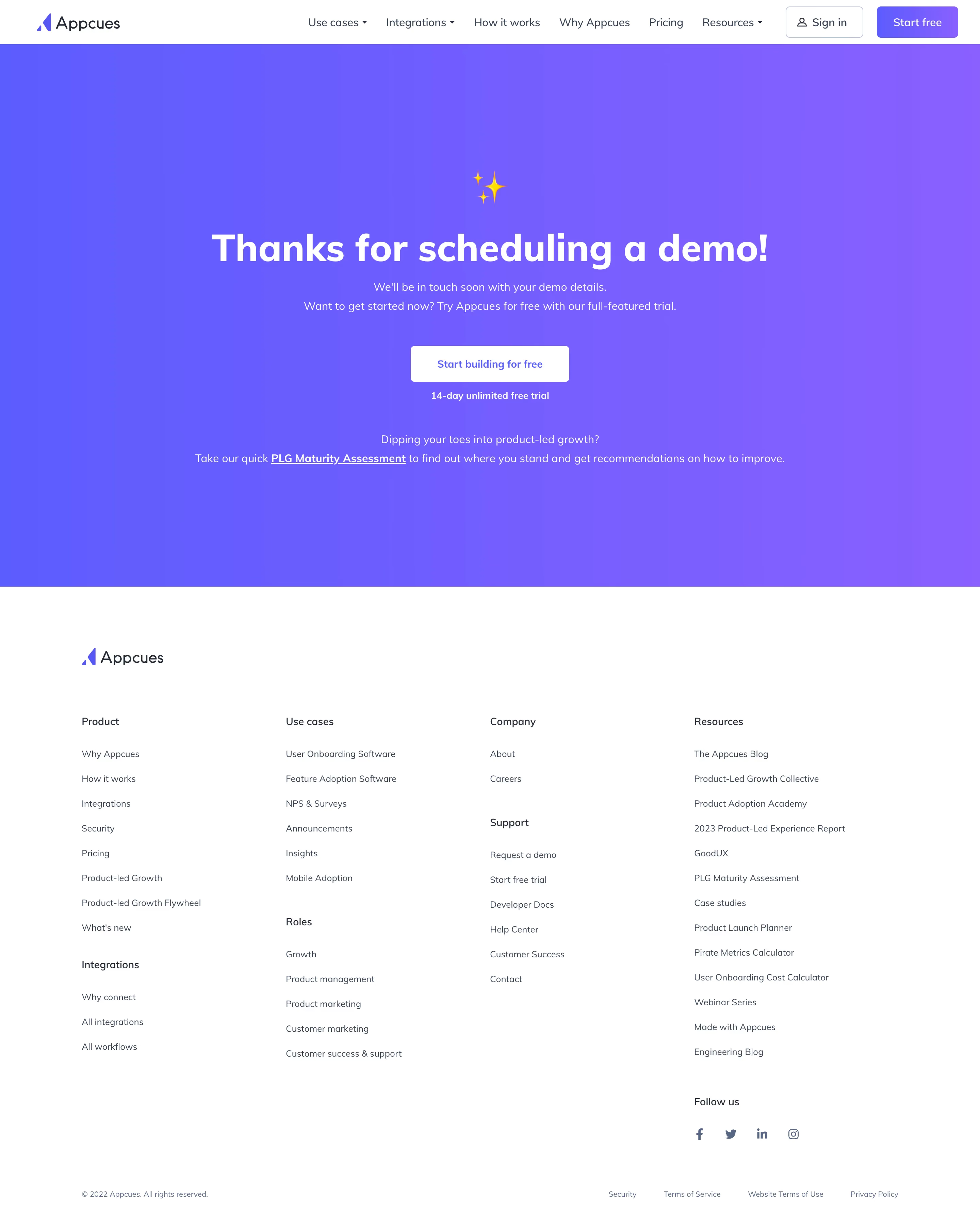
- **Character:** Celebratory demo-confirmation page with a large blue-to-violet gradient, white centered content and a clean white footer.
- **Accent:** Small yellow sparkle graphic and white trial action reinforce the thank-you state.
- **Scale:** The source measures 2880 × 3608 px. Dimensions below estimate a 1440 × 1804 CSS layout at 2× scale; device ratio and zoom are unverified. Two portions were inspected.
### Page composition
- **Header:** White navigation row includes wordmark, six link groups, outlined sign-in and purple free-start action.
- **Confirmation band:** A full-width gradient region contains sparkle, large thank-you heading, two explanatory lines, white trial button and small trial reassurance.
- **Secondary link:** A short assessment invitation sits lower in the same gradient area.
- **Footer:** White section includes brand mark and four main columns with secondary subgroups, social links and bottom legal row.
### Information hierarchy
- **Confirmation:** Large heading states that a demo has been scheduled.
- **Next expectation:** Smaller copy says details will follow.
- **Immediate action:** Trial-start button offers a separate product path.
- **Secondary resource:** Underlined assessment link provides another option.
- **State truth:** This describes the captured confirmation screen; no demo booking is performed here.
### Typography
- **Family:** Rounded geometric sans-serif; exact identity is unverified.
- **Heading:** Approximately 56–60 CSS px, bold, centered.
- **Body:** Around 16–17 px with 28 px leading.
- **Action:** Approximately 16 px medium/bold.
- **Footer:** Group labels around 15 px; links about 13–14 px and muted.
### Colors & surfaces
- **Measured base:** ICC-aware sRGB sampling yields #FFFFFF.
- **Measured gradient:** #8A5DFF, #655DFF, #805EFF and #6F5CFF occur across the large violet/blue band.
- **Foreground:** White text contrasts with gradient; footer uses dark slate and muted blue-gray.
- **Accent:** Yellow sparkle is localized above the heading.
- **Depth:** Flat sections and small button corners dominate.
### Components
- **Sparkle:** Small yellow multi-star graphic centered above the message.
- **Trial button:** White rounded rectangle with purple caption.
- **Assessment link:** Underlined inline destination within centered copy.
- **Header actions:** Outlined sign-in with person icon and filled purple signup.
- **Footer groups:** Four columns contain multiple small subsections and plain links.
- **Social/legal:** Small icons and legal links align along lower footer rows.
### Visual rhythm
- **Center axis:** Sparkle, heading, copy and action align centrally.
- **Spacing:** Large gradient padding gives the confirmation message ample room.
- **Hierarchy:** Secondary assessment copy sits well below the primary action.
- **Footer:** Broad gutters and generous line spacing organize many links.
### Responsive
- **Evidence limit:** Only desktop is shown; recommendations follow.
- **Header:** Collapse navigation.
- **Message:** Scale heading fluidly and preserve readable line breaks.
- **Footer:** Reduce columns progressively.
- **Actions:** Keep trial and assessment targets clear and touchable.
### Adaptation guidance
- **Reusable pattern:** Confirm the request, set follow-up expectations and offer an optional immediate next step.
- **Visual discipline:** Use celebration accents sparingly within one strong color band.
- **Accessibility:** Maintain contrast across the gradient and clear link/focus states.
- **State clarity:** Distinguish confirmation messaging from actual booking data.
Use this context to reproduce the reference's visual language: layout, typography, colors, spacing, borders, radii, and distinctive elements. The screenshot takes priority if descriptions conflict.
## Direction
{{preferences.fidelityInstructions}}
## Output
{{output.instructions}}
Deliver a polished, cohesive design with precise alignment, hierarchy, and spacing. Produce the requested visual artifact, not just a description. If unsupported, explain the limitation.