Overall Style and Aesthetic
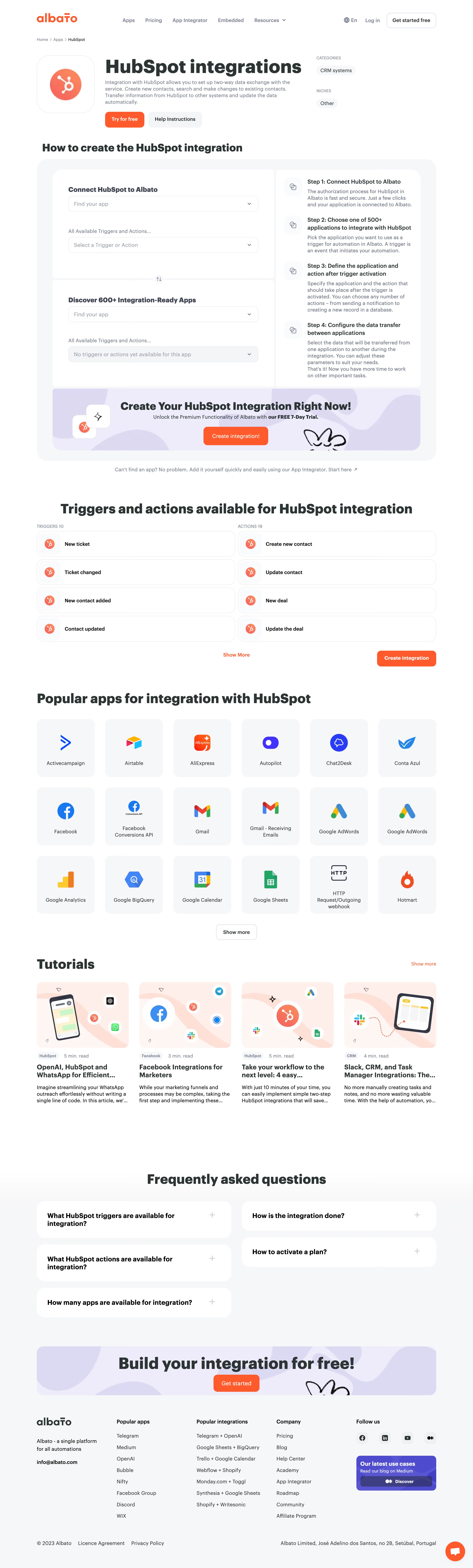
Albato’s HubSpot integration page exemplifies a clean, modern SaaS aesthetic with a strong sense of professionalism. The interface embraces abundant white space, balanced by vibrant accent hues, which creates an inviting and uncluttered visual experience. The site’s approach feels welcoming yet authoritative—striking a balance between friendly accessibility and enterprise-level trustworthiness. Layout and Structure
The page follows a logical, user-centric flow. It opens with a compact hero section that immediately communicates value with clear headlines, concise copy, and a high-impact call to action. Key features are showcased in digestible blocks below, enhanced by custom icons and succinct explanations. Further down, user testimonial elements foster credibility. The structure is easy to scan, with a sticky CTA and navigation bar providing continual access to essential links. Visual Elements
Engaging, flat-style illustrations and precise icons replace generic stock photography, lending the page a custom and dynamic energy. Animation is subtle, used to highlight interactivity and guide attention without overwhelming. Key integrations are visually grouped, making the platform’s capabilities instantly clear. Color Palette and Typography
A fresh palette centers on pure whites, deep blues, and energetic oranges, ensuring vital elements stand out. Headings use bold, geometric typefaces while body text remains highly legible with sans-serif fonts, enhancing information hierarchy and scannability. User Experience Patterns and Distinctiveness
Navigation is frictionless, with sticky menus and thoughtful anchor links. Prominent CTAs invite interaction, and micro-interactions provide satisfying feedback. What sets this design apart is its restraint—visuals and content are purposefully optimized, crafting an experience that feels innovative, confident, and genuinely user-focused.