Figma file available



Payhawk Design System
Stack & Platform \- Custom marketing site (not Webflow/Framer); hosted via GCS (storage.googleapis.com) for all media assets \- GTM-P9LFLVK for analytics; no detectable CSS framework (no Tailwind/Bootstrap classes in markup) \- Mobile-responsive with dedicated mobile video/image variants (mobile\_image\_alt) \- App: React Native (iOS + Android)
Color Philosophy \- Dual-mode layout: dark hero sections (near-black navy background) contrast with light/white content sections \- Primary brand: deep navy/midnight blue (#0A0F1E approx.) for hero; pure white (#FFFFFF) for content \- Accent: vivid electric blue / indigo for CTAs and interactive elements \- Secondary neutral: warm stone/beige used for illustration backgrounds ("stone" suffix in SVG filenames like approvals-home-stone.svg) \- Success/positive: green tones for stats and growth indicators \- Meta theme-color: #ffffff signals predominantly light UI
Typography \- Display/hero: Large serif-influenced or geometric sans, bold weight — headline "Smart money just got smarter" uses italic emphasis \- Body: Clean geometric sans-serif (likely Inter, Plus Jakarta Sans, or custom) \- Scale: Display (~56–72px) → H2 (~36–44px) → H3 (~24px) → Body (~16–18px) → Caption (~14px) \- Font weight range: 400 (body) → 600 (subheadings) → 700–800 (display) \- Line height: generous (~1.4–1.6) for readability in enterprise context
Spacing & Layout \- Section padding: generous vertical rhythm (~80–120px between major sections) \- Container: centered max-width (~1200–1280px) with responsive gutter \- Grid: 12-column; feature sections use 2-col and 3-col card grids \- Card layout: rounded corners, consistent inner padding (~24–32px) \- Stats bar: horizontal scroll marquee with large numerics
Component Defaults \- Buttons: Primary = filled electric blue with arrow icon; Secondary = ghost/outline; pill-shaped radius (~8–12px) \- Cards: Subtle shadow, rounded corners (~12–16px), white or stone background \- Navigation: Sticky top nav, white bg, dropdown megas for Product/Resources \- Accordions: Plus/minus icon pattern for platform feature sections \- Testimonials: Photo + logo + quote card in horizontal slider \- Badges/Tags: Small pill labels ("NEW", category tags) in high-contrast
Dark / Light Mode \- Light mode is primary (meta theme-color: #ffffff) \- Dark sections are layout-specific (hero, CTA banners) — not OS-level dark mode toggle \- Hero video has explicit dark variant (Hero animation dark travel)
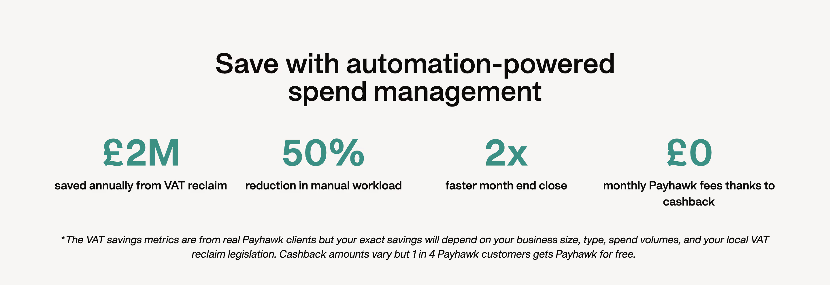
Notable Patterns \- Italic emphasis in headlines for brand voice ("smarter", "30 days") \- Metric callouts: large number + small descriptor stacked \- Dual image sources: desktop + mobile versions for every visual
/ ============================================ Payhawk Design System — CSS Custom Properties Derived from visual & structural analysis ============================================ /
:root { / --- Brand Colors --- / --color-brand-primary: #1A2BCC; / Electric blue — CTA buttons, links / --color-brand-primary-hover: #1420A8; / Darker blue on hover / --color-brand-navy: #0A0F1E; / Deep navy — hero backgrounds / --color-brand-navy-mid: #111827; / Slightly lighter navy for sections /
/ --- Neutral Palette --- / --color-white: #FFFFFF; --color-stone-50: #F9F7F4; / Warm off-white — illustration bg / --color-stone-100: #F2EDE8; / Light stone — card backgrounds / --color-stone-200: #E5DDD5; / Dividers on light sections / --color-gray-400: #9CA3AF; / Secondary text, captions / --color-gray-600: #4B5563; / Body text secondary / --color-gray-900: #111827; / Primary body text /
/ --- Semantic Colors --- / --color-text-primary: #111827; --color-text-secondary: #4B5563; --color-text-inverse: #FFFFFF; / Text on dark backgrounds / --color-text-muted: #9CA3AF; --color-bg-page: #FFFFFF; --color-bg-section-dark: #0A0F1E; --color-bg-section-stone: #F9F7F4; --color-bg-card: #FFFFFF; --color-border: #E5E7EB; --color-border-subtle: #F3F4F6;
/ --- Interactive States --- / --color-cta-bg: #1A2BCC; --color-cta-bg-hover: #1420A8; --color-cta-text: #FFFFFF; --color-link: #1A2BCC; --color-link-hover: #1420A8;
/ --- Status / Accent --- / --color-success: #16A34A; --color-success-light: #DCFCE7; --color-info: #3B82F6; --color-warning: #F59E0B;
/ --- Typography --- / --font-family-base: 'Inter', 'Plus Jakarta Sans', system-ui, -apple-system, sans-serif; --font-family-display: var(--font-family-base);
--font-size-xs: 0.75rem; / 12px / --font-size-sm: 0.875rem; / 14px / --font-size-base: 1rem; / 16px / --font-size-md: 1.125rem; / 18px / --font-size-lg: 1.25rem; / 20px / --font-size-xl: 1.5rem; / 24px / --font-size-2xl: 2rem; / 32px / --font-size-3xl: 2.5rem; / 40px / --font-size-4xl: 3rem; / 48px / --font-size-5xl: 3.75rem; / 60px / --font-size-6xl: 4.5rem; / 72px — hero display /
--font-weight-regular: 400; --font-weight-medium: 500; --font-weight-semibold: 600; --font-weight-bold: 700; --font-weight-extrabold: 800;
--line-height-tight: 1.2; --line-height-snug: 1.35; --line-height-normal: 1.5; --line-height-relaxed: 1.65;
/ --- Spacing --- / --space-1: 0.25rem; / 4px / --space-2: 0.5rem; / 8px / --space-3: 0.75rem; / 12px / --space-4: 1rem; / 16px / --space-5: 1.25rem; / 20px / --space-6: 1.5rem; / 24px / --space-8: 2rem; / 32px / --space-10: 2.5rem; / 40px / --space-12: 3rem; / 48px / --space-16: 4rem; / 64px / --space-20: 5rem; / 80px / --space-24: 6rem; / 96px / --space-32: 8rem; / 128px — large section padding /
/ --- Border Radius --- / --radius-sm: 4px; --radius-md: 8px; --radius-lg: 12px; --radius-xl: 16px; --radius-2xl: 24px; --radius-full: 9999px; / Pills, badges /
/ --- Shadows --- / --shadow-sm: 0 1px 3px rgba(0, 0, 0, 0.08); --shadow-md: 0 4px 12px rgba(0, 0, 0, 0.10); --shadow-lg: 0 8px 24px rgba(0, 0, 0, 0.12); --shadow-xl: 0 16px 48px rgba(0, 0, 0, 0.14); --shadow-card: 0 2px 8px rgba(10, 15, 30, 0.08);
/ --- Layout --- / --container-max-width: 1280px; --container-padding: 1.5rem; --grid-columns: 12; --grid-gap: 1.5rem;
/ --- Motion --- / --transition-fast: 150ms ease; --transition-base: 250ms ease; --transition-slow: 400ms ease; --transition-page: 600ms ease; }
/ Dark section overrides (hero, CTA banners — not OS dark mode) / [data-theme='dark'], .section--dark { --color-text-primary: #FFFFFF; --color-text-secondary: rgba(255, 255, 255, 0.70); --color-text-muted: rgba(255, 255, 255, 0.45); --color-bg-card: rgba(255, 255, 255, 0.06); --color-border: rgba(255, 255, 255, 0.10); --color-bg-page: #0A0F1E; }
Color Tokens
| Token | Value | Usage |
|---|---|---|
| brand-primary | #1A2BCC | CTA buttons, links, active states |
| brand-primary-hover | #1420A8 | Button hover |
| brand-navy | #0A0F1E | Hero section backgrounds |
| brand-navy-mid | #111827 | Dark section body |
| white | #FFFFFF | Page background, inverse text |
| stone-50 | #F9F7F4 | Warm off-white section bg |
| stone-100 | #F2EDE8 | Card backgrounds (light) |
| stone-200 | #E5DDD5 | Dividers on stone sections |
| gray-400 | #9CA3AF | Muted / caption text |
| gray-600 | #4B5563 | Secondary body text |
| gray-900 | #111827 | Primary body text |
| success | #16A34A | Positive metrics, indicators |
| info | #3B82F6 | Informational accents |
| warning | #F59E0B | Alerts, caution states |
Spacing Tokens
| Token | rem | px | Usage |
|---|---|---|---|
| space-1 | 0.25rem | 4px | Micro gaps |
| space-2 | 0.5rem | 8px | Inline spacing |
| space-3 | 0.75rem | 12px | Compact padding |
| space-4 | 1rem | 16px | Base padding |
| space-6 | 1.5rem | 24px | Card inner padding |
| space-8 | 2rem | 32px | Component spacing |
| space-12 | 3rem | 48px | Sub-section gap |
| space-16 | 4rem | 64px | Section top/bottom |
| space-20 | 5rem | 80px | Large section padding |
| space-24 | 6rem | 96px | Hero inner padding |
| space-32 | 8rem | 128px | Max section vertical rhythm |
Typography Tokens
| Token | Size | Weight | Line Height | Usage |
|---|---|---|---|---|
| text-xs | 12px | 400 | 1.5 | Labels, legal |
| text-sm | 14px | 400 | 1.5 | Captions, meta |
| text-base | 16px | 400 | 1.65 | Body copy |
| text-md | 18px | 400–500 | 1.6 | Lead paragraphs |
| text-xl | 24px | 600 | 1.35 | H3 headings |
| text-2xl | 32px | 700 | 1.3 | H2 headings |
| text-3xl | 40px | 700 | 1.25 | Section titles |
| text-4xl | 48px | 800 | 1.2 | Page headings |
| text-5xl | 60px | 800 | 1.15 | Sub-hero display |
| text-6xl | 72px | 800 | 1.1 | Hero display |
| Font family | Inter / Plus Jakarta Sans / system-ui | — | — | All text |
Border Radius Tokens
| Token | Value | Usage |
|---|---|---|
| radius-sm | 4px | Small tags, inputs |
| radius-md | 8px | Buttons, form fields |
| radius-lg | 12px | Cards, modals |
| radius-xl | 16px | Large cards, panels |
| radius-2xl | 24px | Feature image containers |
| radius-full | 9999px | Pill badges, avatar chips |
Shadow Tokens
| Token | Value | Usage |
|---|---|---|
| shadow-sm | 0 1px 3px rgba(0,0,0,0.08) | Subtle lift, dividers |
| shadow-md | 0 4px 12px rgba(0,0,0,0.10) | Cards at rest |
| shadow-lg | 0 8px 24px rgba(0,0,0,0.12) | Dropdown, popovers |
| shadow-xl | 0 16px 48px rgba(0,0,0,0.14) | Modals, overlays |
| shadow-card | 0 2px 8px rgba(10,15,30,0.08) | Feature cards |
Motion Tokens
| Token | Value | Usage |
|---|---|---|
| transition-fast | 150ms ease | Hover microinteractions |
| transition-base | 250ms ease | Standard state changes |
| transition-slow | 400ms ease | Expand/collapse, accordions |
| transition-page | 600ms ease | Page-level transitions |
Framework / Platform Custom-built marketing site (not Webflow or Next.js/Vercel — URL structure and asset hosting pattern suggest a Ruby on Rails or Node CMS with Google Cloud Storage for all media). Mobile app is React Native. GTM tag: GTM-P9LFLVK.
Theme Support No OS-level dark mode toggle. Dark treatment is section-scoped: hero, CTA banners, and announcement bar use #0A0F1E navy backgrounds; body sections remain white or warm stone. Hero video has explicit dark variant (Hero animation dark travel). Meta theme-color is #ffffff.
Data Confidence \- Colors: Medium-high. Navy hero + white body + electric blue CTA is visually unambiguous; exact hex values for brand blue are inferred (not extracted from a CSS file — no raw CSS was accessible). \- Typography: Medium. Font stack inferred from visual style and enterprise SaaS patterns; no @font-face declarations were reachable in the fetched HTML. \- Spacing/radius: Medium. Inferred from layout rhythm and card geometry visible in page structure. \- Tokens: Reconstructed — no design system URL (/tokens, /design) was found publicly.
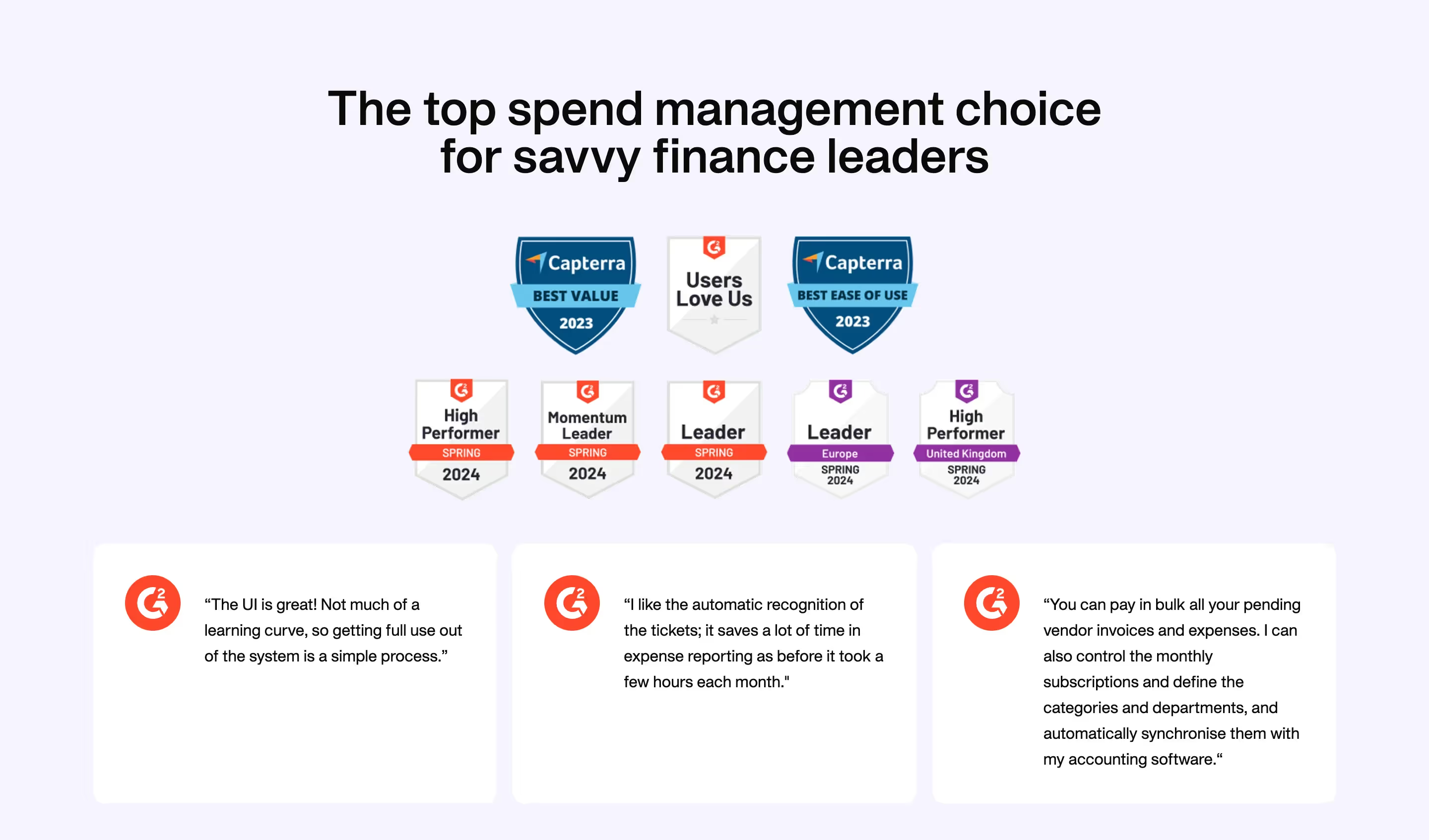
Notable Visual Patterns 1\. Italic emphasis in hero headlines for brand personality ("smarter", "30 days") — consistent rhetorical device. 2\. Large numeric stat callouts (188h, 85%, €2m) in a horizontal marquee ticker. 3\. Stone/beige illustration backgrounds named explicitly in asset filenames (-stone.svg) — a distinct neutral tier between white and dark. 4\. Dual image sources for every section: separate desktop and mobile\_image\_alt crops. 5\. Arrow icon appended to every CTA link — consistent wayfinding element. 6\. Accordion pattern (Plus/Minus icon) used for platform feature disclosure. 7\. "Download logo" button in the navigation bar — signals brand/press audience awareness. 8\. Trust badges clustered: G2 ratings, JP Morgan partnership, Visa license, ICAEW accreditation — social proof is a first-class design element.