Generate a new design based on this screen using your own content.
Thank you! Your submission has been received!
Oops! Something went wrong while submitting the form.
# Design from Reference: WorkOS Customer Stories
Create an original, high-fidelity visual design inspired by the reference. Prioritize composition, typography, colors, spacing, and component styling over technical implementation.
## Reference
- **Product:** WorkOS
- **Category:** Customer Stories
- **Screenshot:** https://cdn.prod.website-files.com/5e9dc792e1210c5325f7ebbc/6acb6adbbf2e69a0c03b6a18_6acb6a07ac21a1e4ab66b663_cms-2a3d6fbb76a980ad8ec40152.webp
Analyze the screenshot first. If inaccessible, request it rather than guessing.
## Content
{{content.instructions}}
{{content.data}}
Preserve essential messaging and factual accuracy. Adapt structure and copy length for visual balance; never invent product claims.
## Visual Design
Use this context to reproduce the reference's visual language: layout, typography, colors, spacing, borders, radii, and distinctive elements. The screenshot takes priority if descriptions conflict.
## Direction
{{preferences.fidelityInstructions}}
## Output
{{output.instructions}}
Deliver a polished, cohesive design with precise alignment, hierarchy, and spacing. Produce the requested visual artifact, not just a description. If unsupported, explain the limitation.
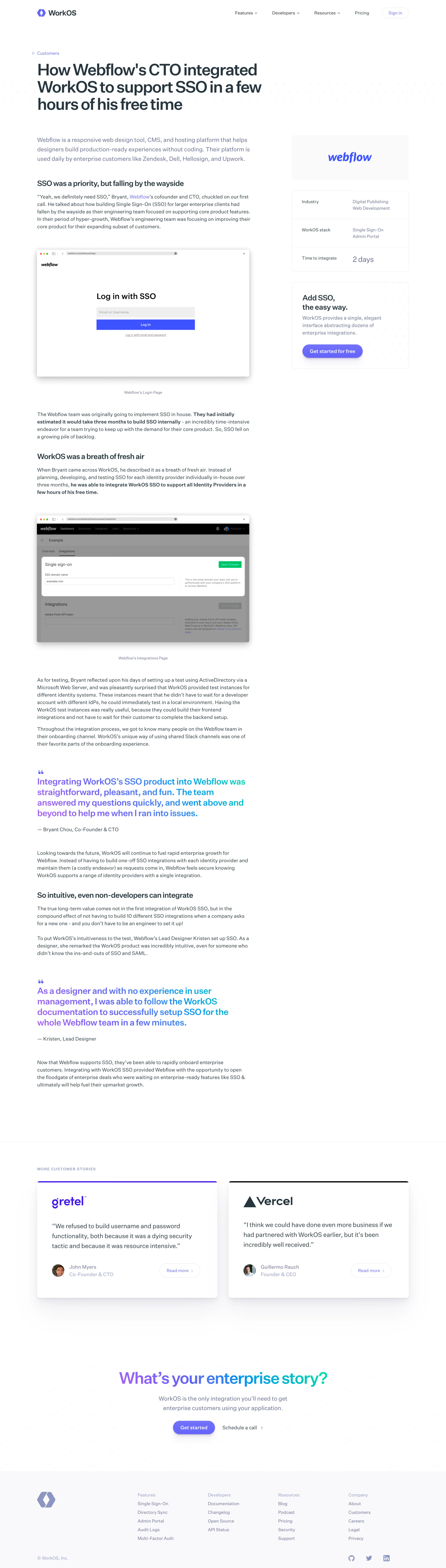
WorkOS’s Webflow customer page radiates a refined, modern professionalism with a minimalist approach. Generous white space underscores a crisp, clean aesthetic, while subtle gradients and high-contrast accents guide attention without visual clutter. The vibe is confident and trustworthy, perfectly matching the target SaaS audience.
Layout and Structure
The structure flows logically from a striking hero section—featuring brand logos, a bold headline, and a succinct value message—into tidy narrative blocks. Case studies and feature highlights alternate with quotes and visuals, sustaining engagement. The absence of overwhelming navigation keeps visitors focused on the story, while CTAs like “See Full Case Study” stay prominent but unobtrusive. The footer smartly aggregates resources and links, wrapping up the user journey seamlessly.
Visual Elements
High-resolution photography of real team members adds authenticity, while animated, looping UI snippets quietly showcase product functionality. Custom iconography and sleek divider lines punctuate information elegantly. The motion is understated—enough to add dynamism, without distraction.
Color Palette and Typography
The palette pairs deep navy blues with clean white, punctuated by lively accent colors for CTAs and highlights. Typography is contemporary and sans-serif, using strong font weights for headings and lighter ones for details, ensuring effortless reading and clear emphasis.
User Experience Patterns & Unique Choices
Smooth transitions, accessible font sizes, and sticky navigation enhance usability. The standout feature: modular case studies blending video, quotes, and interactive elements—presented like editorial spreads. The overall feeling is innovative yet approachable, exuding both clarity and credibility, inspiring confidence in potential customers and designers alike.