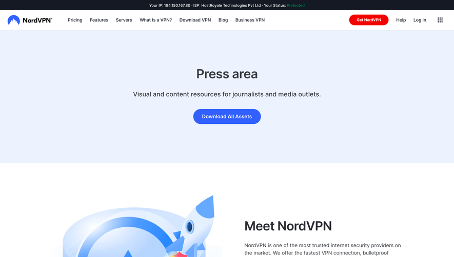
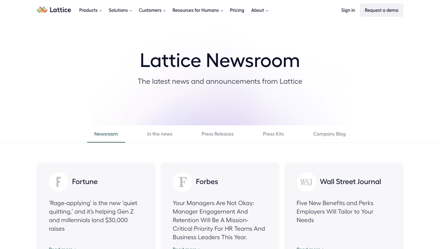
Generate a new design based on this screen using your own content.
Thank you! Your submission has been received!
Oops! Something went wrong while submitting the form.
# Design from Reference: Workable Press Page
Create an original, high-fidelity visual design inspired by the reference. Prioritize composition, typography, colors, spacing, and component styling over technical implementation.
## Reference
- **Product:** Workable
- **Category:** Press Page
- **Screenshot:** https://cdn.prod.website-files.com/5e9dc792e1210c5325f7ebbc/62ec9c75a4f21f750ba274d5_1659622284180-screenshot-device-8b14651e1e3bef859528cd88de375c81-1659602747407.webp
Analyze the screenshot first. If inaccessible, request it rather than guessing.
## Content
{{content.instructions}}
{{content.data}}
Preserve essential messaging and factual accuracy. Adapt structure and copy length for visual balance; never invent product claims.
## Visual Design
Use this context to reproduce the reference's visual language: layout, typography, colors, spacing, borders, radii, and distinctive elements. The screenshot takes priority if descriptions conflict.
## Direction
{{preferences.fidelityInstructions}}
## Output
{{output.instructions}}
Deliver a polished, cohesive design with precise alignment, hierarchy, and spacing. Produce the requested visual artifact, not just a description. If unsupported, explain the limitation.
Workable’s Press page exudes a highly professional, modern minimalism tailored for B2B audiences. The aesthetic prioritizes clarity and function, using plenty of white space, precise alignment, and subtle touches of color that support—rather than distract from—content.
Layout and Structure
Content is organized in a tight, single-column layout, limiting cognitive load. The hero section immediately establishes the page’s purpose with a bold headline and succinct supporting text. Below, press assets and recent media coverage are presented with clear visual hierarchy, featuring logos, clickable email CTAs, and downloadable resources. There’s no clutter: sections flow seamlessly, with ample room to breathe, guiding users efficiently to key information.
Visual Elements
Instead of illustrations or animations, the design leverages strong brand iconography, high-resolution partner logos, and straightforward buttons. There’s an emphasis on sharp imagery over decorative elements, projecting trustworthiness and corporate maturity. Use of photography is minimal and purposeful.
Color Palette and Typography
The palette revolves around cool blue and charcoal accents on a crisp white background, with subtle pops of brand color for links and CTAs. Typography choices combine legibility with style: sans-serif fonts in varying weights create a confident hierarchy, with headlines commanding attention and body text remaining highly readable.
User Experience Patterns
Navigation is streamlined, with the main nav sticky at the top and clear CTAs—like “Contact us”. Download buttons and linked company logos are intuitively placed for easy press access. Information is scannable thanks to well-structured sections and consistent alignment.
Unique or Notable Design Choices
What’s unique is the press-centric focus: instead of using visual flair for engagement, the page builds credibility and accessibility for journalists. The blend of purposeful simplicity with sharp branding feels authoritative and transparent—striking for SaaS inspiration.