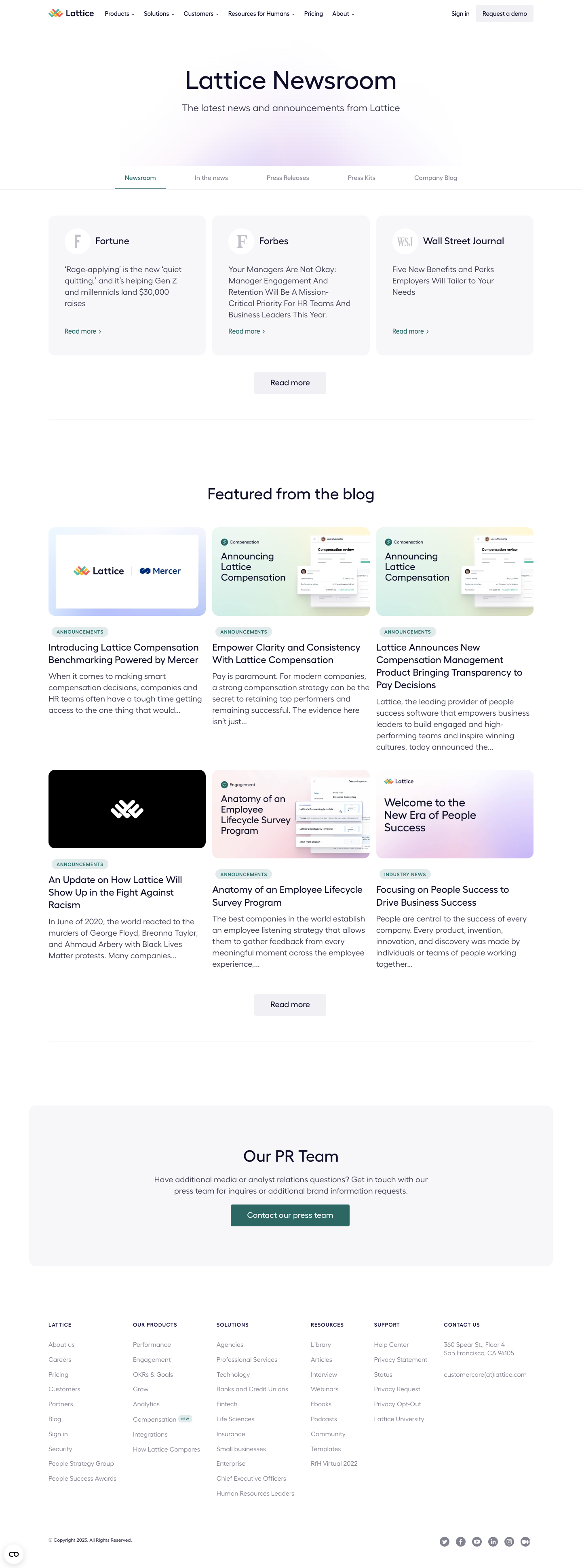
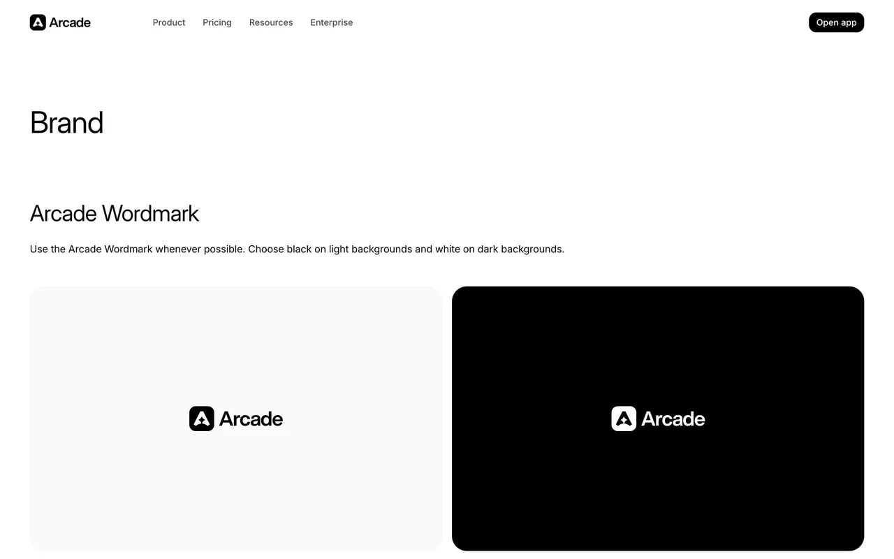
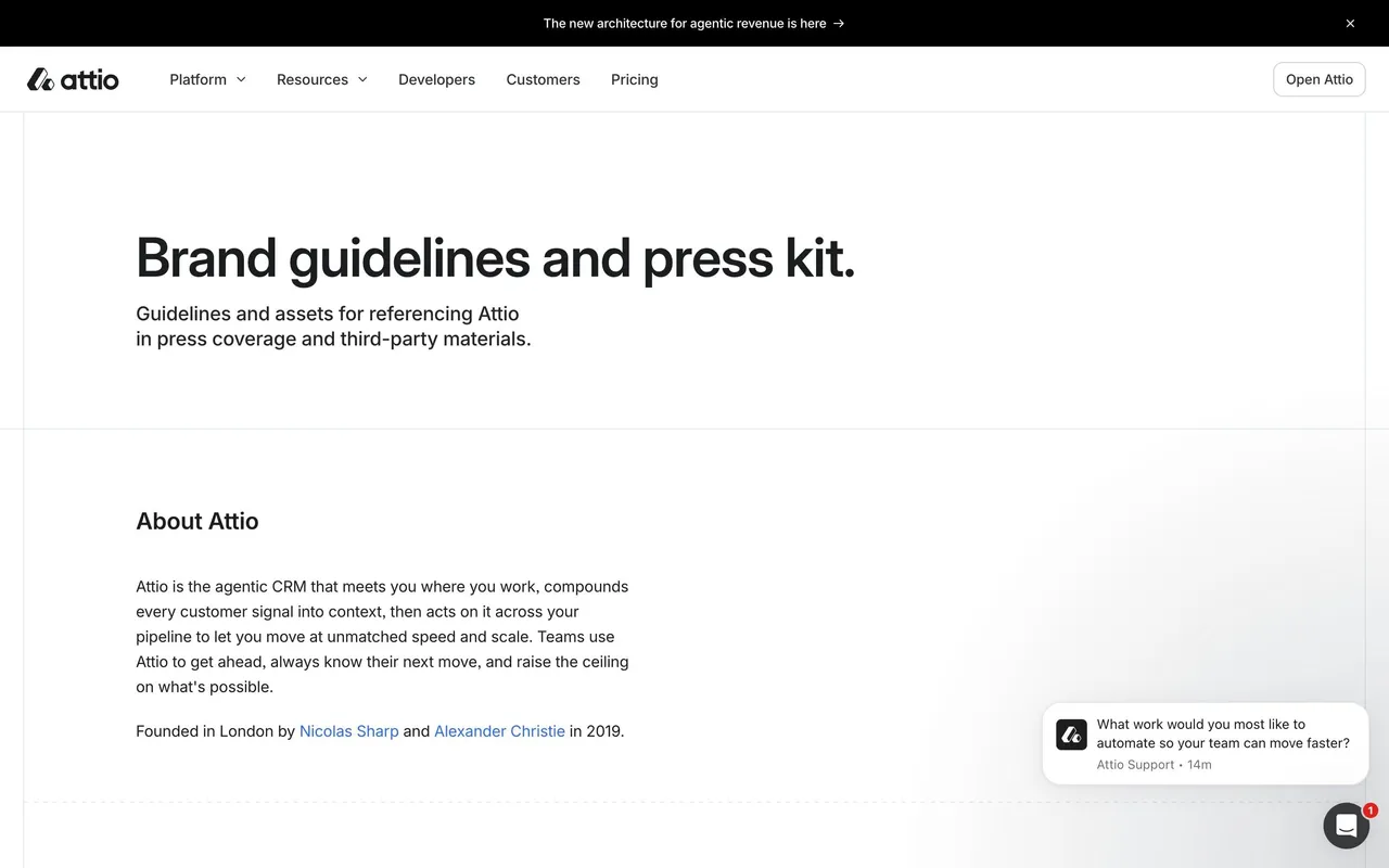
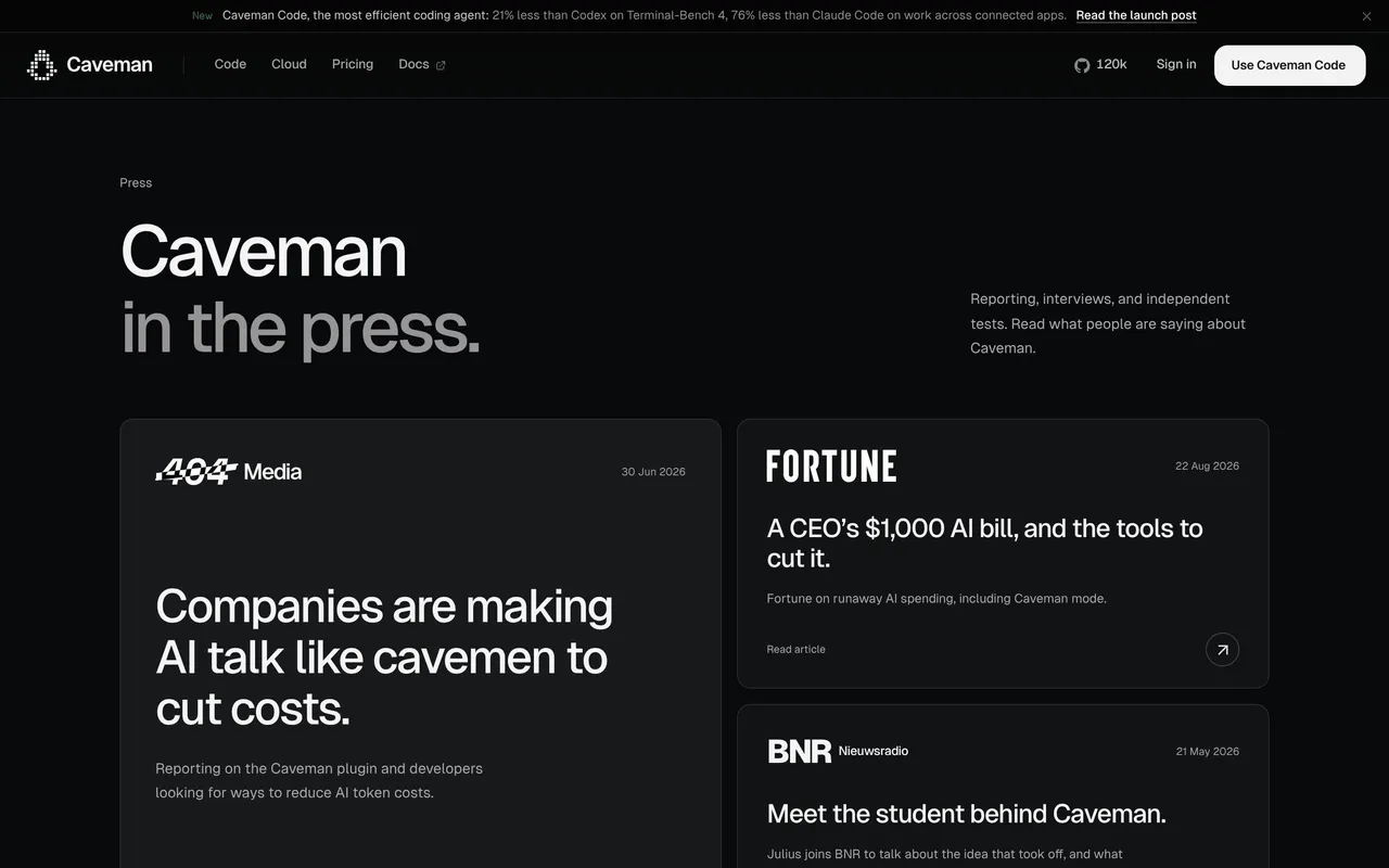
Lattice’s Newsroom page exemplifies a modern, minimalist approach layered with a professional and approachable tone. The design benefits from generous white space, ensuring the content feels open, airy, and easy to navigate. Subtle use of accent colors—soft blues, muted greens, and gentle neutrals—reinforces brand identity while avoiding visual clutter, creating an experience that feels both trustworthy and forward-thinking.
Layout and Structure
The layout is organized with clarity and purpose. A bold, succinct hero section immediately sets the context, accompanied by a straightforward navigation bar that keeps users anchored. Press releases and news items are presented as neat, card-based modules, which are visually separated yet consistent, allowing for effortless browsing. There are no superfluous sections—everything is laser-focused on media content and easy discovery.
Visual Elements
The design uses crisp, high-resolution logos and thumbnails to visually distinguish media types, complemented by understated icons and careful microinteractions (hover states, subtle transitions). There are no distracting illustrations or animations, focusing attention on the content itself—a conscious choice that preserves professionalism and bolsters credibility.
Color Palette and Typography
Lattice’s palette uses soothing pastels as accents against a white backdrop, balancing vibrancy with restraint. Typography is unified and highly readable, with a clear hierarchy: bold headlines grab attention while lighter body text ensures legibility. Font choices are modern and sans-serif, contributing to a tech-savvy yet accessible feel.
User Experience Patterns
Interaction is seamless: intuitive navigation, persistent CTAs (“Contact Us,” “Back To Home”), and filtering tools enhance usability. The lack of overwhelming forms or pop-ups keeps the experience frictionless. Logical grouping and progressive disclosure (e.g., details expand on demand) exemplify best UX practices.
Unique or Notable Design Choices
What stands out most is the disciplined restraint. By resisting decorative excess, the page delivers an efficient and elegant resource for press audiences—proof that less can indeed be more in SaaS web design.
 SaaSFrame