Overall Style and Aesthetic
Workable’s "Customers" page exemplifies a polished, professional aesthetic balanced with modern warmth. The design leverages generous white space, clean edges, and vibrant accent colors, delivering a refined yet inviting experience. The minimalist approach is juxtaposed with ample customer logos and diverse photography, communicating both credibility and approachability. Layout and Structure
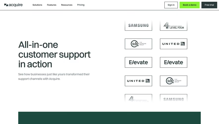
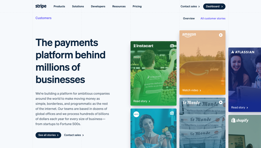
The page opens with a concise hero section featuring a reassuring headline, a CTA, and a grid of notable customer logos, quickly building trust. Scrolling down, customer stories are grouped by industry, each accompanied by succinct summaries and clear “Read story” links. Testimonials blend seamlessly, featured in pull quotes with customer headshots for authenticity. The footer anchors the page, packed with resources and secondary navigation. Visual Elements
Prominent use of real company logos and candid customer photography add both legitimacy and relatability, avoiding faceless stock imagery. Subtle hover animations enliven story links, while icons and badges are used minimally—letting testimonials and brand visuals shine. Color Palette and Typography
A clean palette of navy, white, and Workable’s signature teal underscores the trustworthy, tech-forward mood. Headings use a distinctive, slightly rounded sans-serif in bold weights, creating clear visual hierarchy. Body text is subdued for easy reading but remains crisp on all backgrounds. User Experience Patterns and Notable Choices
Navigation is effortless, with sticky headers and clear CTAs drawing users to explore stories or book a demo. The industry filter bar above the customer grid is especially effective, enabling users to personalize their browsing journey. The blend of concise copy, strong visuals, and interactive elements results in a page that instills confidence and encourages action—making it a standout model for SaaS design inspiration.