Overall Style and Aesthetic
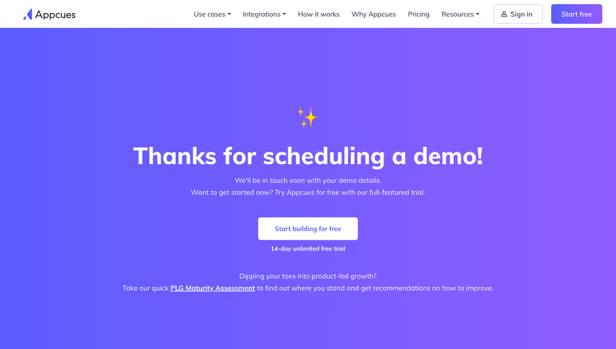
Wistia’s “Thanks for Requesting a Demo” page exemplifies a modern, approachable aesthetic that feels both professional and inviting. The clean interface combines plenty of open space with rounded card elements, subtly shadowed to float above the background, giving the page a light, airy quality. Thoughtful touches of motion and playful graphics keep the atmosphere friendly and unpretentious. Layout and Structure
The layout employs a centered, single-column structure, focusing visitor attention on the confirmation message. A concise hero section with a vibrant graphic leads, followed by a helpful summary of next steps. There are gentle prompts to explore related resources and product information, seamlessly guiding users onward. The persistent navigation bar ensures visitors stay grounded, while a slender footer wraps the experience with additional links. Visual Elements
The page balances whimsical custom illustrations—spotlighting Wistia’s brand mascot—with strategic use of subtle animation that enlivens the static content. Bold, geometric shapes provide splashes of color, while clean icons direct users to supplementary resources or actions. The visuals cultivate both memorability and ease of engagement. Color Palette and Typography
A refined palette of pastel blues, aquas, and energetic coral accents underpins the brand personality, complemented by deep navy for text contrast. Typography pops: a sans-serif font with generous weight for headings creates hierarchy, while lighter body text ensures clarity. Abundant white space and organized content blocks prevent cognitive overload. User Experience Patterns & Notable Choices
Primary CTAs are unmistakable through vivid coloring and straightforward labeling. Actionable content appears above the fold, with gentle scroll cues for additional options. Persistent navigation, smart content grouping, and gentle microinteractions, like hover states and animated mascots, foster a seamless, positive journey. The overall tone is trustworthy and innovative—an ideal reference for SaaS designers seeking a human, energetic interface.