Design with AI
Generate a new design based on this screen using your own content.
# Design from Reference: Webflow University
Create an original, high-fidelity visual design inspired by the reference. Prioritize composition, typography, colors, spacing, and component styling over technical implementation.
## Reference
- **Product:** Webflow
- **Category:** Academy
- **Screenshot:** https://cdn.prod.website-files.com/5e9dc792e1210c5325f7ebbc/6acbd249d69dbc5db1018969_6acbd007a58d0f99faaf62c2_cms-2a76bc3722f7f037661474ea.webp
Analyze the screenshot first. If inaccessible, request it rather than guessing.
## Content
{{content.instructions}}
{{content.data}}
Preserve essential messaging and factual accuracy. Adapt structure and copy length for visual balance; never invent product claims.
## Visual Design
### Overall aesthetic
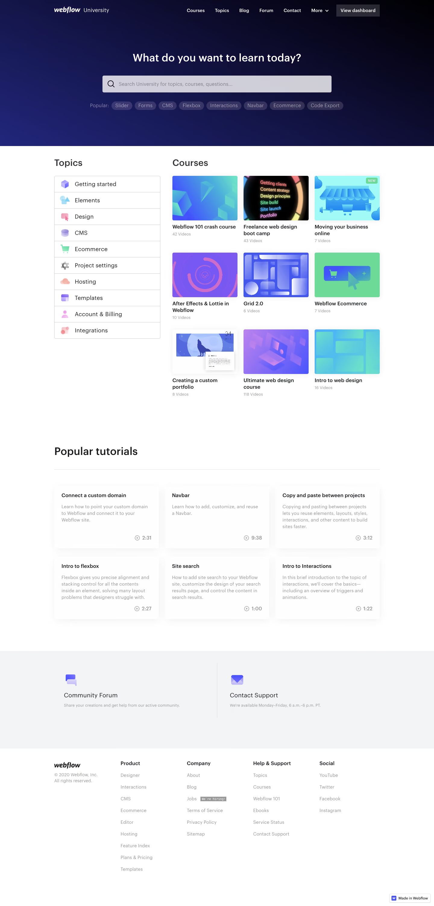
- **Character:** Clear educational directory with a dark search-led hero and a bright, orderly course catalogue.
### Page composition
- **Canvas:** 1440 × 3009 screenshot px.
- **Structure:** Top navigation over a dark blue gradient; centered heading/search/tags; left Topics list beside a three-column Courses grid; six tutorial cards; two support panels; multicolumn footer.
- **Width:** Estimated screenshot content width approximately 1080 px, with 180 px outer margins and 36–40 px grid gaps.
### Information hierarchy
- **Priority:** Search is the main entry point. Topics support browsing; colorful course thumbnails lead the catalogue, while duration labels remain secondary.
### Typography
- **Family:** Neutral sans serif; exact font unverified.
- **Scale:** Estimated screenshot hero 34–36 px, section headings 28–32 px, course titles 16–18 px and metadata 14 px; bold titles and regular descriptions.
### Colors & surfaces
- **Sampled palette:** White #FFFFFF canvas and pale gray #F3F4F5 support band.
- **Hero:** Deep navy-to-indigo gradient with white heading, light search field and muted violet topic pills. Exact gradient stops not sampled.
- **Cards:** White tutorial tiles with faint shadows; course thumbnails use vivid cyan, violet, blue and green.
### Components
- **Search:** Wide approximately 760 × 56 screenshot px field with leading magnifier, followed by a row of rounded popular-topic tags.
- **Topics:** Ten bordered stacked rows with pastel icons; course tiles pair rounded rectangular thumbnails with compact captions.
- **Tutorials:** Three columns by two rows; title top, summary below, small clock/duration anchored lower right.
### Visual rhythm
- **Spacing:** Approximately 80–120 screenshot px between catalogue, tutorial and support regions. Repeated thumbnail sizes and aligned captions create a regular grid.
### Responsive
- **Observed:** Desktop only.
- **Adaptation:** Stack topics above courses, use two then one course columns and wrap search tags. Preserve legible metadata rather than shrinking cards.
### Adaptation guidance
- **Preserve:** Search-first hierarchy, distinct browsing modes and restrained white card surfaces.
- **Replace:** Use supplied topics, course artwork and durations; retain clear visual distinction between courses and short tutorials.
Use this context to reproduce the reference's visual language: layout, typography, colors, spacing, borders, radii, and distinctive elements. The screenshot takes priority if descriptions conflict.
## Direction
{{preferences.fidelityInstructions}}
## Output
{{output.instructions}}
Deliver a polished, cohesive design with precise alignment, hierarchy, and spacing. Produce the requested visual artifact, not just a description. If unsupported, explain the limitation.