Generate a new design based on this screen using your own content.
Thank you! Your submission has been received!
Oops! Something went wrong while submitting the form.
# Design from Reference: Swan Contact Page
Create an original, high-fidelity visual design inspired by the reference. Prioritize composition, typography, colors, spacing, and component styling over technical implementation.
## Reference
- **Product:** Swan
- **Category:** Contact Page
- **Screenshot:** https://cdn.prod.website-files.com/5e9dc792e1210c5325f7ebbc/6acada0eca6d79c1e0c8a0cd_6acad997b3daa04f5427a3fe_cms-b9289e0fc20dc79e8cacb049.webp
Analyze the screenshot first. If inaccessible, request it rather than guessing.
## Content
{{content.instructions}}
{{content.data}}
Preserve essential messaging and factual accuracy. Adapt structure and copy length for visual balance; never invent product claims.
## Visual Design
Use this context to reproduce the reference's visual language: layout, typography, colors, spacing, borders, radii, and distinctive elements. The screenshot takes priority if descriptions conflict.
## Direction
{{preferences.fidelityInstructions}}
## Output
{{output.instructions}}
Deliver a polished, cohesive design with precise alignment, hierarchy, and spacing. Produce the requested visual artifact, not just a description. If unsupported, explain the limitation.
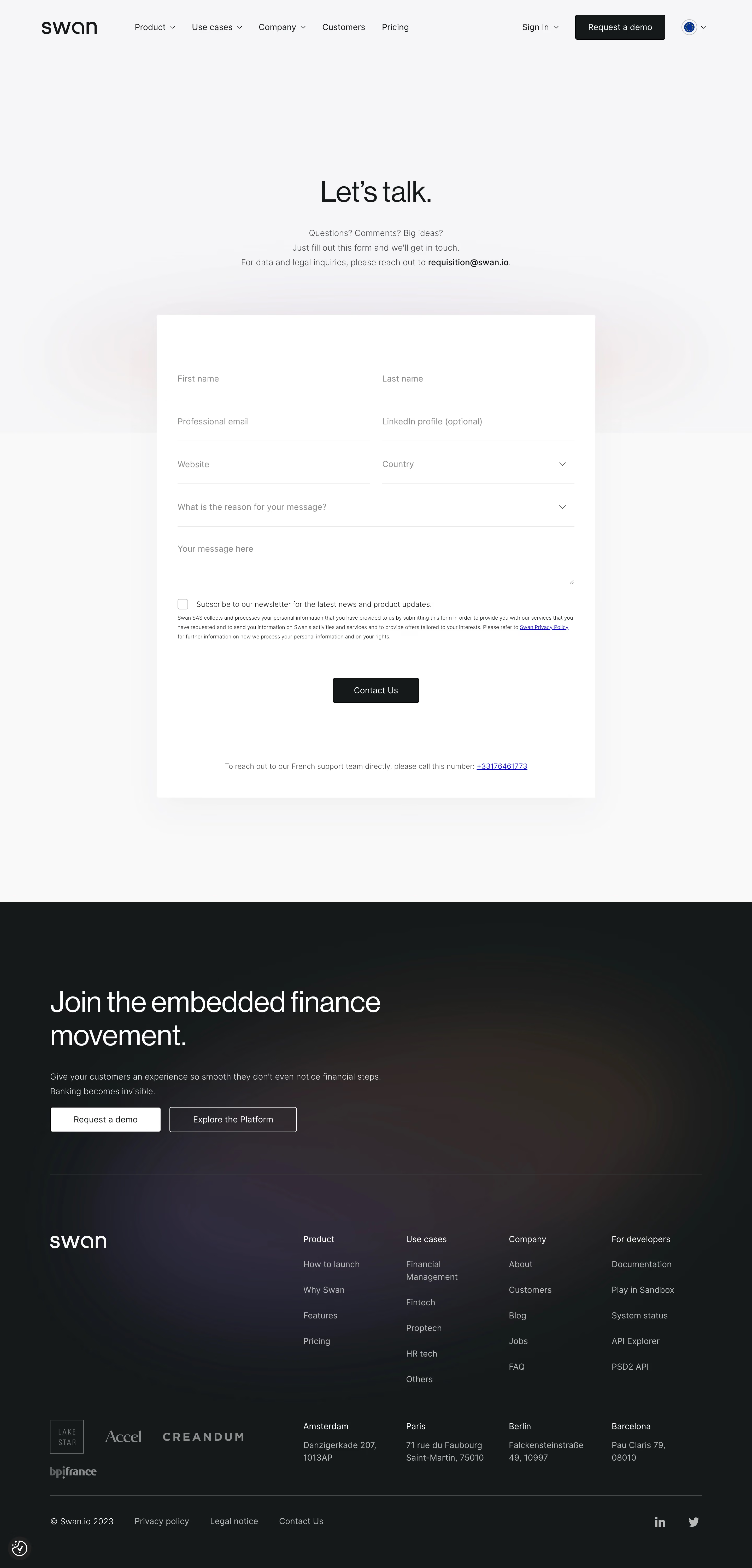
Swan’s Contact page exudes a sleek, minimalist aesthetic, emphasizing clarity and confidence. The use of abundant white space combined with crisp, purposeful interface elements evokes a modern, high-end feel—professional yet approachable. Refined spacing and clean lines create a sense of order that immediately instills trust, inviting users to engage without distractions.
Layout and Structure
The page structure is straightforward yet elegant. The hero section is compact, immediately presenting the contact purpose, followed by a thoughtfully placed form. Navigation remains accessible via a streamlined header. Instead of dense content blocks, the site opts for subtle guidance—no clutter of testimonials or feature overload, keeping focus on the action at hand.
Visual Elements
Visuals are subtle but effective. Custom line-drawn illustrations add character without overwhelming the content. Iconography is sparse but consistent and purposeful. Micro-interactions—such as form field outlines and hover states—add a layer of polish, enhancing feedback and touchpoints without visual noise.
Color Palette and Typography
The color palette is refined: cool blues, gentle grays, and crisp whites dominate, conveying calm and competence. Swan uses a geometric sans-serif font, reinforcing clarity and modernity, with bold headings and lighter body text for clear hierarchy. Attention is drawn to actionable elements with subdued yet noticeable accent tones.
User Experience Patterns
Navigation is frictionless—persistent, minimal header links, and a sticky interactive form that adapts gracefully to device sizes. Call-to-action buttons are distinct but not aggressive. Form usability is prioritized: large clickable fields, logical grouping, and visual cues for errors or completion.
Unique or Notable Design Choices
The page stands out through restraint: it commits to the “less is more” philosophy, letting each element breathe. Hand-drawn illustration accents and seamless form interactions subtly reinforce brand personality without sacrificing usability. The overall tone is quietly confident—trustworthy and customer-centric, well-suited for fintech audiences seeking reliability and clarity.