Generate a new design based on this screen using your own content.
Thank you! Your submission has been received!
Oops! Something went wrong while submitting the form.
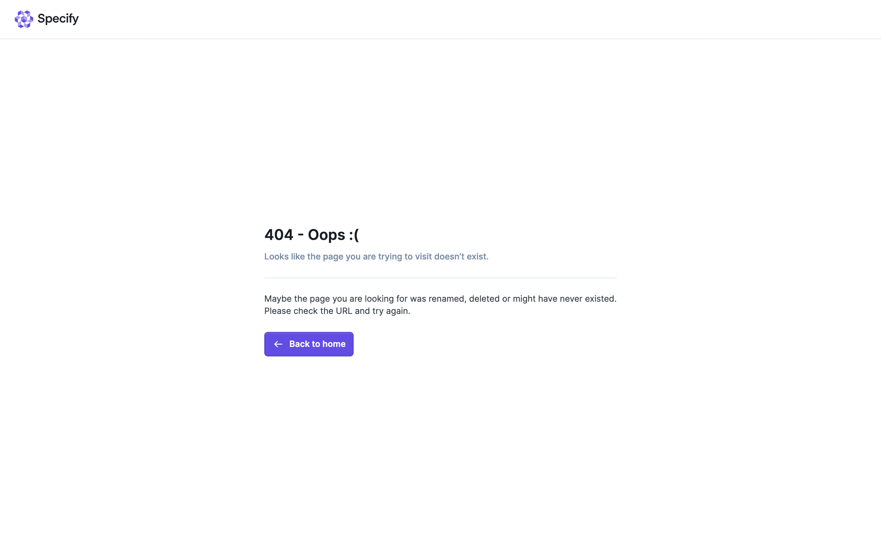
# Design from Reference: Specify 404 Page
Create an original, high-fidelity visual design inspired by the reference. Prioritize composition, typography, colors, spacing, and component styling over technical implementation.
## Reference
- **Product:** Specify
- **Category:** 404 Page
- **Screenshot:** https://cdn.prod.website-files.com/5e9dc792e1210c5325f7ebbc/6acbd24ad69dbc5db101898a_6acbd00ad69dbc5db1013dfc_cms-f2aa1404f6121f92c72f0a97.webp
Analyze the screenshot first. If inaccessible, request it rather than guessing.
## Content
{{content.instructions}}
{{content.data}}
Preserve essential messaging and factual accuracy. Adapt structure and copy length for visual balance; never invent product claims.
## Visual Design
Use this context to reproduce the reference's visual language: layout, typography, colors, spacing, borders, radii, and distinctive elements. The screenshot takes priority if descriptions conflict.
## Direction
{{preferences.fidelityInstructions}}
## Output
{{output.instructions}}
Deliver a polished, cohesive design with precise alignment, hierarchy, and spacing. Produce the requested visual artifact, not just a description. If unsupported, explain the limitation.
Specify’s 404 page radiates a playful, modern minimalism that immediately feels fresh yet polished. The design leans into a tech-forward, approachable vibe, using light backgrounds and ample negative space to let the visuals and messaging shine without distraction.
Layout and Structure
The structure is elegantly simple. The hero section sits front-and-center, featuring a bold, apologetic headline and a whimsical animated illustration that adds delight without overwhelming. Navigation remains accessible at the top, inviting users to continue exploring the site despite hitting a dead end. The design forgoes typical 404 page clutter or extraneous content, focusing attention on action and discovery rather than explanation or apology.
Visual Elements
A standout animated robot illustration captures attention with smooth, looped motion, injecting character and personality. The page uses vector style graphics, offering a sense of cohesion with the rest of Specify’s branding. Visual cues are sharp, purposeful, and lively.
Color Palette and Typography
Specify’s signature electric blue anchors the palette, contrasted with soft neutrals and energetic accent shades. Typography is clean and modern—sharp sans-serif fonts with clear hierarchy, making messaging pop and ensuring readability even at a glance.
User Experience Patterns
Primary navigation remains prominent, immediately offering pathways back to core areas like the homepage. A clear, playful call to action (“Back to homepage”) doubles as both a rescue and a re-engagement mechanism, keeping users interacting with the product instead of bouncing.
Unique or Notable Design Choices
The animated illustration isn’t just visually unique—it softens the “error” moment and makes brand personality memorable. The overall tone balances apology with optimism, reinforcing the company’s trustworthy yet innovative character. The page turns an error into an on-brand interaction, serving as both inspiration and a practical UX solution.