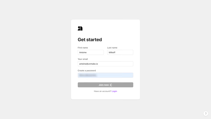
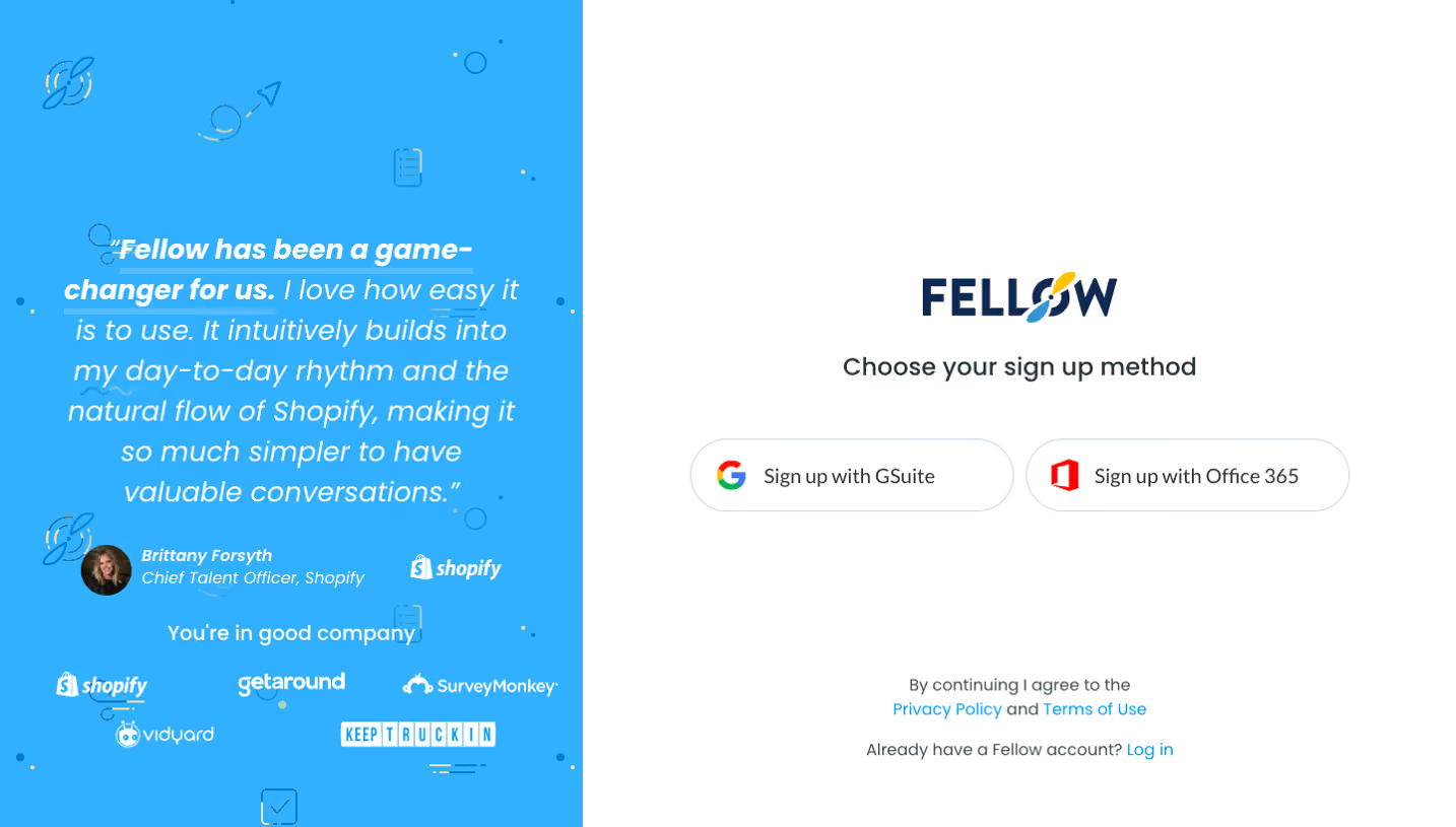
Generate a new design based on this screen using your own content.
Thank you! Your submission has been received!
Oops! Something went wrong while submitting the form.
# Design from Reference: Segment Signup Page
Create an original, high-fidelity visual design inspired by the reference. Prioritize composition, typography, colors, spacing, and component styling over technical implementation.
## Reference
- **Product:** Segment
- **Category:** Signup
- **Screenshot:** https://cdn.prod.website-files.com/5e9dc792e1210c5325f7ebbc/6acbd0438f05a14579f04749_6acbcb28405d8e0fbc3cb07a_cms-03edfff18140b45696225750.webp
Analyze the screenshot first. If inaccessible, request it rather than guessing.
## Content
{{content.instructions}}
{{content.data}}
Preserve essential messaging and factual accuracy. Adapt structure and copy length for visual balance; never invent product claims.
## Visual Design
Use this context to reproduce the reference's visual language: layout, typography, colors, spacing, borders, radii, and distinctive elements. The screenshot takes priority if descriptions conflict.
## Direction
{{preferences.fidelityInstructions}}
## Output
{{output.instructions}}
Deliver a polished, cohesive design with precise alignment, hierarchy, and spacing. Produce the requested visual artifact, not just a description. If unsupported, explain the limitation.
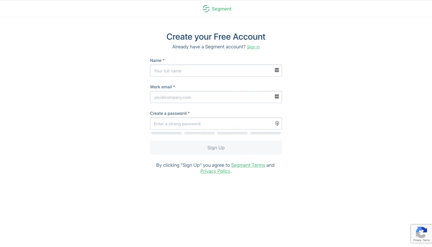
Segment’s signup page showcases an ultra-minimalist, modern aesthetic, relying on generous white space to evoke clarity and professionalism. The design avoids visual clutter, drawing visitors’ focus towards the central form and essential messaging, which lends an air of trustworthiness and confidence typical of best-in-class SaaS platforms.
Layout and Structure
The structure is laser-focused: a single-column hero layout with the signup form as the centerpiece. Subtle supporting content sits beneath, reinforcing messaging without overwhelming the user. Absent are the usual features, testimonials, or lengthy footers—every element is purposefully omitted to remove distractions and streamline the conversion process.
Visual Elements
Segment employs clean, vector-based brand illustrations beside the form, introducing a touch of approachability and warmth. Iconography is used sparingly yet effectively to add visual interest. No complex animations or photography are present, which maintains the form’s primacy.
Color Palette and Typography
A crisp, blue and white palette dominates, with subtle gradients adding dimension to the background and accents. Typography leans on a geometric sans-serif, using bold weights for headings and lighter styles for forms and secondary information, ensuring clear visual hierarchy and fast scanning.
User Experience Patterns
Navigation is almost invisible, with a simple logo and login prompt. The primary CTA (“Create free account”) is bold, inviting, and immediately visible. The signup form is short, uses clear field labels, and encourages OAuth signups for frictionless onboarding.
Unique or Notable Design Choices
Segment’s relentless focus on the signup form itself—eschewing distractions in favor of pure usability—sets it apart. The page exudes innovation and confidence through reduction, making it a powerful inspiration for SaaS teams seeking high-conversion, form-centric design.