Design with AI
Generate a new design based on this screen using your own content.
# Design from Reference: Routine Welcome Screen
Create an original, high-fidelity visual design inspired by the reference. Prioritize composition, typography, colors, spacing, and component styling over technical implementation.
## Reference
- **Product:** Routine
- **Category:** Welcome Screen
- **Screenshot:** https://cdn.prod.website-files.com/5e9dc792e1210c5325f7ebbc/6acadc595c79bb17f221b131_6acadbbb3ce5f4104ec07038_cms-09d1a259d36a1c9a5bb85fd5.webp
Analyze the screenshot first. If inaccessible, request it rather than guessing.
## Content
{{content.instructions}}
{{content.data}}
Preserve essential messaging and factual accuracy. Adapt structure and copy length for visual balance; never invent product claims.
## Visual Design
### Overall aesthetic
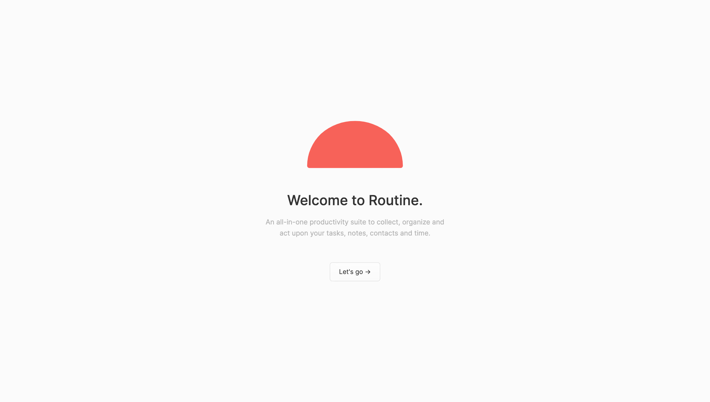
- **Character:** An exceptionally minimal welcome screen with a near-white background, a coral semicircle mark and a single understated action. Large empty margins create a calm first-run introduction.
- **Image basis:** Source dimensions are 2880 × 1630, inspected at approximately 1400 × 792. Measurements below are inspection-pixel estimates; CSS scale and pixel ratio are unverified.
### Page composition
- **Central group:** A single content stack centers horizontally near x700 and occupies approximately y238–554.
- **Brand mark:** A coral semicircle about 189 px wide and 93 px tall sits above the text.
- **Text:** A centered welcome heading precedes a short two-line product description.
- **Action:** A small outlined Let's go button sits centered below. No navigation, footer or other content is visible.
### Information hierarchy
- **Brand:** The saturated geometric mark is the first visual anchor.
- **Heading:** The welcome line establishes the product and next-step context.
- **Description:** Muted text briefly explains the productivity scope without additional links or lists.
- **Action:** A single small button provides an unambiguous continuation. No progress, error or loading state is shown.
### Typography
- **Heading:** Approximately 29 px semibold dark sans-serif with compact line-height.
- **Description:** Around 14 px regular muted-gray text with roughly 22 px line-height and a bounded width around 360 px.
- **Button:** Approximately 13 px regular dark text with a trailing right arrow.
- **Font certainty:** Typeface identity, exact CSS weights and metrics are unverified.
### Colors & surfaces
- **Measured base:** Near-white #FBFBFB dominates, with nearby #FCFCFC, #FAFAFA and #FDFDFD in antialiased variations.
- **Measured accent:** Coral #FF5551 fills the semicircle.
- **Measured text:** Dark #333333 defines heading/action text; muted #B2B2B2 and #B3B3B3 appear in secondary text.
- **Surface treatment:** No decorative shadow, enclosing card or background gradient is evident.
### Components
- **Mark:** A solid semicircle has a curved upper boundary and flat lower edge with slightly softened ends.
- **Button:** Approximately 100 × 37 px, fine pale-gray border, roughly 5 px corners and centered label/arrow.
- **Text block:** Heading and paragraph are separate centered elements with modest vertical spacing.
- **State evidence:** The button is shown at rest; hover, keyboard focus and activation behavior are not visible.
### Visual rhythm
- **Spacing:** About 48 px separates the mark from the heading; a smaller gap leads into the description, followed by roughly 48 px before the button.
- **Alignment:** Every element shares one central axis.
- **Scale:** The broad mark and heading contrast with the small continuation control.
- **Whitespace:** The content occupies a small fraction of the viewport, with no competing visual regions.
### Responsive
- **Evidence limit:** Only this wide welcome state is observed.
- **Recommended centering:** Keep the stack centered with safe side gutters and allow vertical scrolling on short screens.
- **Recommended text:** Preserve readable description size and natural two-line or three-line wrapping.
- **Recommended action:** Increase the hit area if needed while retaining the quiet outlined appearance.
### Adaptation guidance
- **Preserve:** Keep the simple mark, concise welcome copy and single continuation.
- **Build:** Use a small reusable welcome-stack component with responsive spacing.
- **State design:** Provide visible keyboard focus and clear continuation/loading behavior in implementation.
- **Validate:** Check muted-text contrast, short-viewport fit and actual font metrics.
Use this context to reproduce the reference's visual language: layout, typography, colors, spacing, borders, radii, and distinctive elements. The screenshot takes priority if descriptions conflict.
## Direction
{{preferences.fidelityInstructions}}
## Output
{{output.instructions}}
Deliver a polished, cohesive design with precise alignment, hierarchy, and spacing. Produce the requested visual artifact, not just a description. If unsupported, explain the limitation.