Design with AI
Generate a new design based on this screen using your own content.
# Design from Reference: Remote Enable Referral
Create an original, high-fidelity visual design inspired by the reference. Prioritize composition, typography, colors, spacing, and component styling over technical implementation.
## Reference
- **Product:** Remote
- **Category:** Referral
- **Screenshot:** https://cdn.prod.website-files.com/5e9dc792e1210c5325f7ebbc/6acad79afbf1299940aab5c5_6acad644c910b3adf9e573cc_cms-af8e7d51cd8e0d12103f8d4c.webp
Analyze the screenshot first. If inaccessible, request it rather than guessing.
## Content
{{content.instructions}}
{{content.data}}
Preserve essential messaging and factual accuracy. Adapt structure and copy length for visual balance; never invent product claims.
## Visual Design
### Overall aesthetic
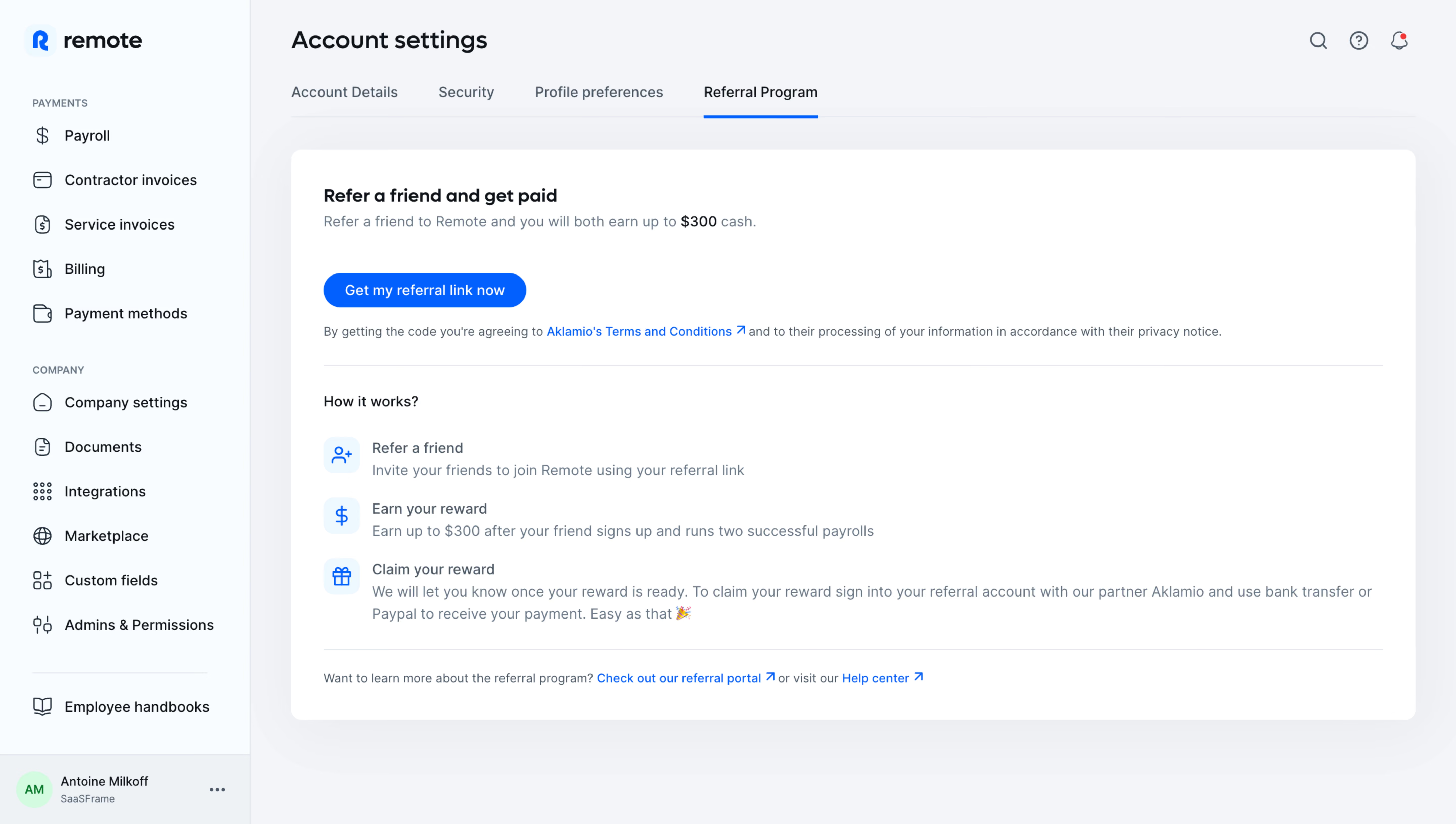
- **Character:** A light account-referral interface uses a pale gray workspace, white information card and bright blue actions.
- **Capture scale:** The screenshot measures 5760 × 3260 pixels. Approximate CSS dimensions assume a 1440 × 815 viewport at 4× density; the scale is unverified.
- **Tone:** A simple three-step explanation and one activation action make the program easy to understand.
### Page composition
- **Sidebar:** A roughly 248px CSS-wide pale rail contains the Remote brand, payment links, company links and a bottom account block.
- **Header:** Account settings appears above four tabs; Referral Program is selected with a blue underline.
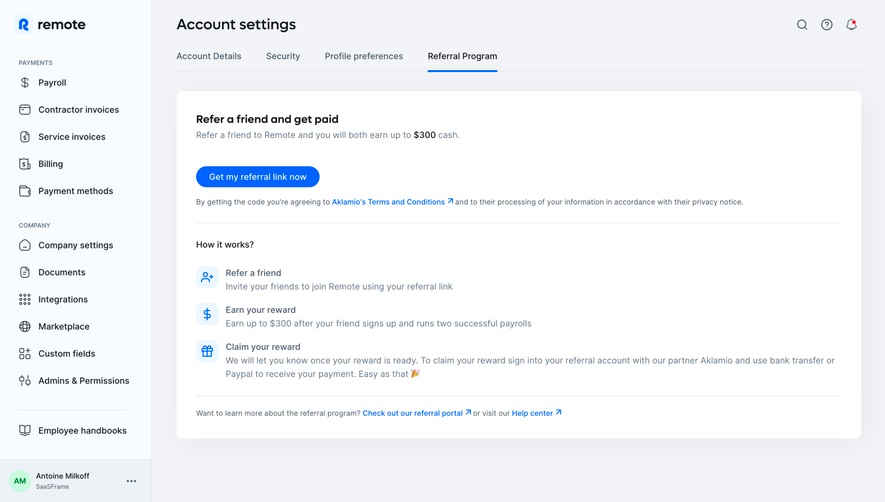
- **Main card:** A wide white rounded panel contains the referral offer, action, consent line, process explanation and help links.
- **Process:** Three vertically stacked icon-and-text rows explain referral, reward earning and reward claiming.
- **Utilities:** Search, help and notification icons align at the upper right.
### Information hierarchy
- **Offer heading:** A bold referral headline leads the card.
- **Supporting claim:** A muted sentence contains a darker reward amount; the displayed offer is captured content, not independently verified terms.
- **Primary action:** A blue referral-link activation pill is the only large filled action.
- **Consent:** Smaller text with a blue external terms link sits beneath.
- **Process:** Each of three rows pairs a blue icon with a short label and descriptive line.
- **Help:** Portal and help-center links sit below a divider at the card bottom.
### Typography
- **Family:** A rounded sans-serif is visible; exact identity is unverified.
- **Page heading:** Approximately 24px CSS, semibold.
- **Card heading:** Approximately 18px bold.
- **Body and tabs:** Approximately 14px with 22px line-height.
- **Small legal/help:** Approximately 12–13px.
- **Sidebar groups:** Small uppercase labels distinguish payment and company sections.
### Colors & surfaces
- **Card:** Sampled #FFFFFF supplies the central panel.
- **Workspace:** Sampled #F3F4F8 and nearby #F2F3F7/#F1F2F6 supply pale gray-lavender surfaces.
- **Sidebar:** Sampled #F8FCFF supplies a cooler near-white rail.
- **Borders:** Sampled #EDF2F6 contributes to thin dividers.
- **Accent:** Saturated blue supplies the selected tab, primary action, icons and links.
- **Text:** Dark navy headings contrast with muted blue-gray supporting copy.
### Components
- **Main panel:** A roughly 1110px-wide CSS card uses about 12px radii, subtle shadow and 32px padding.
- **Activation button:** A compact blue pill around 200 × 36px uses white text.
- **Process icons:** Three small rounded pale-blue tiles contain person-plus, currency and gift symbols.
- **Tab row:** Plain labels sit over a fine bottom rule, with a blue active underline.
- **Sidebar links:** Small line icons precede labels; a separator isolates the handbook link.
- **Account block:** A pale lower strip contains a circular initials avatar and workspace/user text.
### Visual rhythm
- **Content inset:** Around 40px separates the workspace edge from the main card.
- **Card grouping:** Offer/action/consent form the top group, separated from process steps by a thin rule.
- **Step cadence:** Around 60px separates the three process rows.
- **Whitespace:** Generous card width and short copy leave open space to the right.
- **Bottom links:** A second rule clearly separates explanatory content from further help.
### Responsive
- **Evidence limit:** Only a desktop referral state is observed; activation and mobile behavior are unverified.
- **Navigation recommendation:** Collapse the sidebar and let settings tabs wrap or scroll.
- **Card recommendation:** Use fluid width with 20–24px padding.
- **Process recommendation:** Allow descriptions to wrap while keeping each icon associated with its label.
- **Legal recommendation:** Preserve readable consent copy and clear external-link labels.
### Adaptation guidance
- **Program structure:** Keep offer, consent, activation and process explanation distinct.
- **Content accuracy:** Source reward amounts and conditions from maintained program data.
- **Privacy:** Use representative account information in demonstrations.
- **Accessibility:** Label icon controls, expose selected-tab state and provide visible keyboard focus.
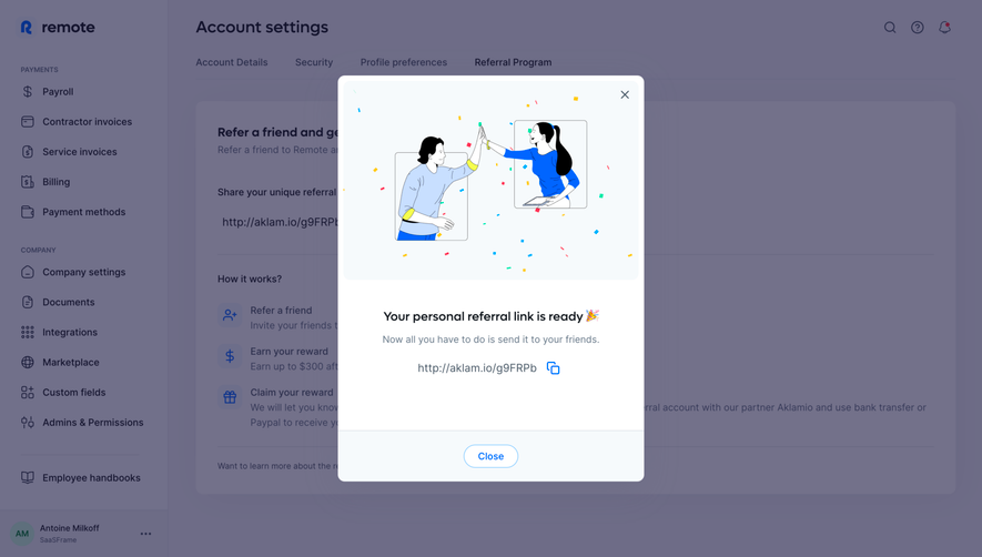
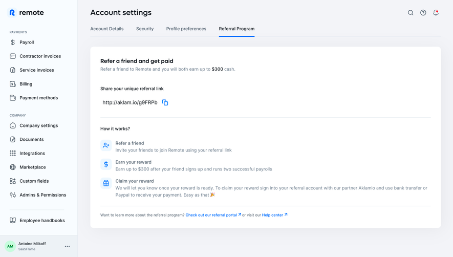
- **Behavior:** Define referral-link activation and confirmation separately; the screenshot only shows the initial control.
Use this context to reproduce the reference's visual language: layout, typography, colors, spacing, borders, radii, and distinctive elements. The screenshot takes priority if descriptions conflict.
## Direction
{{preferences.fidelityInstructions}}
## Output
{{output.instructions}}
Deliver a polished, cohesive design with precise alignment, hierarchy, and spacing. Produce the requested visual artifact, not just a description. If unsupported, explain the limitation.