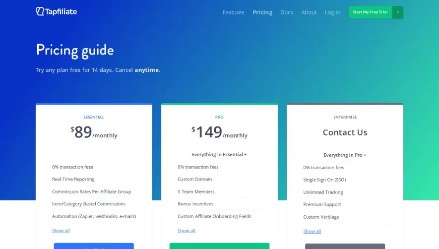
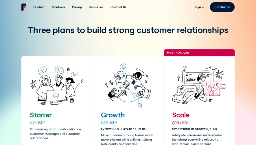
Generate a new design based on this screen using your own content.
Thank you! Your submission has been received!
Oops! Something went wrong while submitting the form.
# Design from Reference: Raycast Pricing Page
Create an original, high-fidelity visual design inspired by the reference. Prioritize composition, typography, colors, spacing, and component styling over technical implementation.
## Reference
- **Product:** Raycast
- **Category:** Pricing Page
- **Screenshot:** https://cdn.prod.website-files.com/5e9dc792e1210c5325f7ebbc/62ff1da3e561b533427551c1_1660886305978-pricing-Laptop%2520Medium-1660886205855.webp
Analyze the screenshot first. If inaccessible, request it rather than guessing.
## Content
{{content.instructions}}
{{content.data}}
Preserve essential messaging and factual accuracy. Adapt structure and copy length for visual balance; never invent product claims.
## Visual Design
Use this context to reproduce the reference's visual language: layout, typography, colors, spacing, borders, radii, and distinctive elements. The screenshot takes priority if descriptions conflict.
## Direction
{{preferences.fidelityInstructions}}
## Output
{{output.instructions}}
Deliver a polished, cohesive design with precise alignment, hierarchy, and spacing. Produce the requested visual artifact, not just a description. If unsupported, explain the limitation.
Raycast’s pricing page embodies a refined, minimalist approach that exudes professionalism and modernity. Crisp whitespace amplifies every interactive element, while bold pops of accent color—particularly violet and cyan—inject energy without overwhelming the senses.
Layout and Structure
The structure is clean and intuitive: a sticky navigation header leads directly into a prominent hero section, which succinctly communicates the value proposition. The central area houses the pricing tiers in clear, card-based layouts, making comparison effortless. A well-spaced FAQ collapses below, while the footer ties things together with links and muted branding.
Visual Elements
Custom vector illustrations give the page visual personality without clutter. Subtle micro-animations on hover and interactive buttons keep the interface feeling lively. Icons are used purposefully to reinforce key features within each plan, and occasional line art lends an approachable, user-centric feel.
Color Palette and Typography
The page employs a restrained palette: deep purples and dark blues form the base, offset by white backgrounds and punctuated by vibrant purple-pink accents. Typeface choices are sleek, readable sans-serifs, with larger, bolder weights reserved for pricing and section headers, and light-weight text used for supporting information.
User Experience Patterns and Notable Choices
Clear CTAs (“Get Started,” “Contact Sales”) are visually prominent, inviting interaction. Toggle switches allow seamless monthly/yearly plan comparison. Sticky navigation persists elegantly as you scroll. The tone remains transparent, direct, and innovative—every element feels trustworthy and designed to reduce cognitive friction, letting users focus on making a decision.