Overall Style and Aesthetic
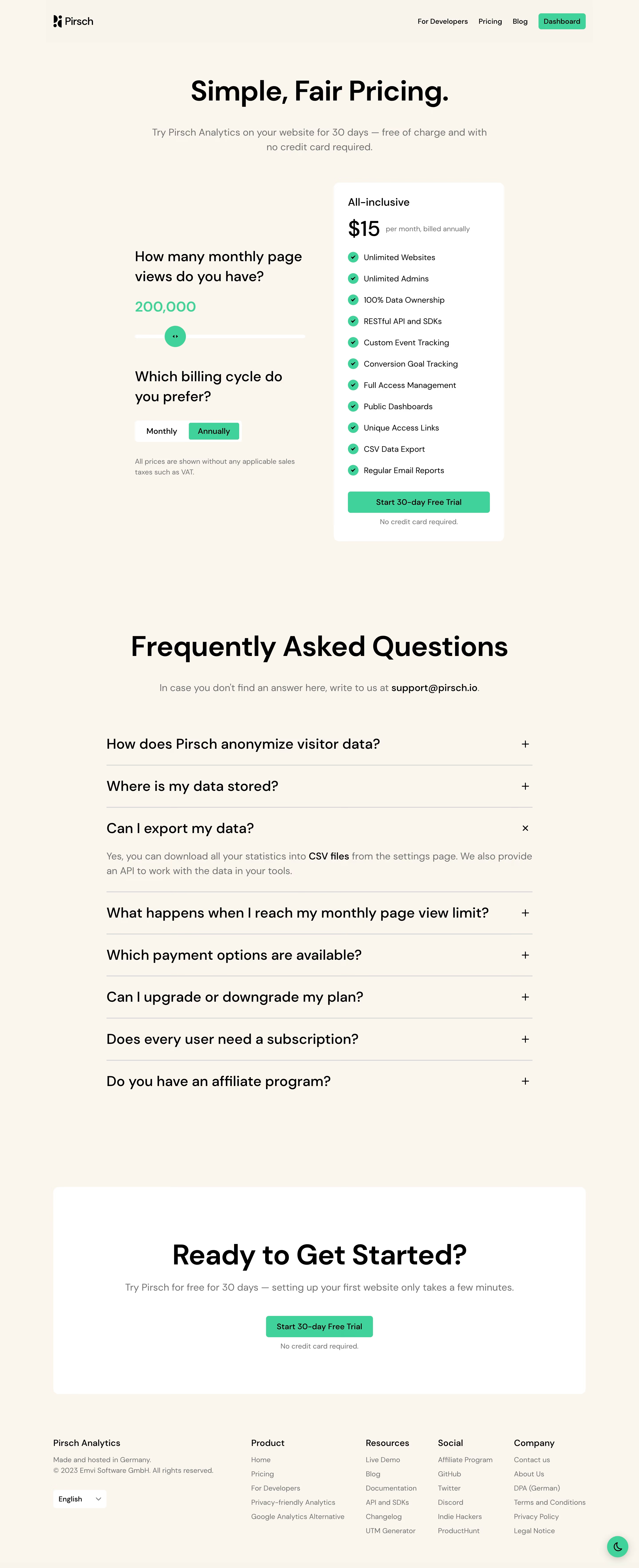
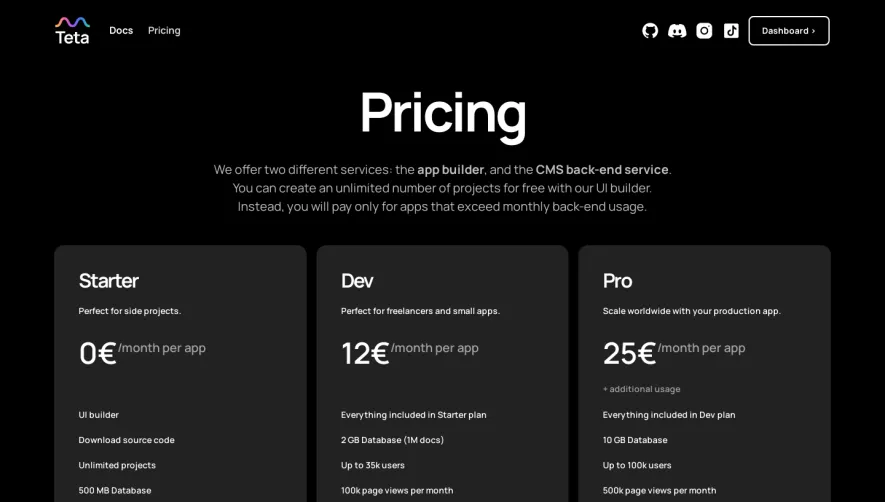
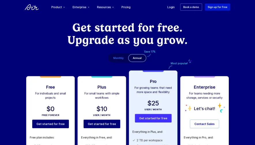
Pirsch.io’s pricing page embodies a clean, minimalist, and highly modern aesthetic. With ample white space, subtle gradients, and perfectly balanced layout, it projects a sense of professionalism and efficiency—ideal for a privacy-focused analytics SaaS. A restrained color palette, paired with uncluttered visuals, establishes instant credibility while remaining approachable. Layout and Structure
The layout is exceptionally streamlined: a concise hero introduces the page, immediately followed by an elegantly organized pricing grid. Clear plan differentiation and a persistent CTA ensure users are never left searching for their next step. Below the pricing, an FAQ collapsible section and transparent disclosure of important details foster user trust, while a simplified, well-ordered footer maintains focus without distraction. Visual Elements
Custom minimalist icons and refined illustrations enrich the interface without overpowering the content. Soft accent highlights help direct attention to plan features. There’s a notable absence of superfluous imagery, centering all focus on product and clarity—reinforcing the page’s functional, user-first approach. Color Palette and Typography
A harmonious blend of navy blue, soft violet accents, and white create an inviting yet professional tone. Typography leans on a geometric sans-serif font family, with prominent, bold headers and generously spaced body text for legibility and visual contrast. Hierarchy is enforced with weight, size, and color, guiding users naturally through information. User Experience Patterns
Navigation is frictionless—with a sticky header for quick return, distinguished call-to-action buttons, and one-click toggles to compare pricing tiers. Forms are elegantly minimal. Every scroll interaction reveals information gradually, avoiding cognitive overload. Unique or Notable Design Choices
Noteworthy is the transparency in pricing presentation: clear, toggleable options for monthly vs. yearly, and honest, upfront FAQs curb user hesitation. The lack of distracting elements—no overplayed animations or stock photography—lets the product and its value proposition shine. Tone and Feel
Overall, the page feels highly trustworthy and quietly innovative. The careful, unobtrusive design language radiates confidence and clarity, making it a model of effective SaaS UX for conversion-focused pricing pages.