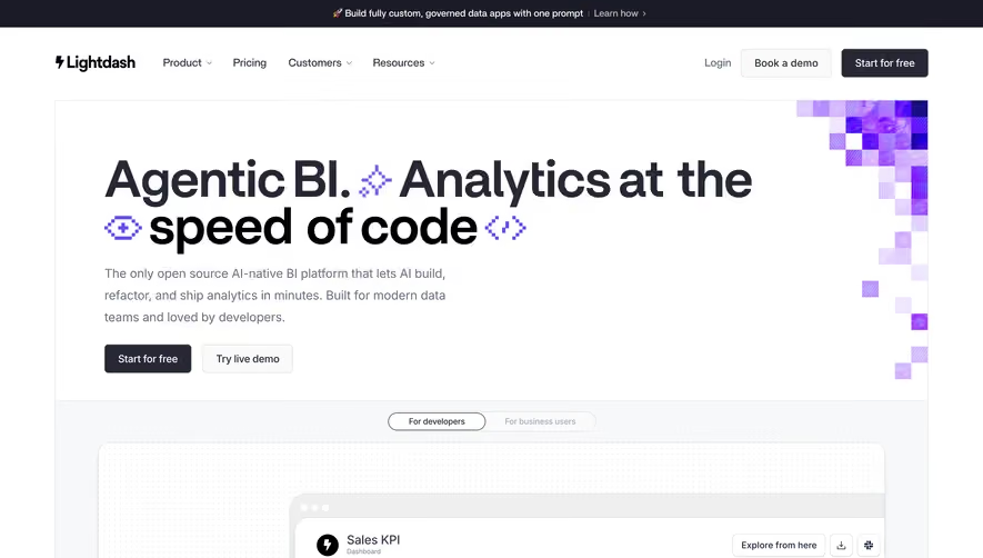
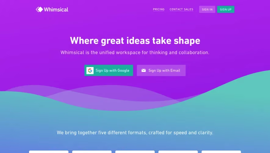
Overall Style and Aesthetic
OpenAI’s website exemplifies a modern, minimalist aesthetic underscored by an innovative and professional tone. Crisp whitespace allows each element to breathe, while bold yet uncluttered layouts signal both confidence and clarity. A sense of technological sophistication pervades the site, achieved through clean lines, generous margins, and understated elegance. Layout and Structure
The layout follows a clear, intuitive structure: it opens with an expansive hero section featuring concise messaging and immersive graphics or video, instantly capturing attention. Beneath, sections are stacked vertically—distinct “feature” areas showcase product strengths with balanced visuals and copy. There's a notable absence of clutter, with each segment flowing seamlessly into the next. Essential CTAs are placed strategically, and the footer consolidates links and resources in an organized, digestible format. Visual Elements
Cutting-edge visuals steal the scene: glossy, abstract animations and subtle motion effects add depth without distraction. Custom, fluid illustrations and occasional, tastefully integrated video loops reinforce technological prowess. Minimal iconography is employed for clarity, while images are used sparingly—the focus is always on the product experience. Color Palette and Typography
A monochromatic base—primarily deep navy and gentle off-whites—is punctuated with vivid accents (like vibrant blues or dynamic gradients), drawing the eye to key CTAs and interactions. The typography is bold and geometric, leveraging a strong sans-serif with clear hierarchy: impactful headings, legible body copy, and balanced spacing underpin every message. User Experience Patterns
Sticky navigation ensures easy access to top-level pages. CTAs are frequent yet unobtrusive, following a consistent coloration and tone. Smooth scroll and reveal animations provide gentle guidance down the page, enhancing engagement. Forms are minimal, reducing effort and friction, while page transitions feel seamless and modern. Unique or Notable Design Choices
Standout features include dynamic backgrounds that subtly animate, signaling innovation without overwhelming users. Headline copy is concise but impactful, and micro-interactions—on buttons and hover states—add delightful polish. The overall tone is aspirational yet grounded, communicating trustworthiness and future-forward thinking—perfect inspiration for SaaS brands seeking a refined, tech-savvy identity.